HONORING HERITAGE, EMBRACING THE FUTURE.
THE BRIEF
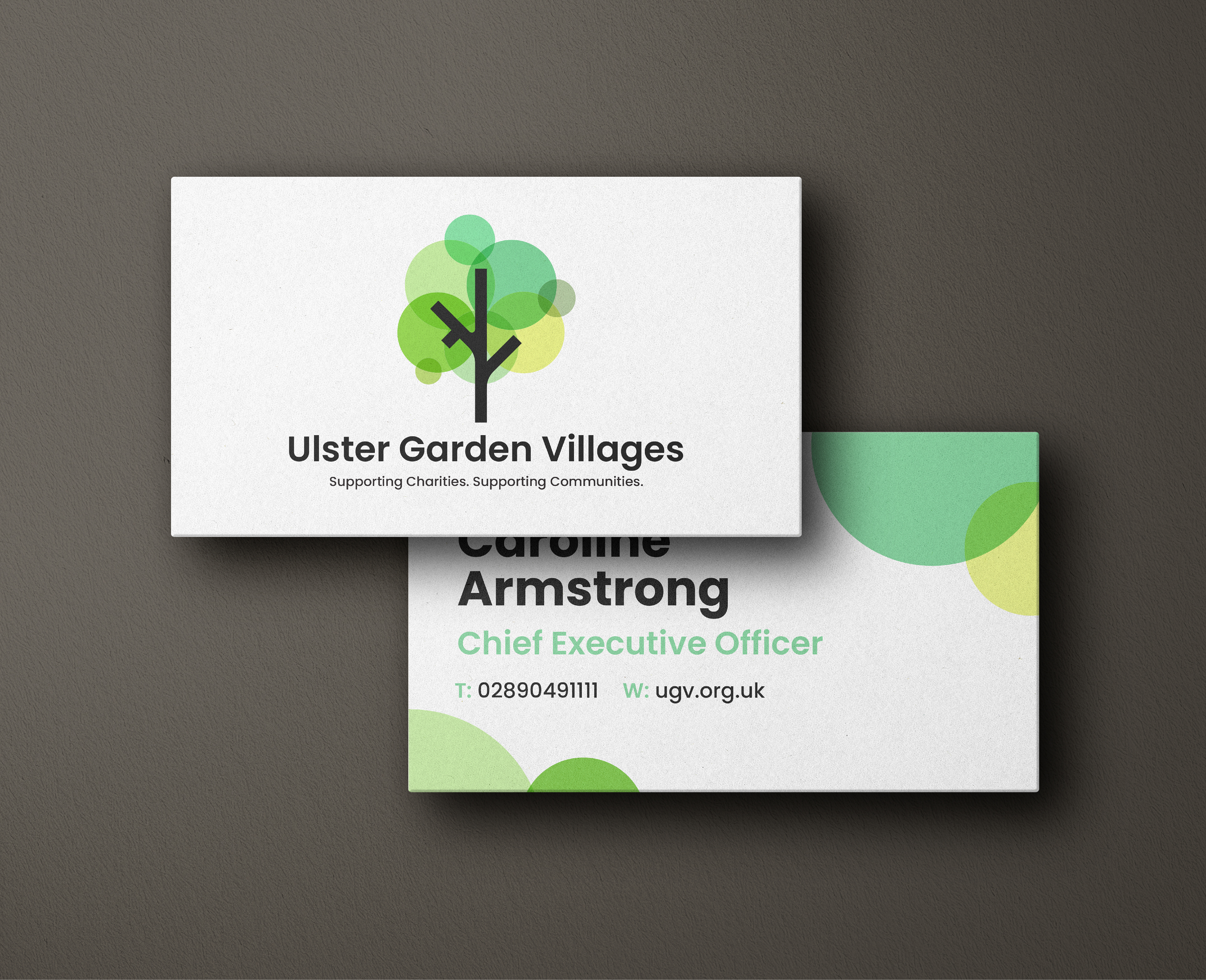
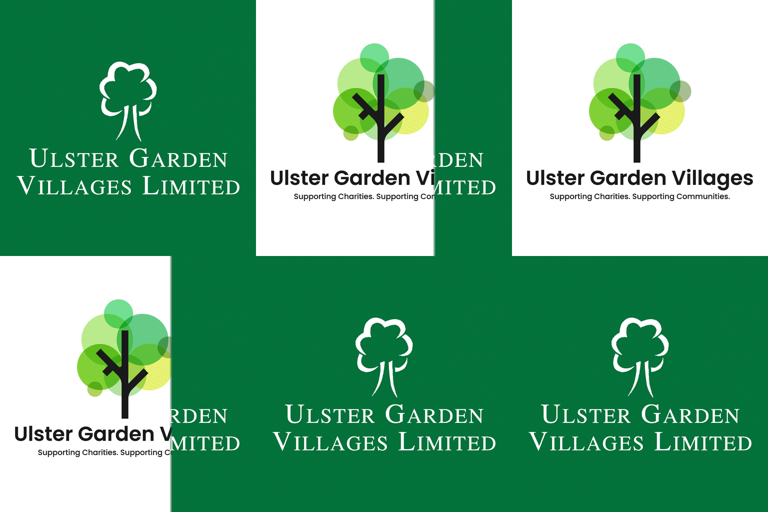
The overall focus of Ulster Garden Villages was to redefine rather than reinvent the brand. The goal was to honour the existing legacy of the charity while refreshing the visuals to become more future - focused.
THE PROCESS
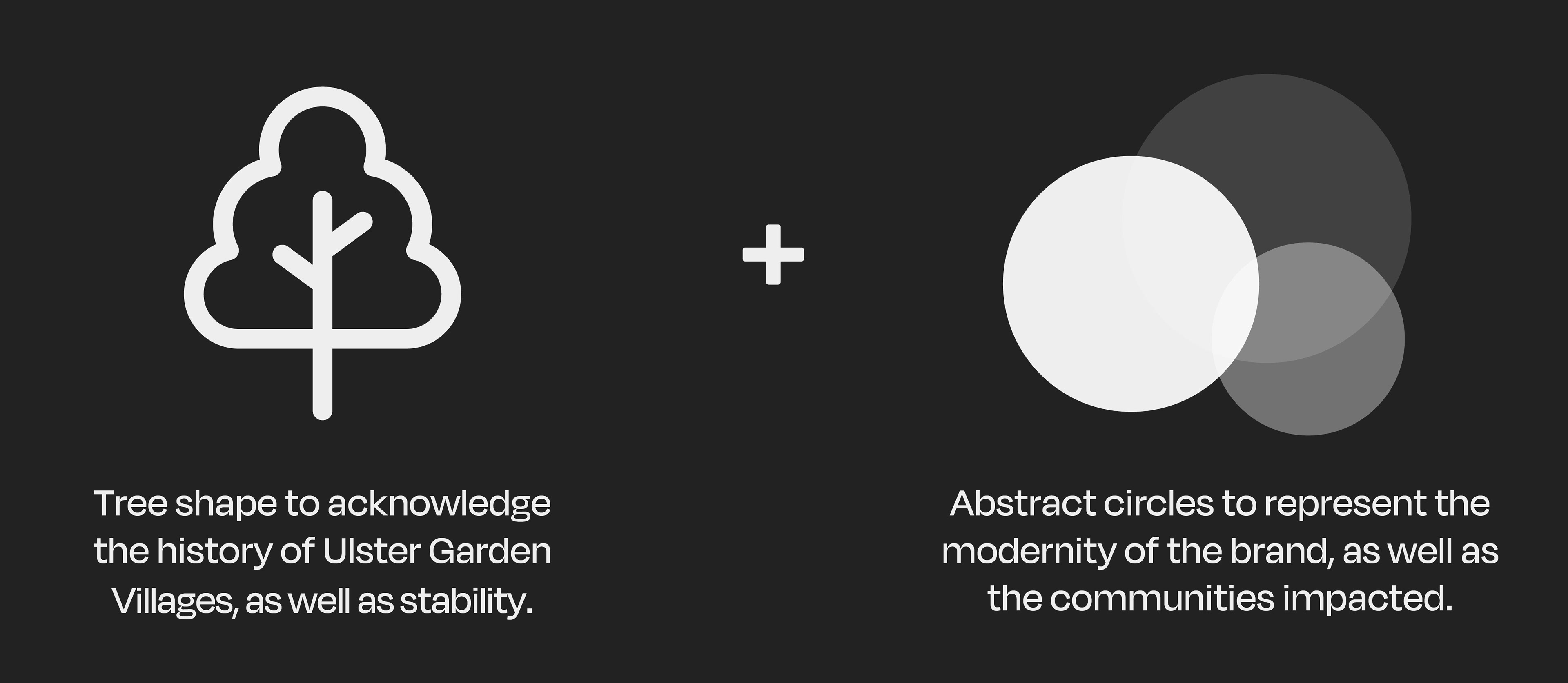
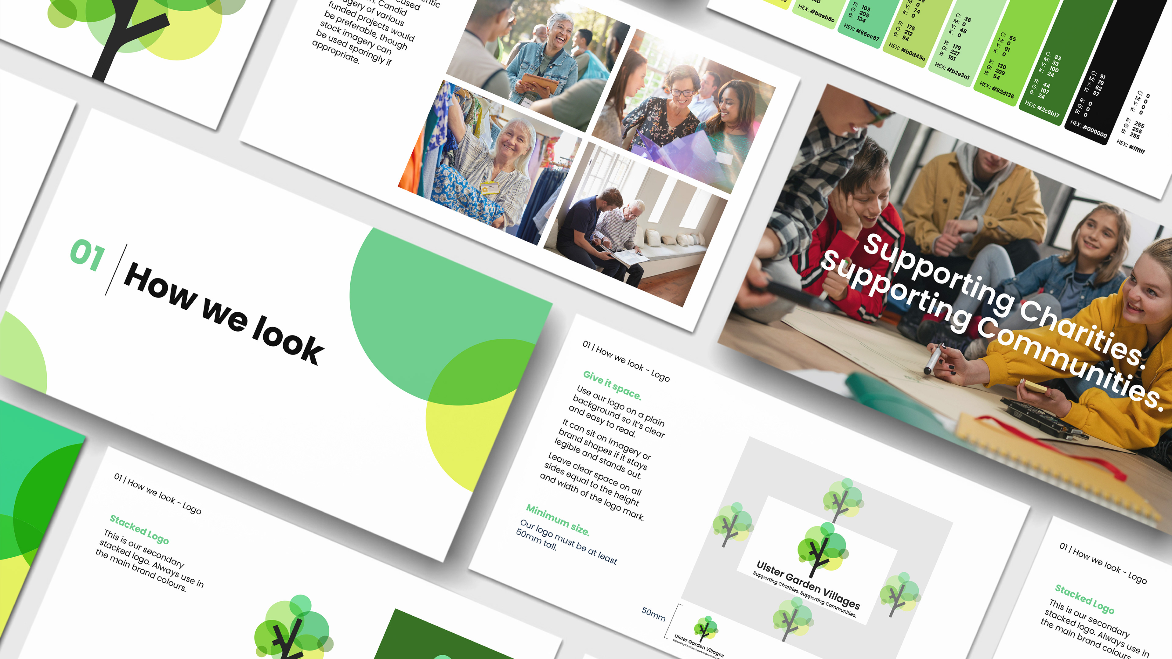
The process involved exploring various iterations, such as including the shape of the 'U' and experimenting with brand new colour palettes. Ultimately, we agreed on an approach that was softer and more vibrant. We wanted to keep the bones of the legacy brand by revisiting the tree design and incorporating different variations of the green rather than one swatch. The typeface was also updated to a modern sans-serif to replace the more traditional serif of the previous branding. This resulted in a solution that was user-friendly, attracted future investors and didn't alienate their existing audience.
TOUCHPOINTS
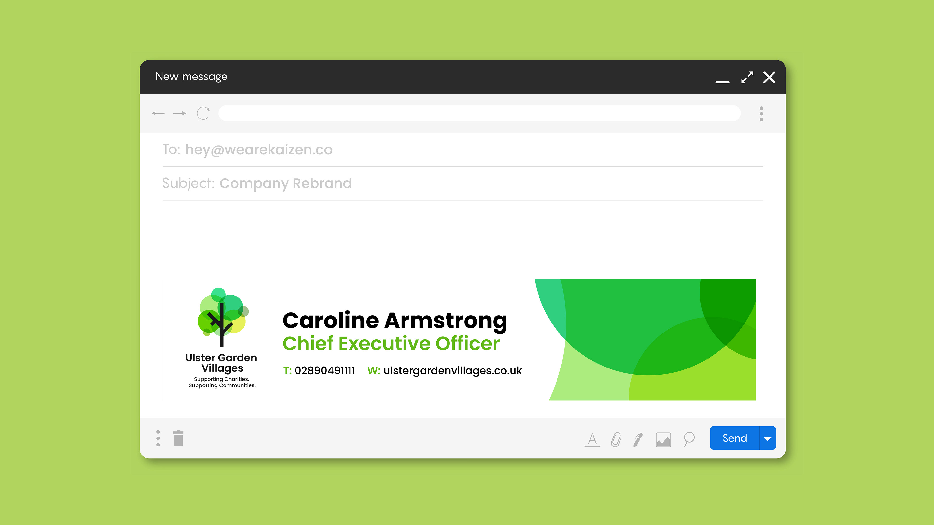
The brand is primarily digital, with the main touchpoints being the Ulster Garden Villages website as well as email.
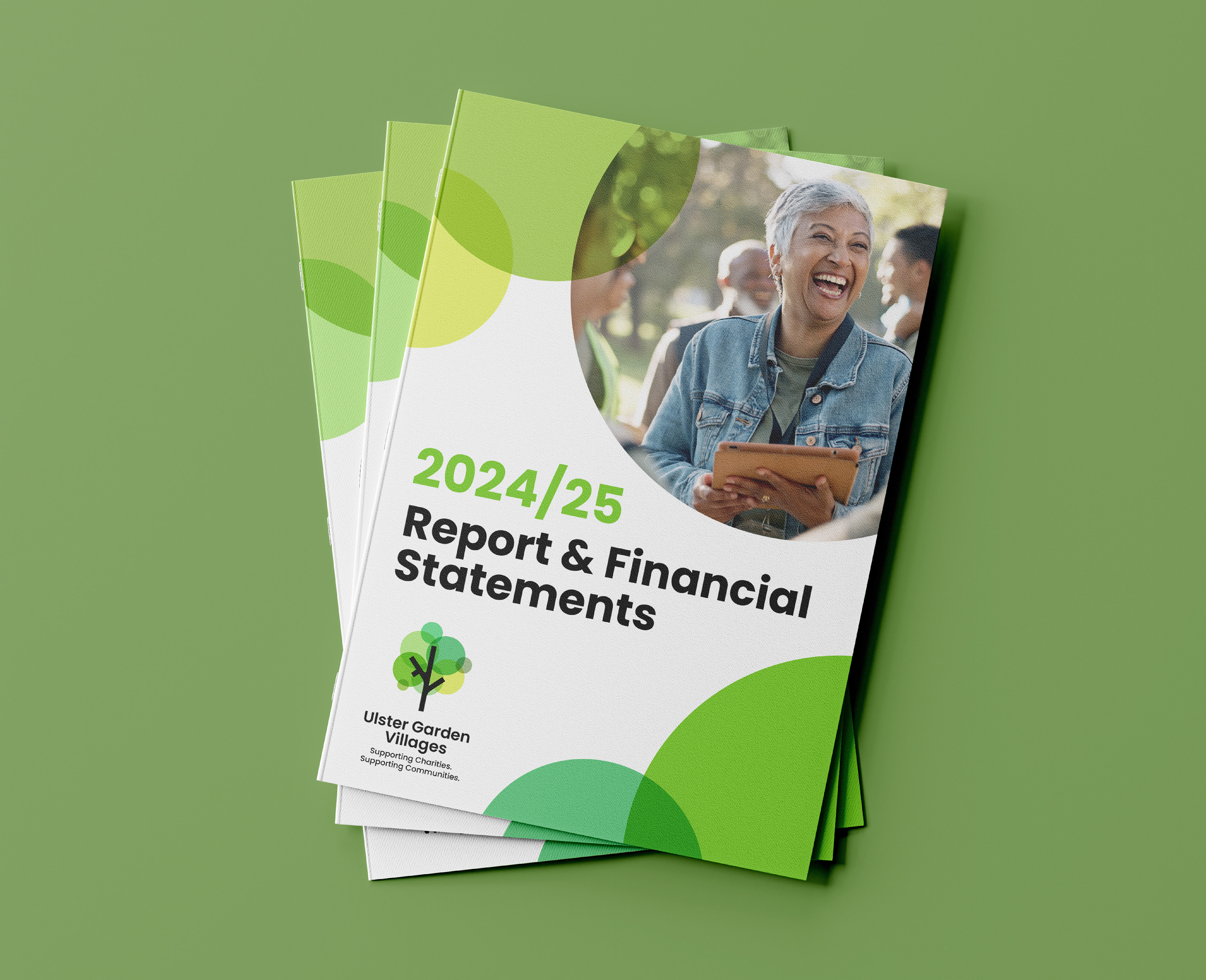
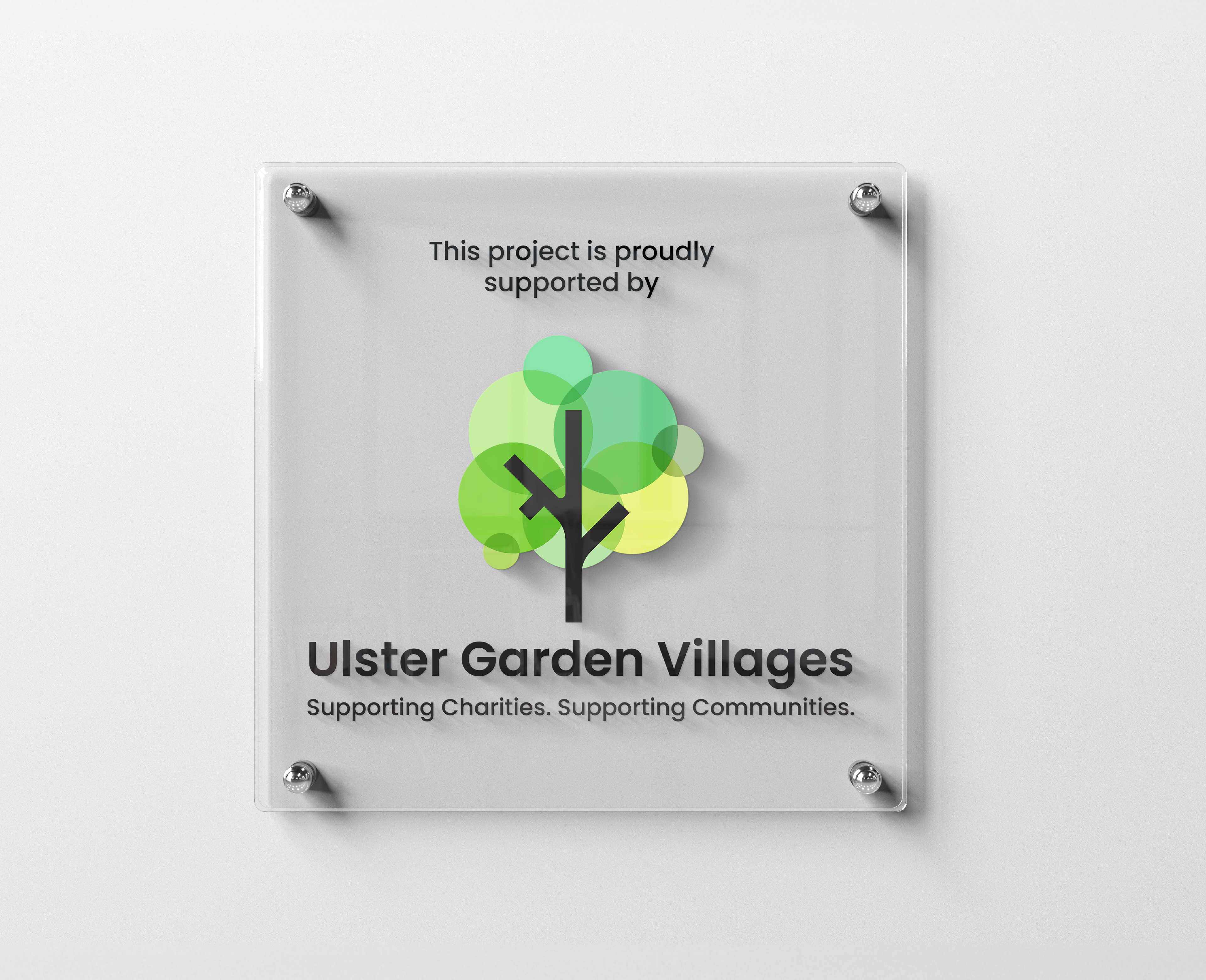
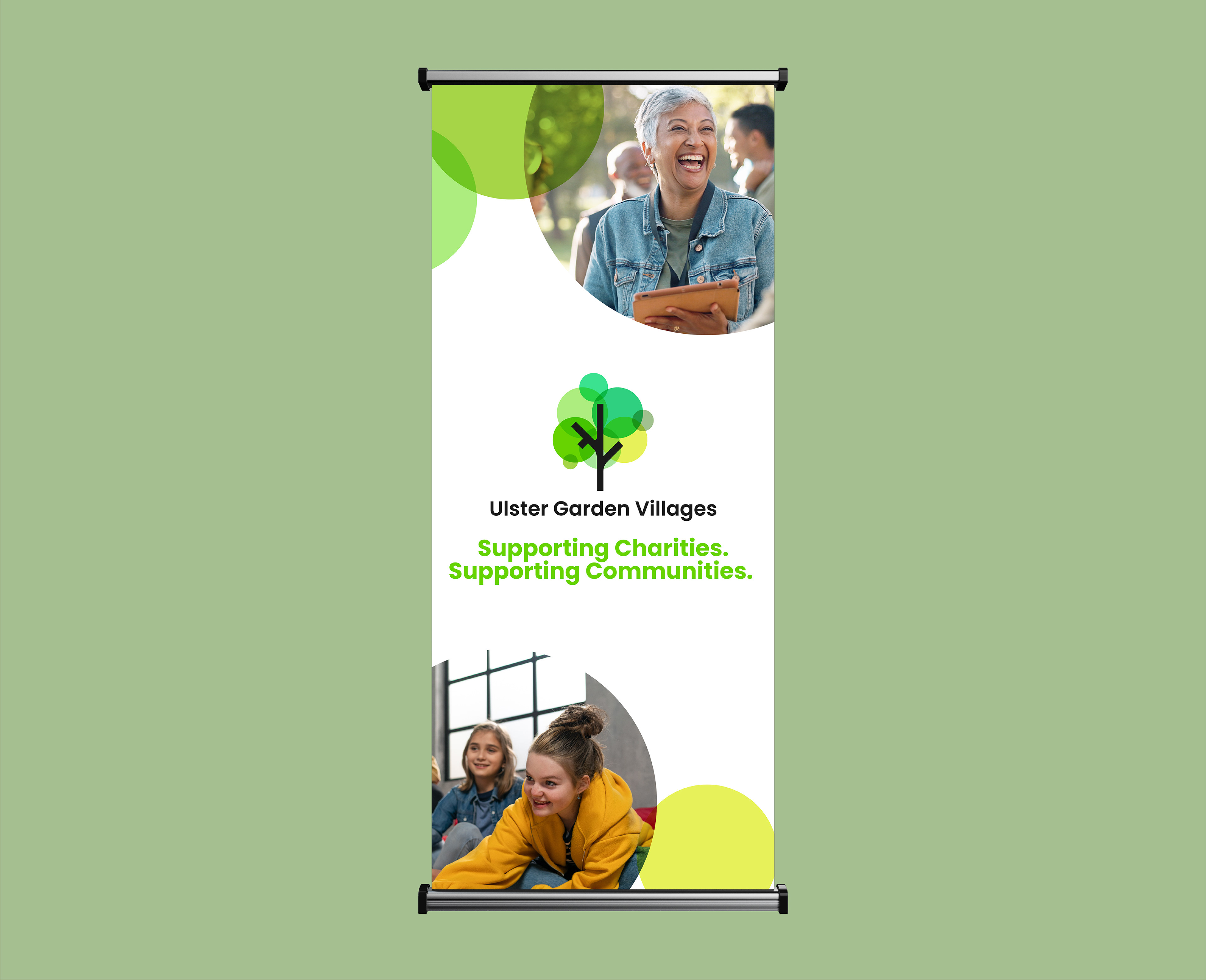
Print assets were designed for occasional use, such as reports, signage or stationery.
Print assets were designed for occasional use, such as reports, signage or stationery.