new decade. new look.
THE BRIEF
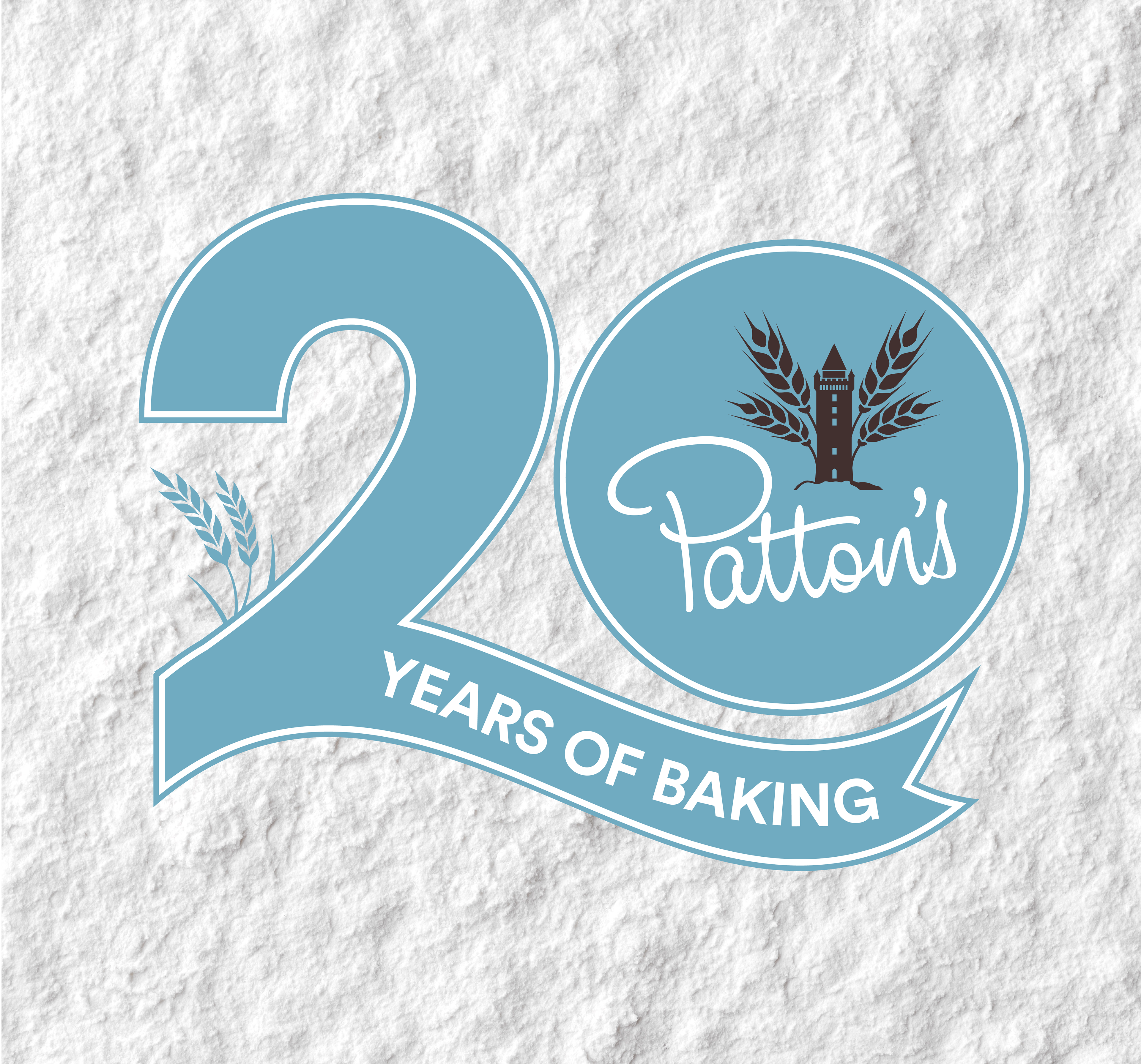
In mark of their 20th anniversary, Pattons wanted to refresh their existing brand. They wished to keep their current logo as a way to honour the legacy of Patton's, but were open to new ways that this could be utilised across brand visuals. The main aim was to create an identity that acknowledged the roots of the bakery while embracing a new modern era for the brand.
THE PROCESS
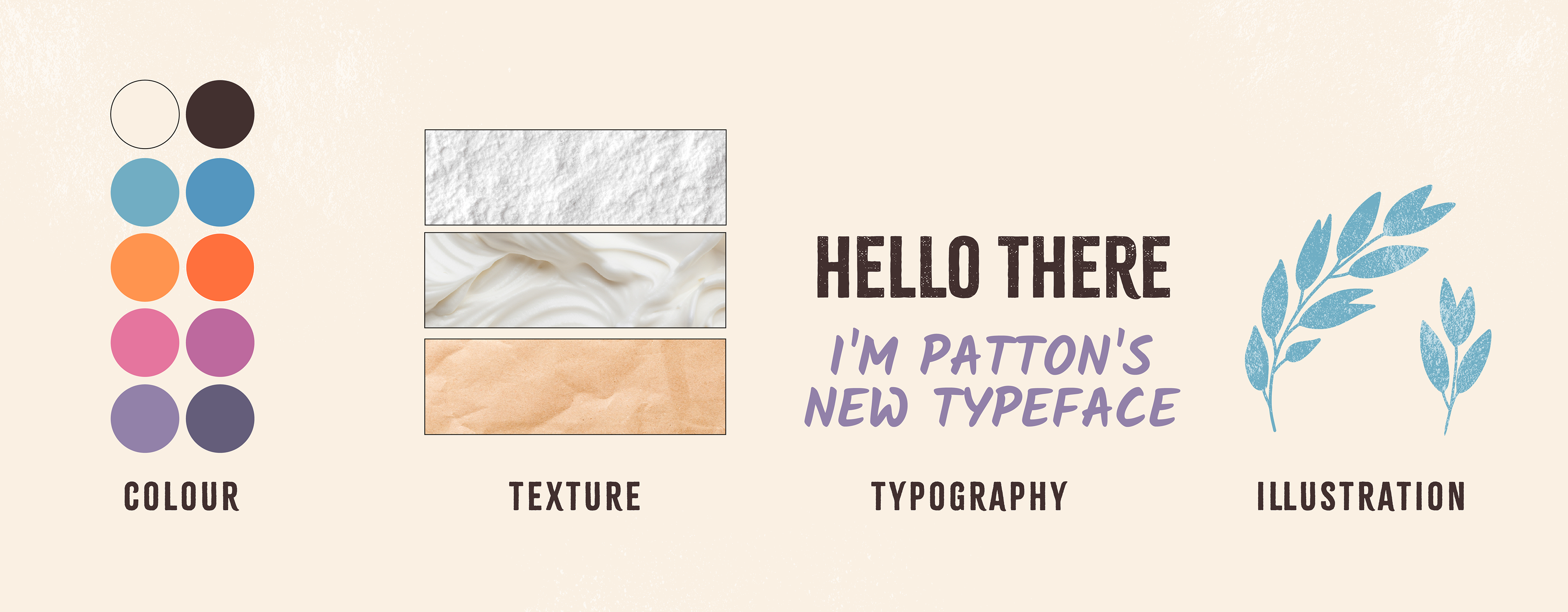
Pattons wanted to reinforce that - despite the modern updates - they still used the traditional techniques associated with their products, with virtually no automation. Therefore, I wanted to explore a rustic approach through the use of textures, stamped illustrations and handwritten typography. This was contrasted with a bold sans-serif and a lively pastel palette to give things a friendly and fresh vibe. Ultimately, the goal was to convey an authentic, hand-crafted product with branding that was personable and that would stand out on a shelf.
THE NEW PATTON'S BRANDMARK
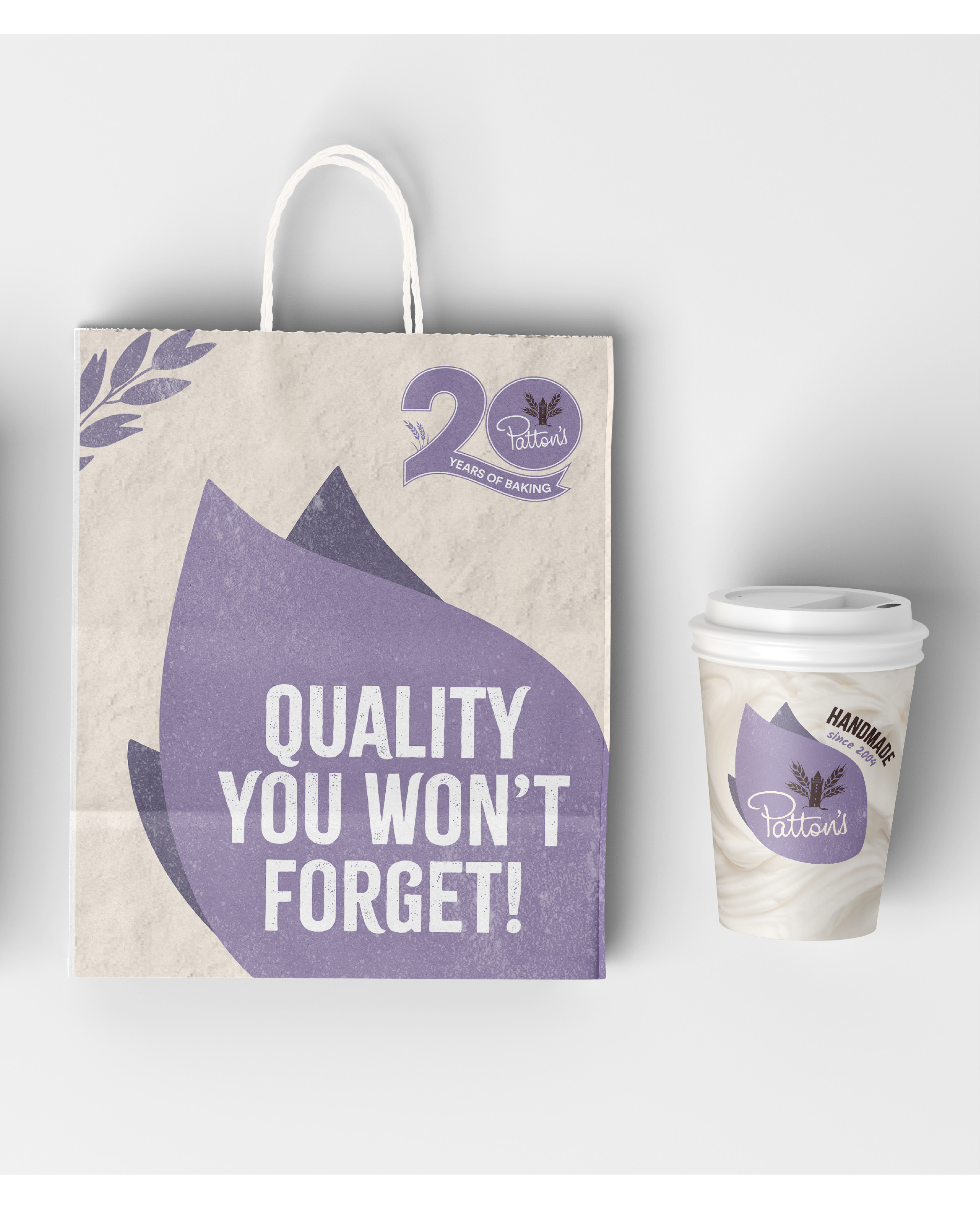
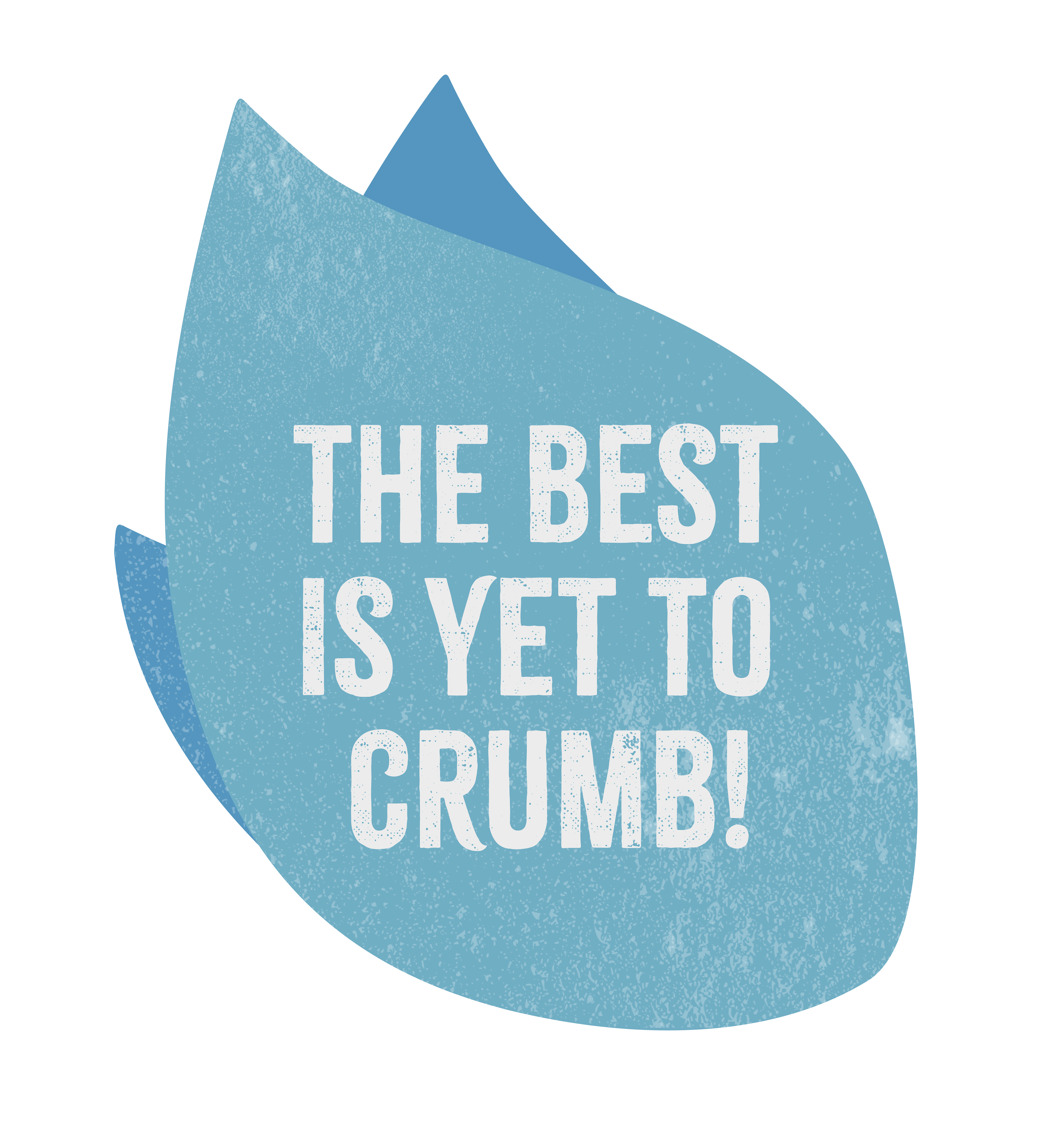
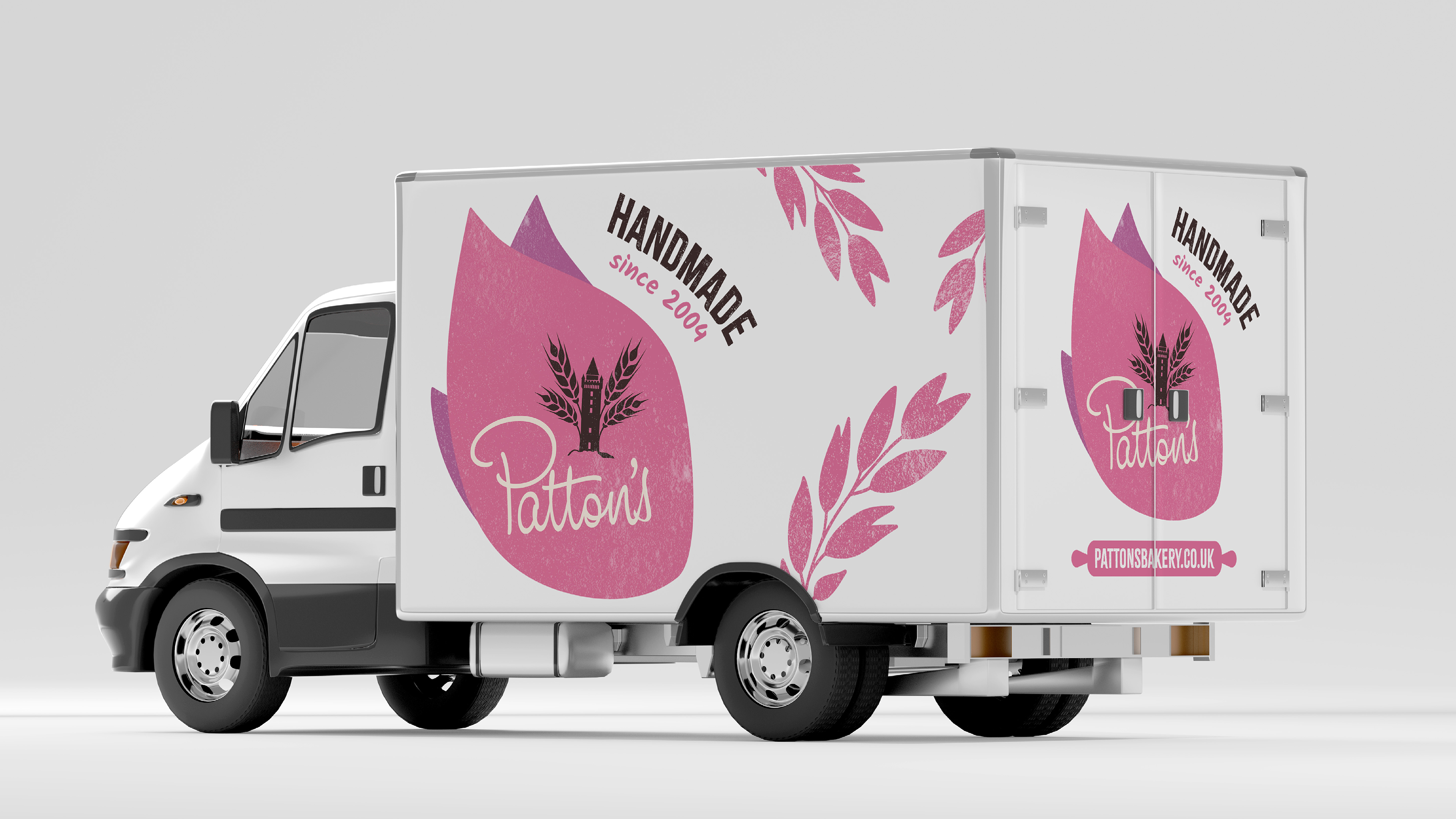
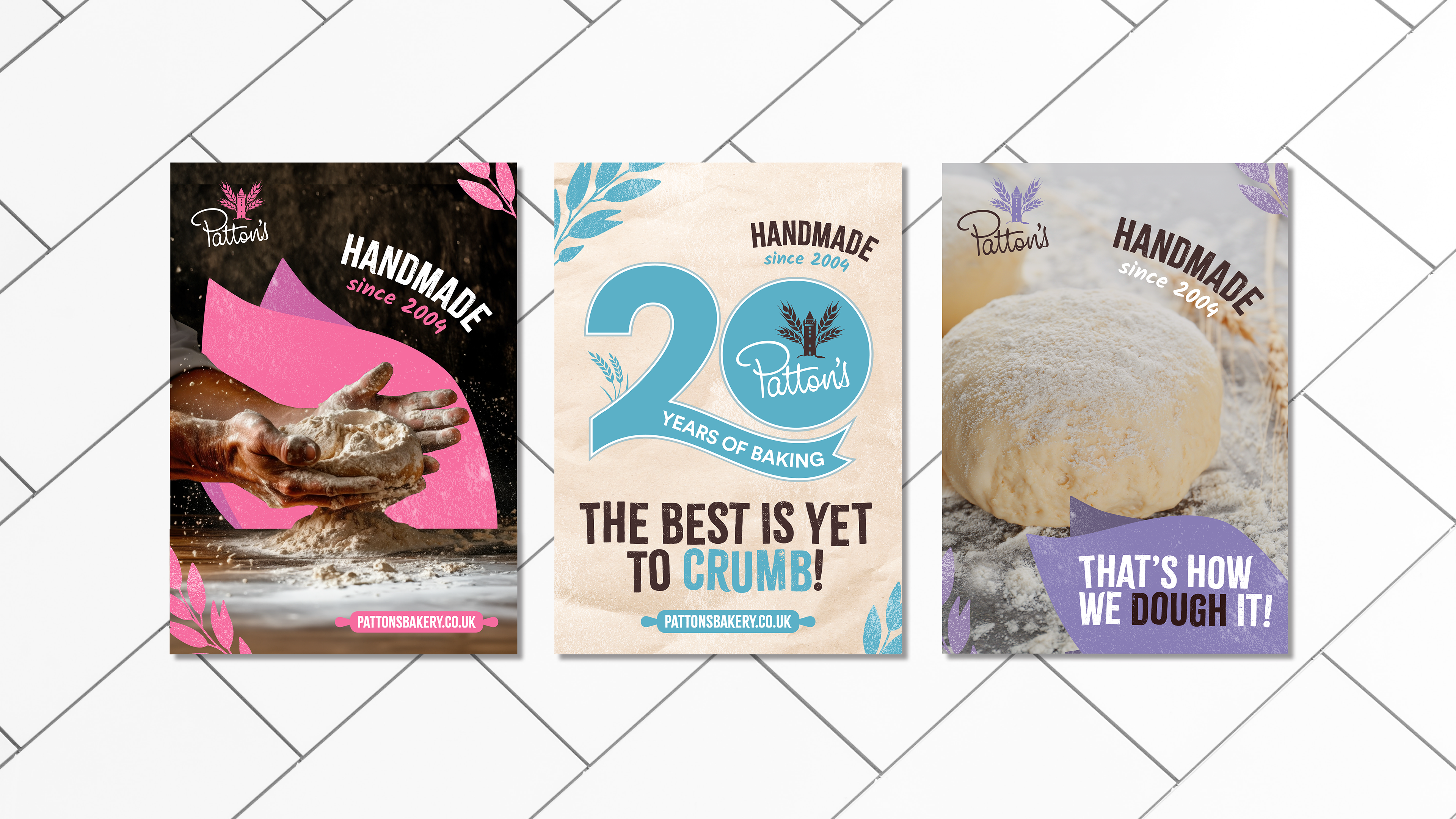
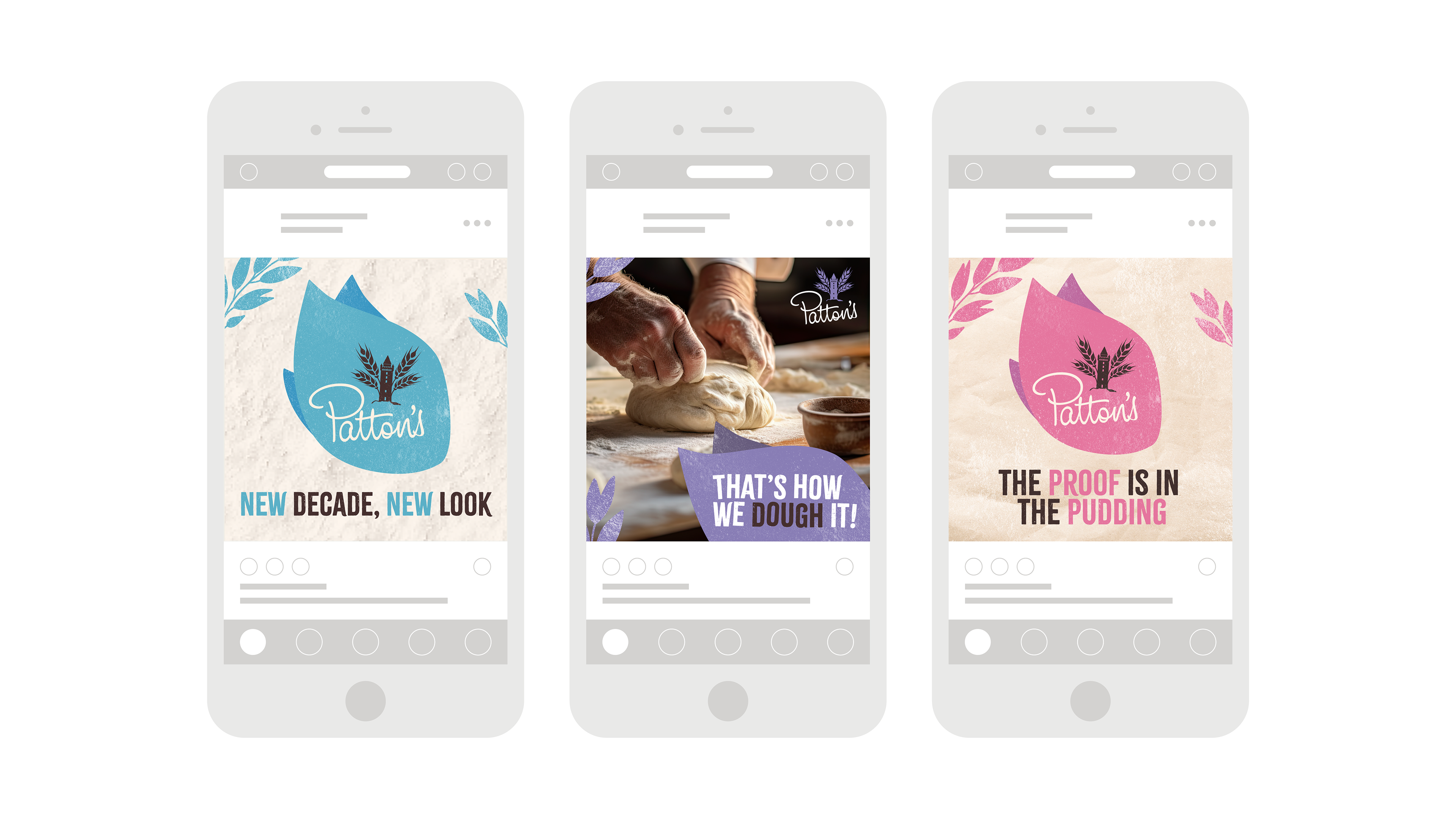
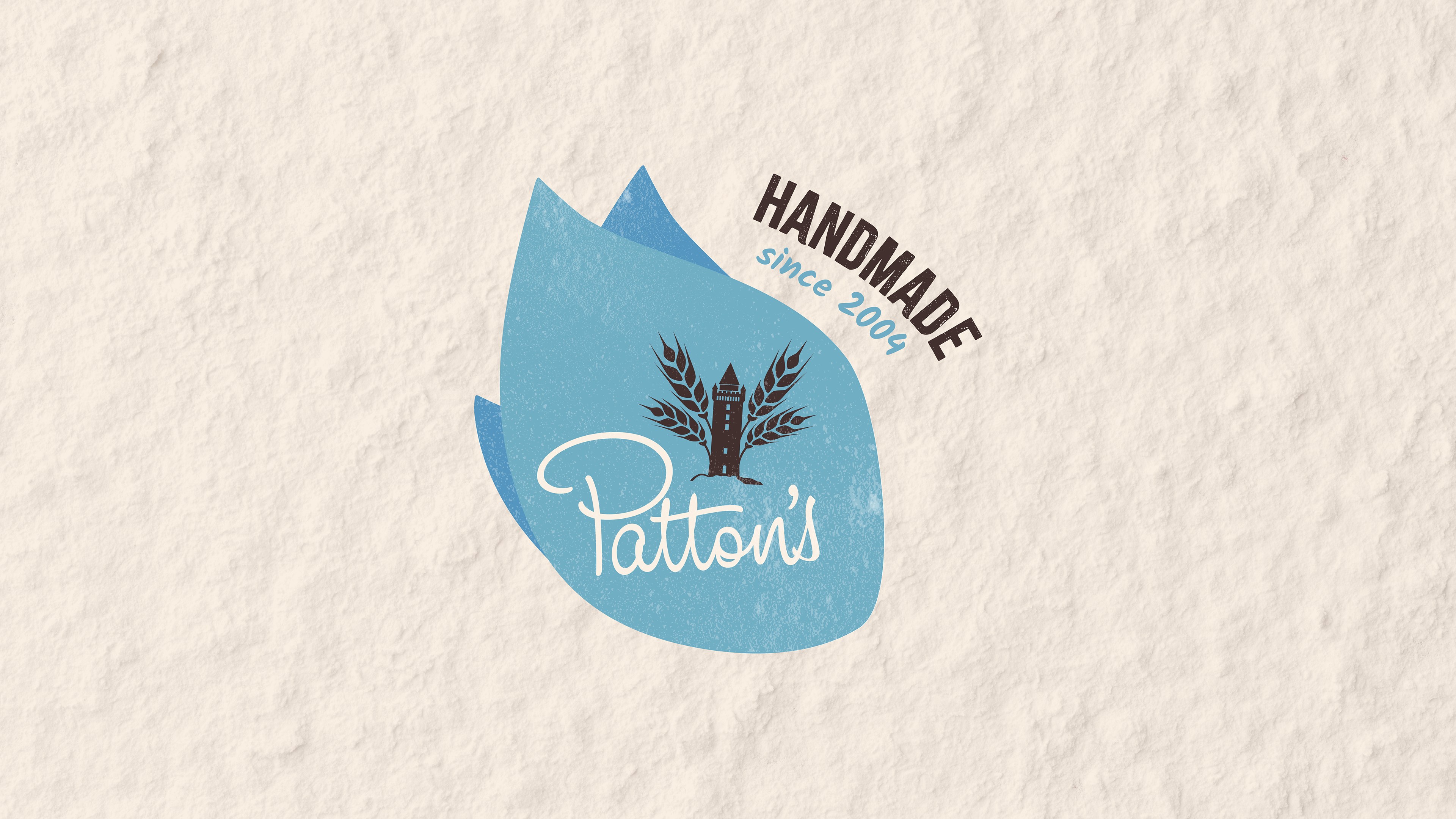
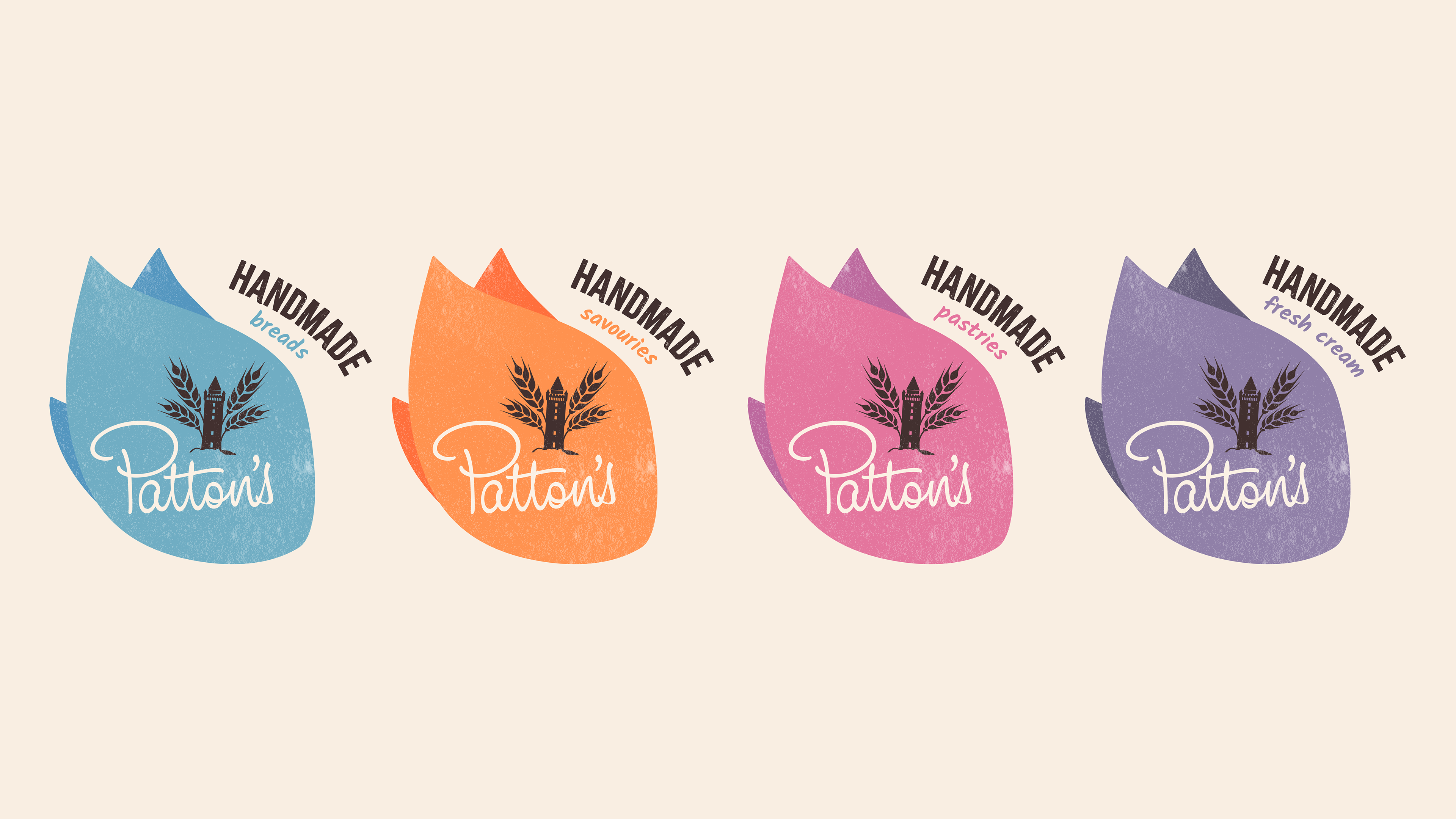
While the main Patton's logo was to remain the same, I experimented with new ways in which to house it. By taking a portion of the wheat shape from the original brandmark, I was able to create a graphic shape that could be used to house imagery and text, or to frame information like the strapline.
Updated Labels
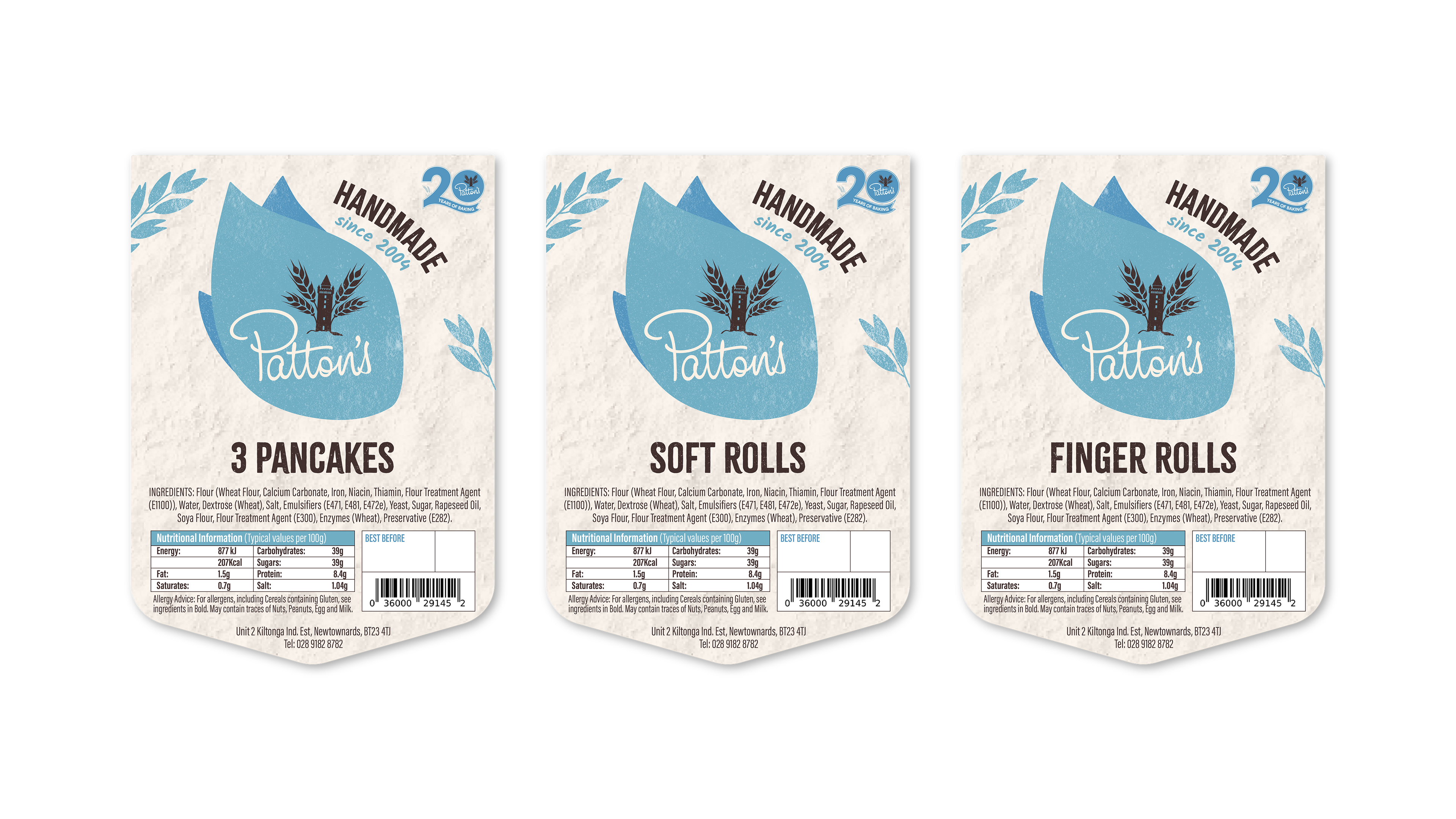
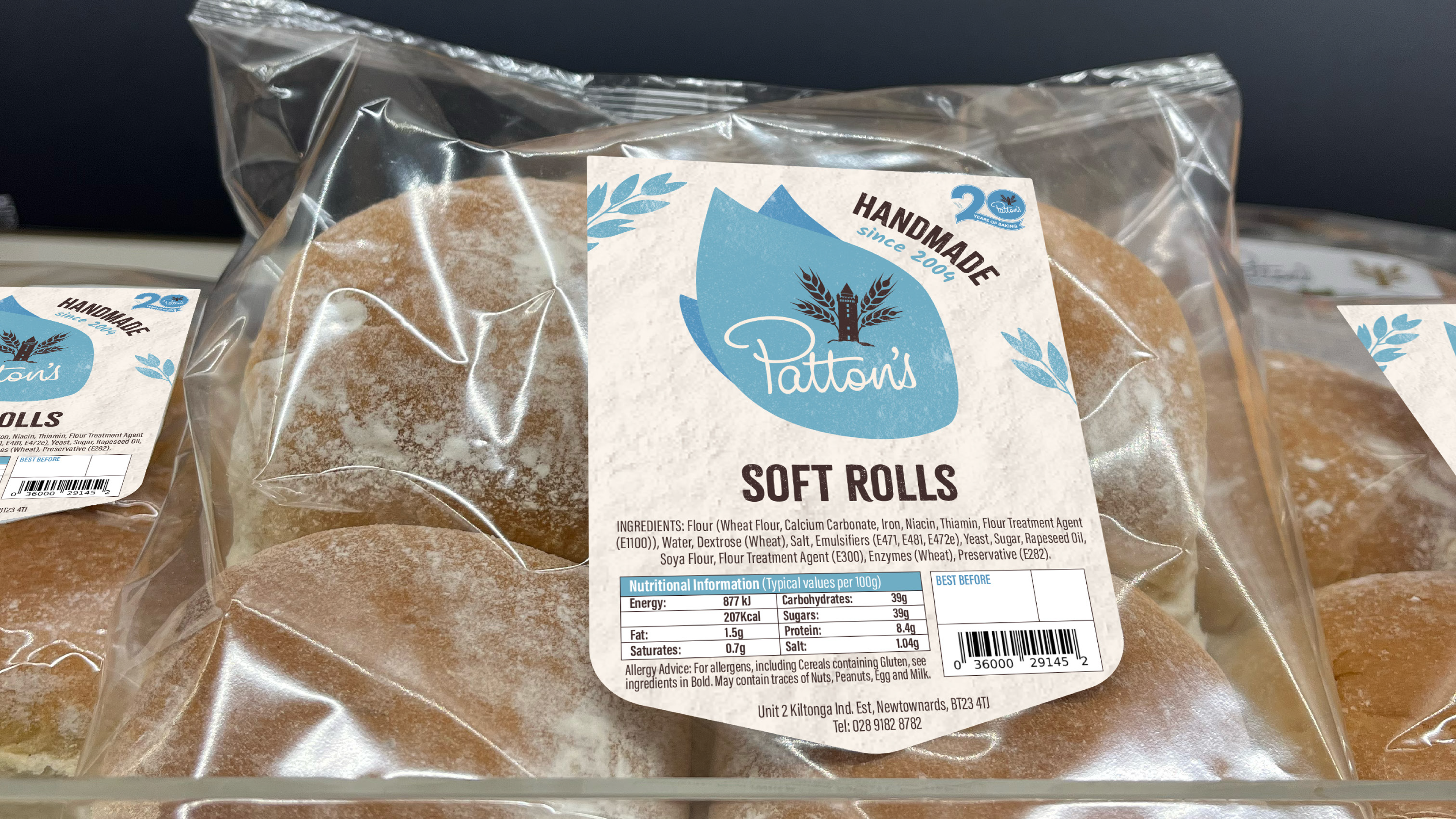
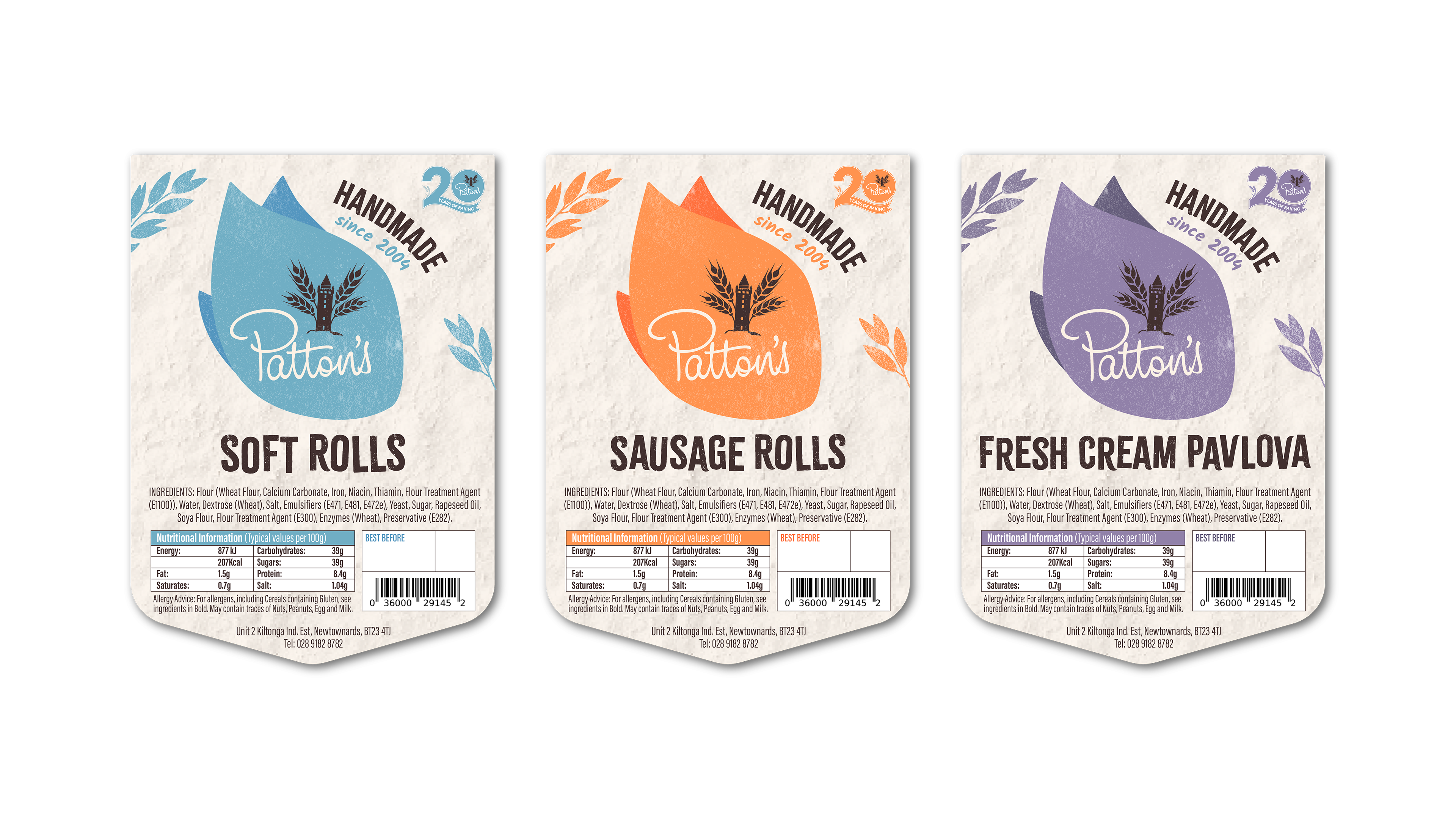
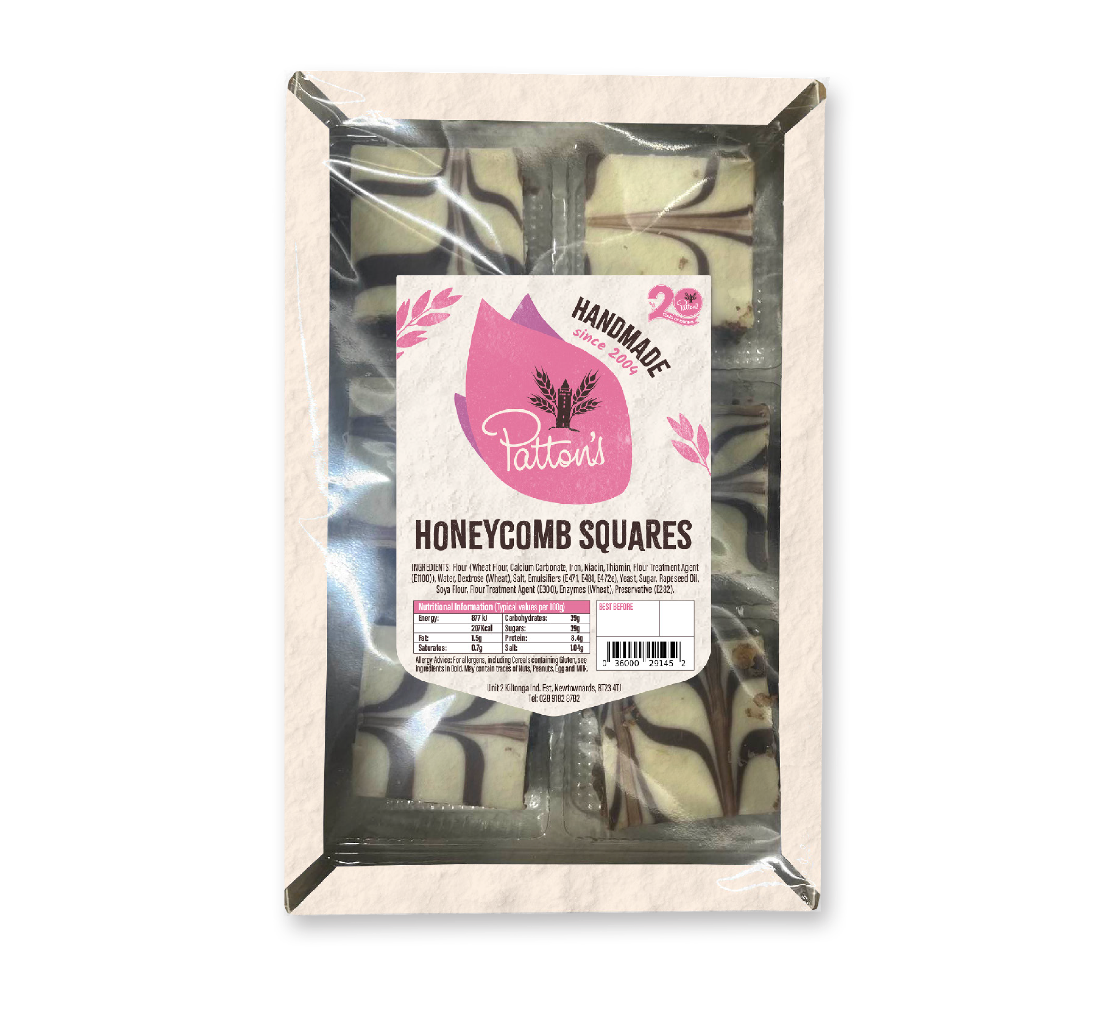
Patton's had an in-house label-maker, therefore it was important that I followed set guidelines on how the new labels could be presented. As all of the labels had been one colour in the past, we were unsure whether the full palette could be used. When presenting this concept, I included a standardised version with the main Patton's blue, as well as a version that was colour-coded depending on the product (as shown below).
TOUCHPOINTS
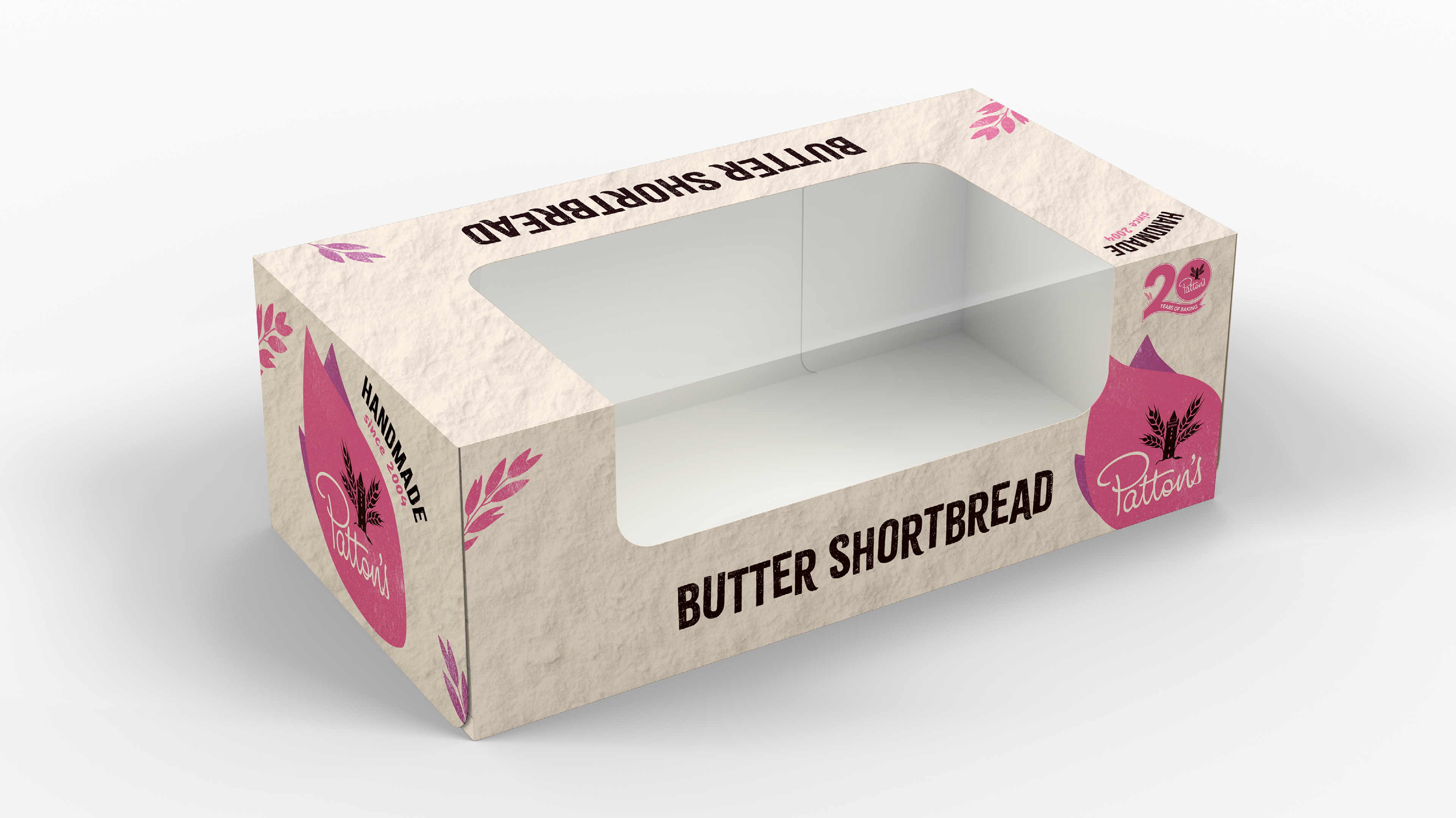
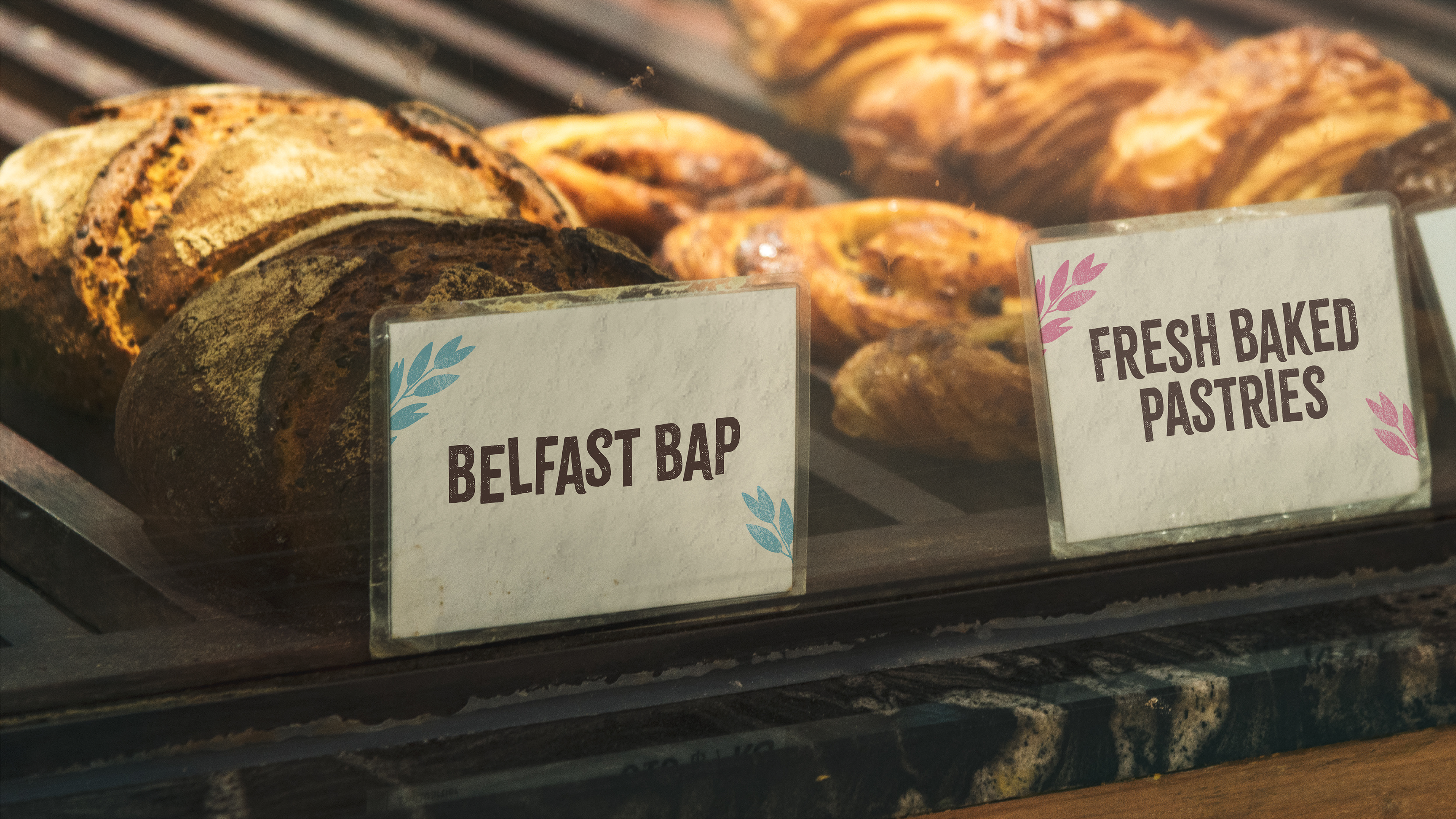
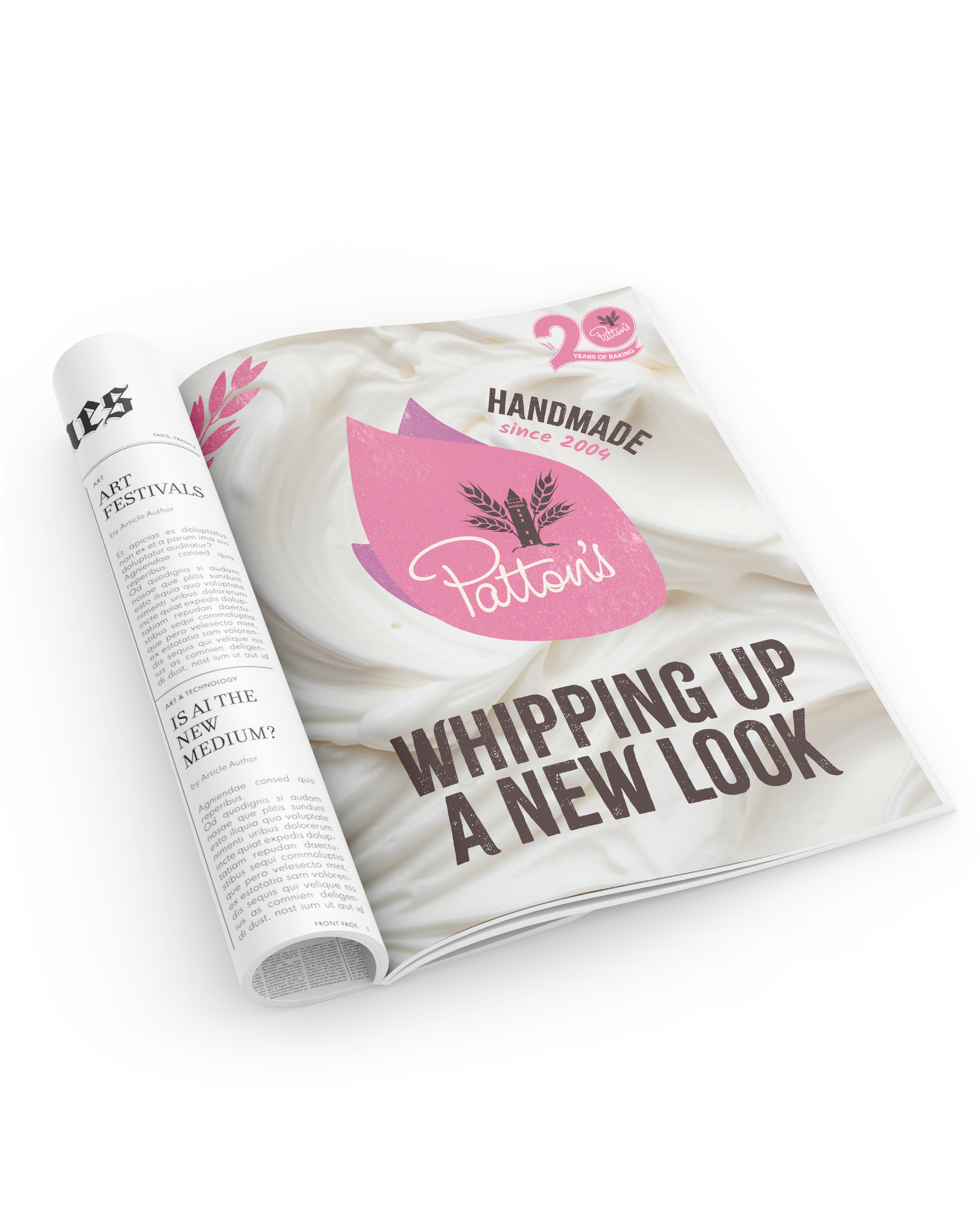
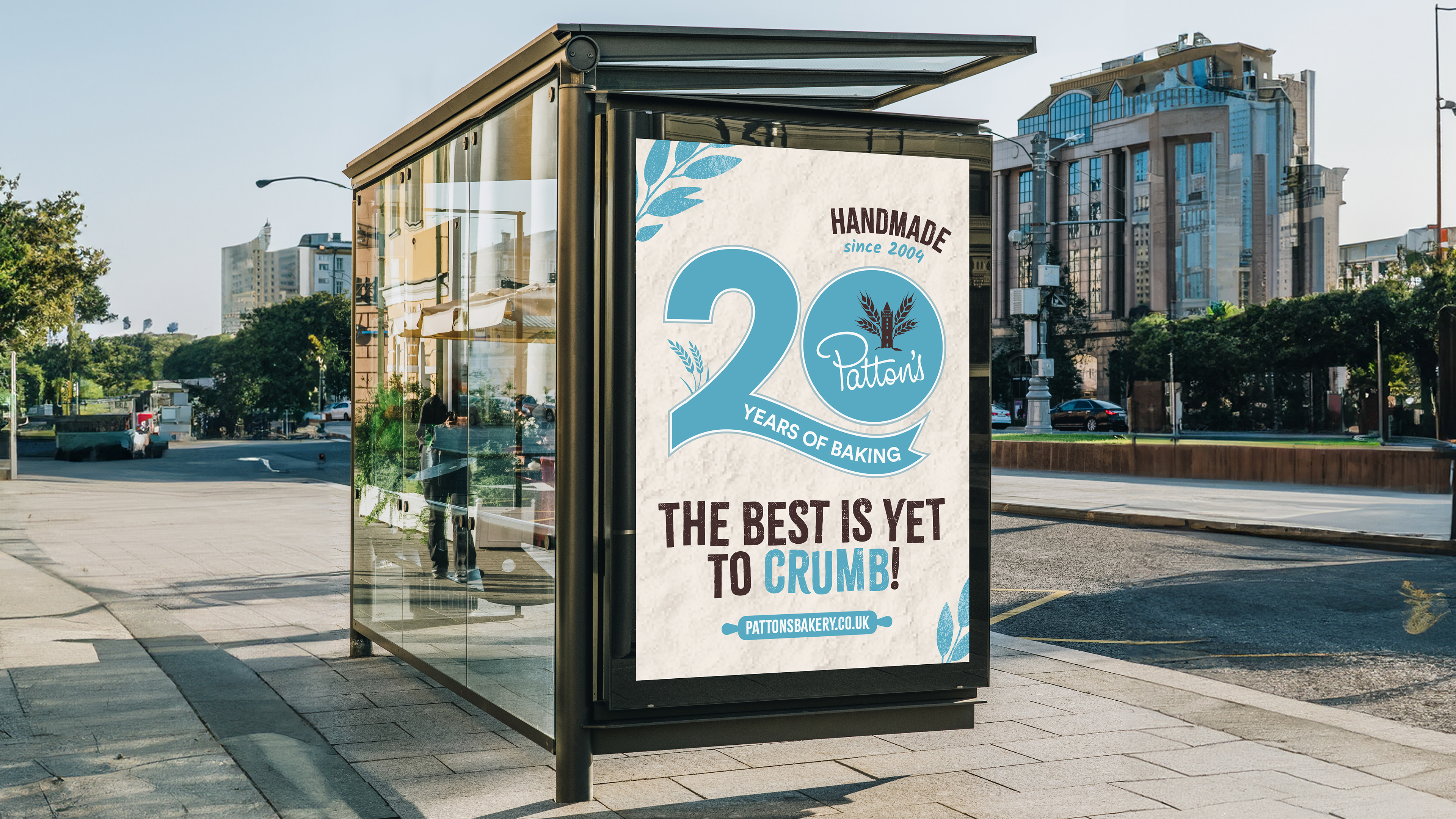
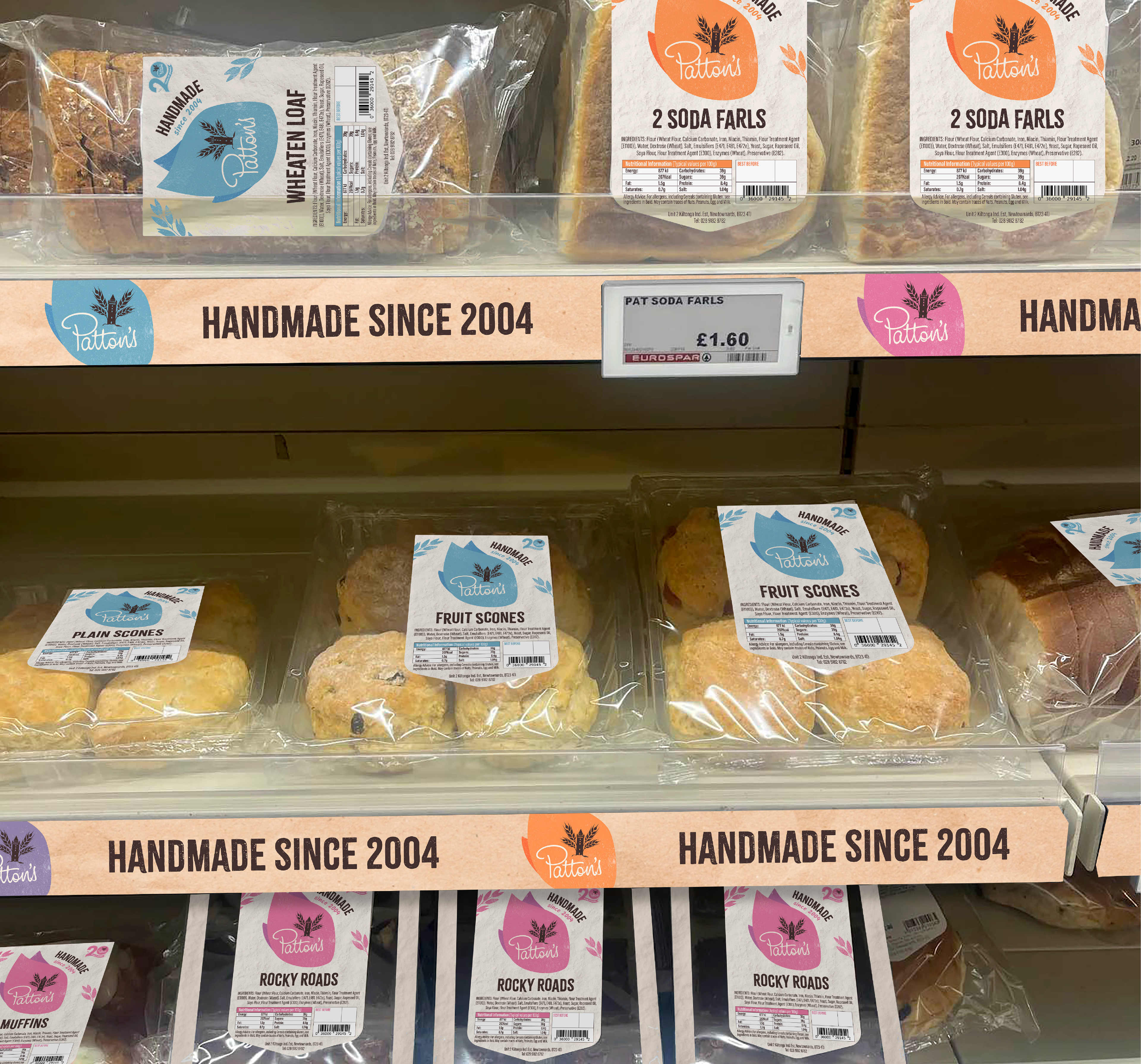
The new Patton's brand would mainly be showcased on packaging and in-store POS for the likes of Spar and Centra. There would also be graphics created for Patton's bakery/café in Donaghadee as well as across uniforms, signage and delivery vehicles. When presenting this concept, I also showcased potential OOH and social media ideas. Through this I was able to have fun with the brand language, primarily through baking puns.