a new chapter for A BELFAST INSTITUTION
THE BRIEF
Union Street wished to revive their brand in a way that was punchy and vibrant as well as cohesive across various touchpoints. The refresh was to coincide with their current refurbishments. As a starting point, they provided moodboards created by their interior design to give an idea of what the overall style would be. The visuals were to be a marriage of art deco glamour and renaissance art. To stay true to the Union Street brand, touch-and-cheek imagery and language was welcomed throughout.
Union Street also wished to pivot their offerings to more drag brunches and cabaret shows and, thus, they wanted the look to be fun and flamboyant with a touch of class.
THE PROCESS
For my branding concept, I wanted to focus on the Art Deco themes from the interiors but add a contemporary twist. I started by looking for more specific inspiration before revisiting the interior moodboards and seeing what could be worked with.
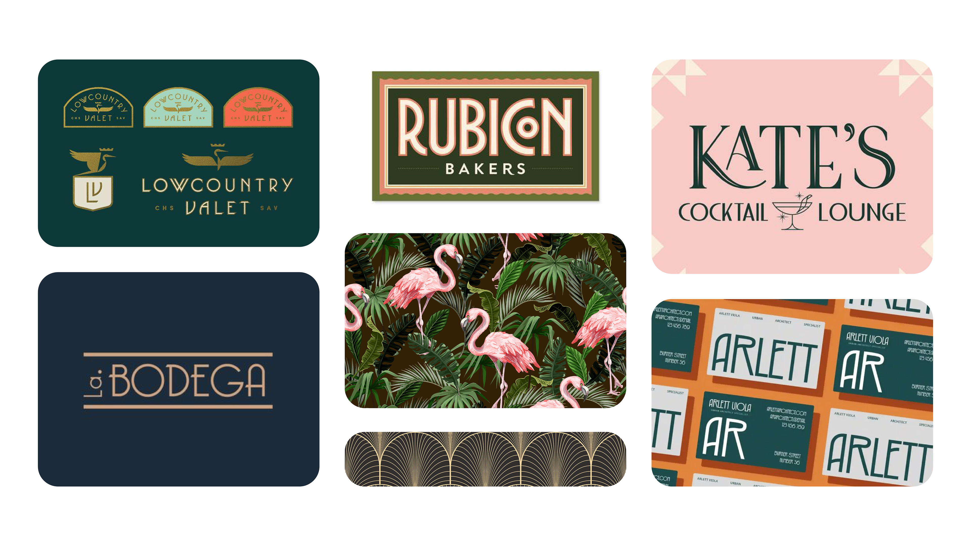
Some of the main sources of INSPIRATION FOR THE Union Street rebrand. tHE GOAL WAS REFERENCE ART DECO FOUNDATIONS BUT ADD A CONTEMPORARY TWIST TO MAKE THE BRAND GLAMOROUS YET PUNCHY.
Style Updates
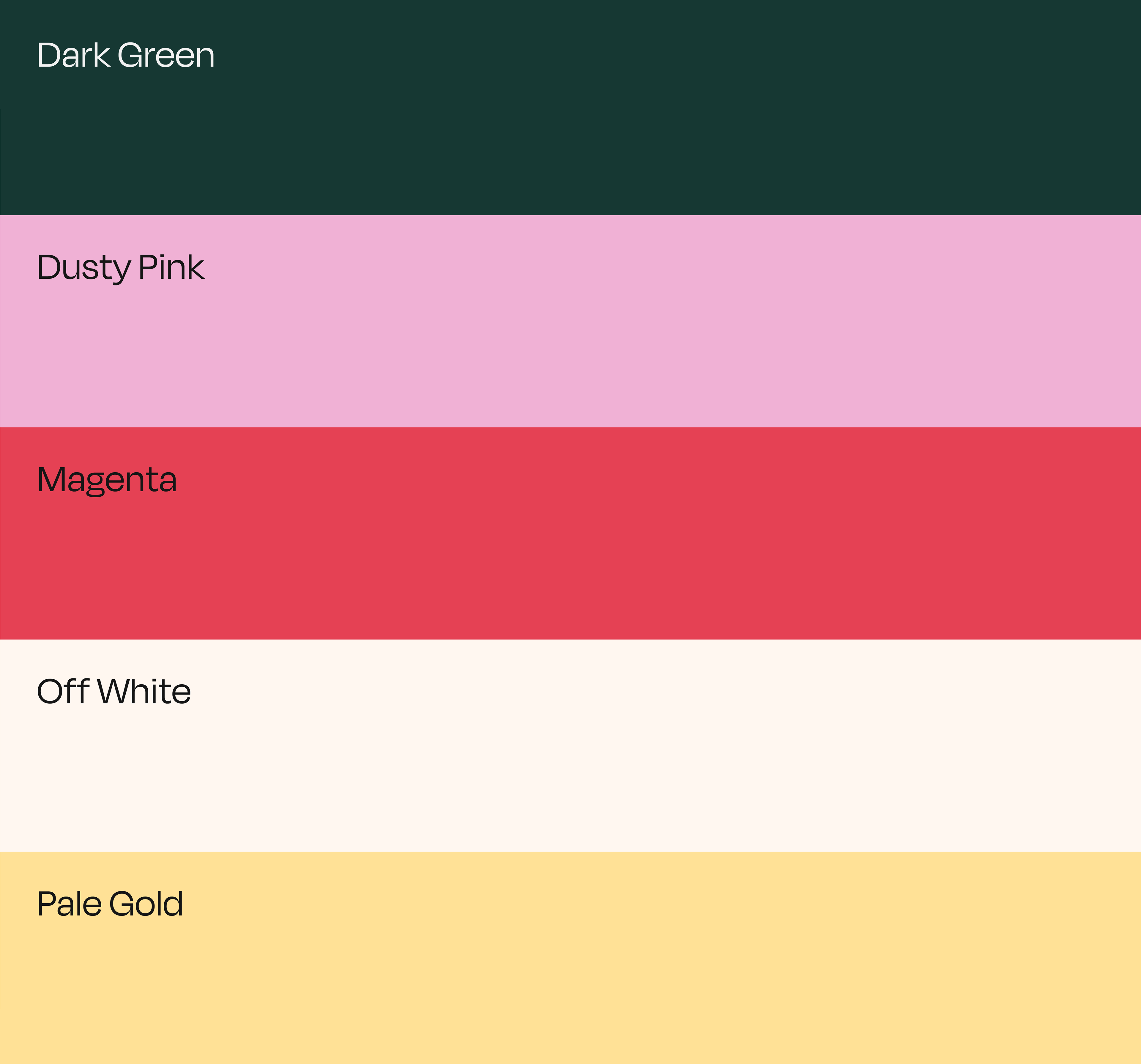
For the interiors, we were told that the palette would primarily be pink, green and gold though we were welcome to experiment with different variations of these colours. To bring a more striking appearance, I went for strong hues such as dark green and magenta and contrasted them with pastel pinks and yellows as well as off-white.
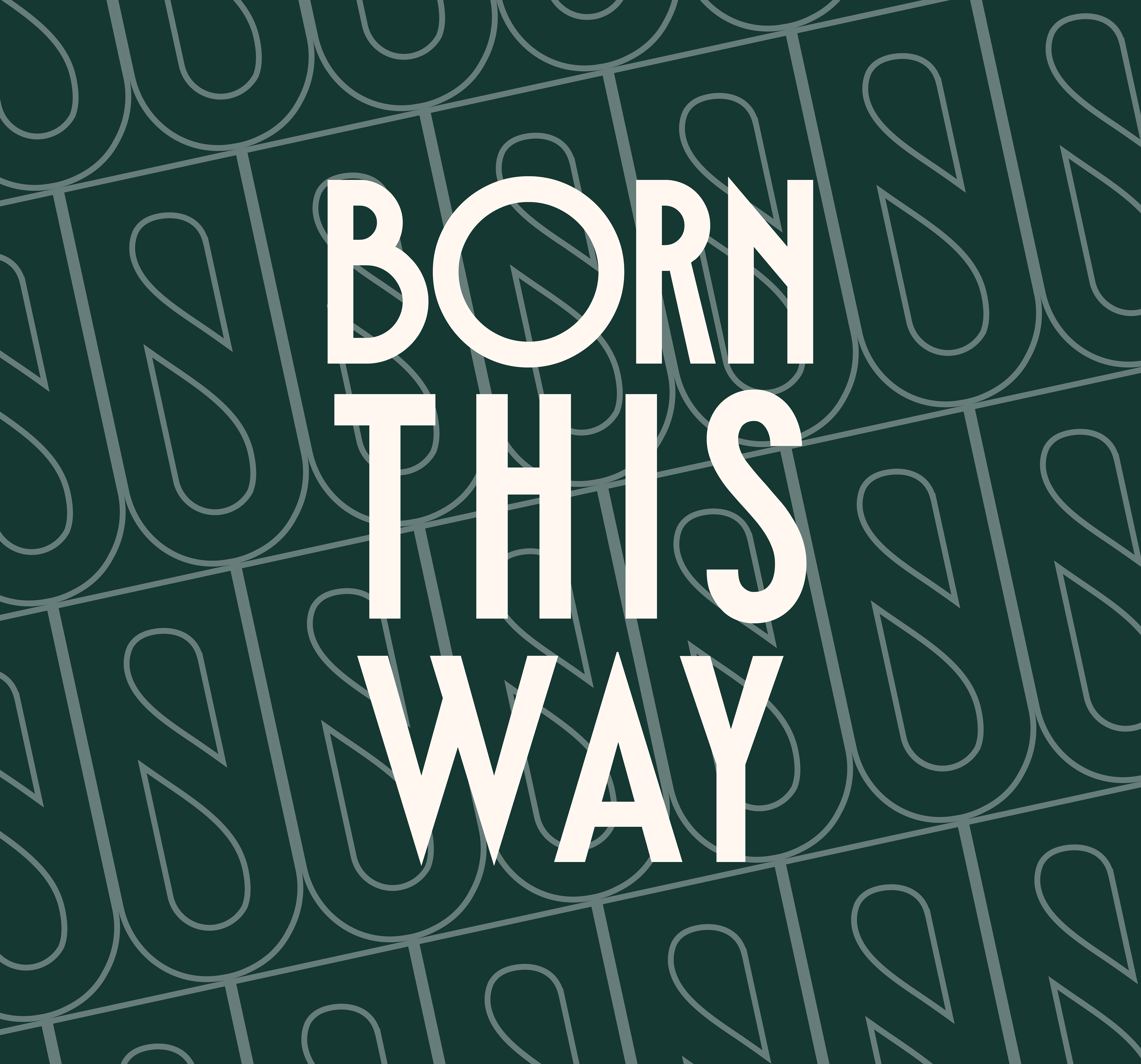
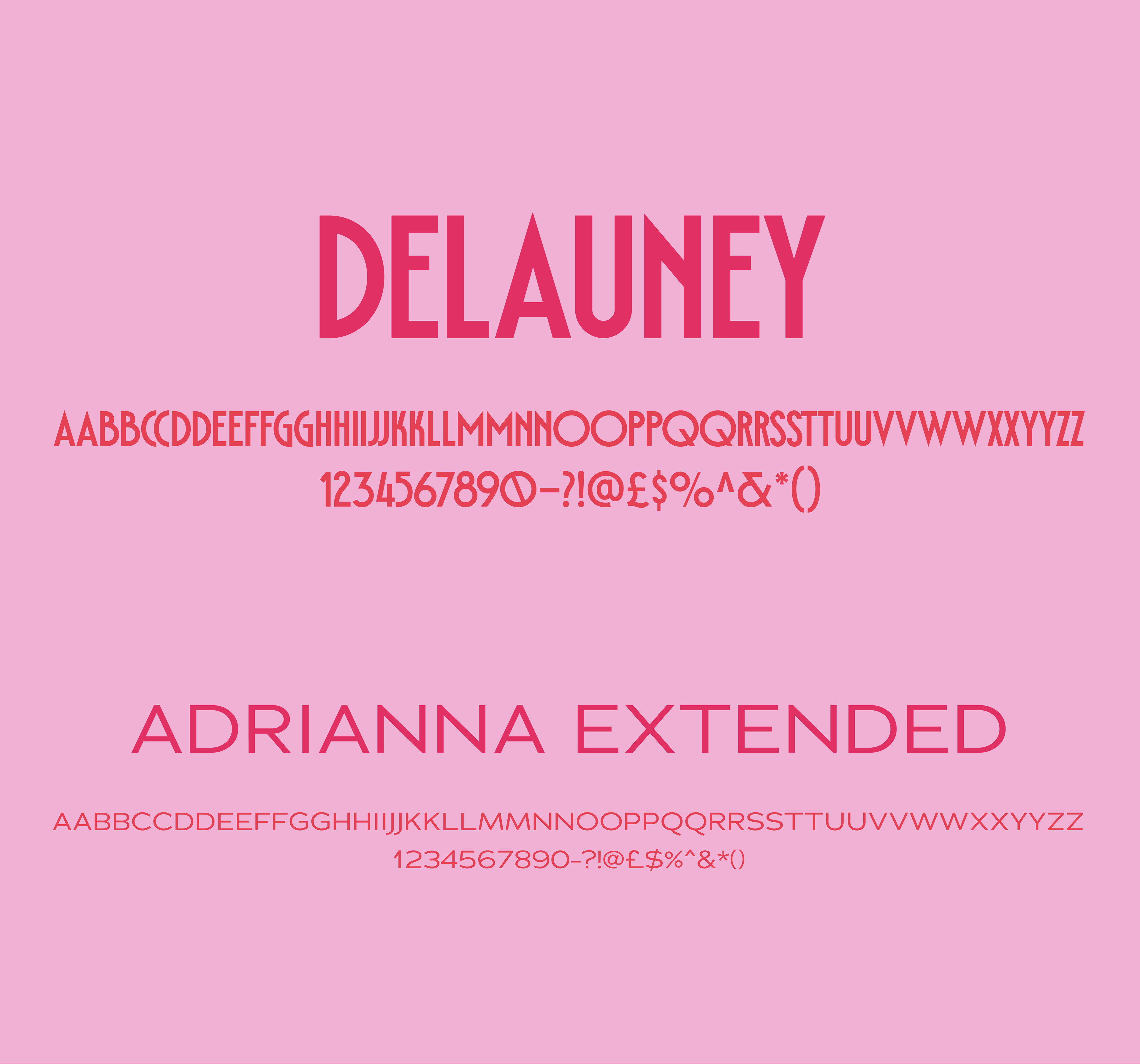
In terms of typography, I chose Delauney for it's Art Deco structure. It was also had a bold and modern appearence that lent well to the new Union Street style. As a secondary typeface, Adrianna Extended provided a nice contrast due to it's wider, more simplistic form.
THE UNION STREET BRANDMARK
When discussing the brand ethos, Union Street wanted to reinforce a sense of unity/togetherness. This was to be a safe space for people to have fun without fear of prejudice.
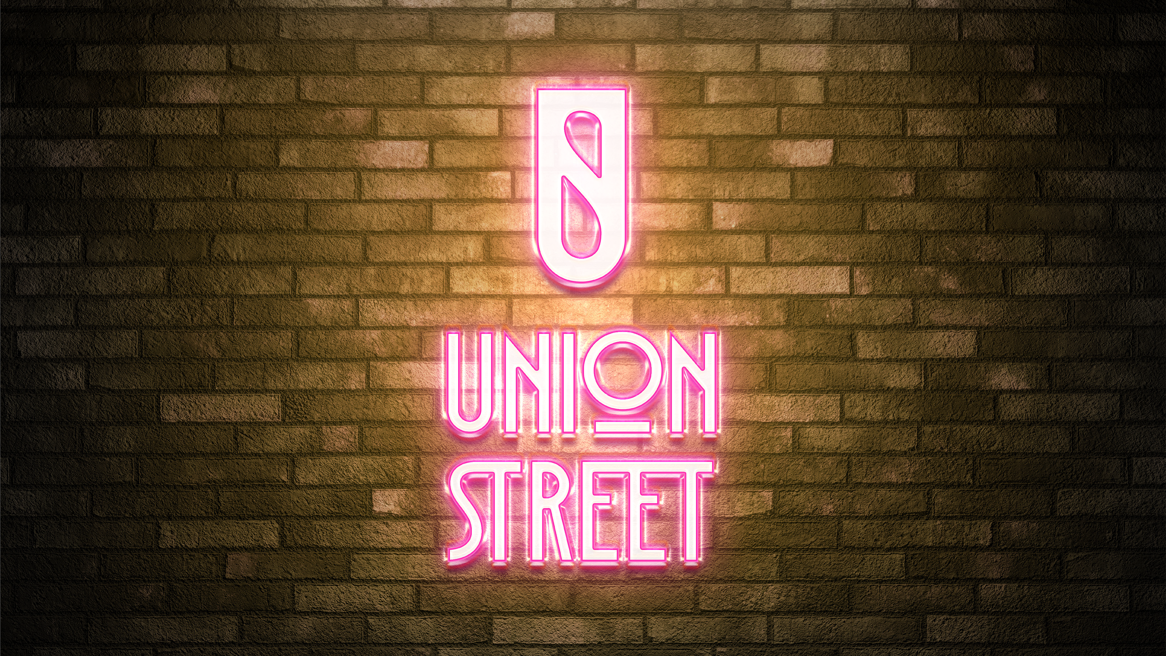
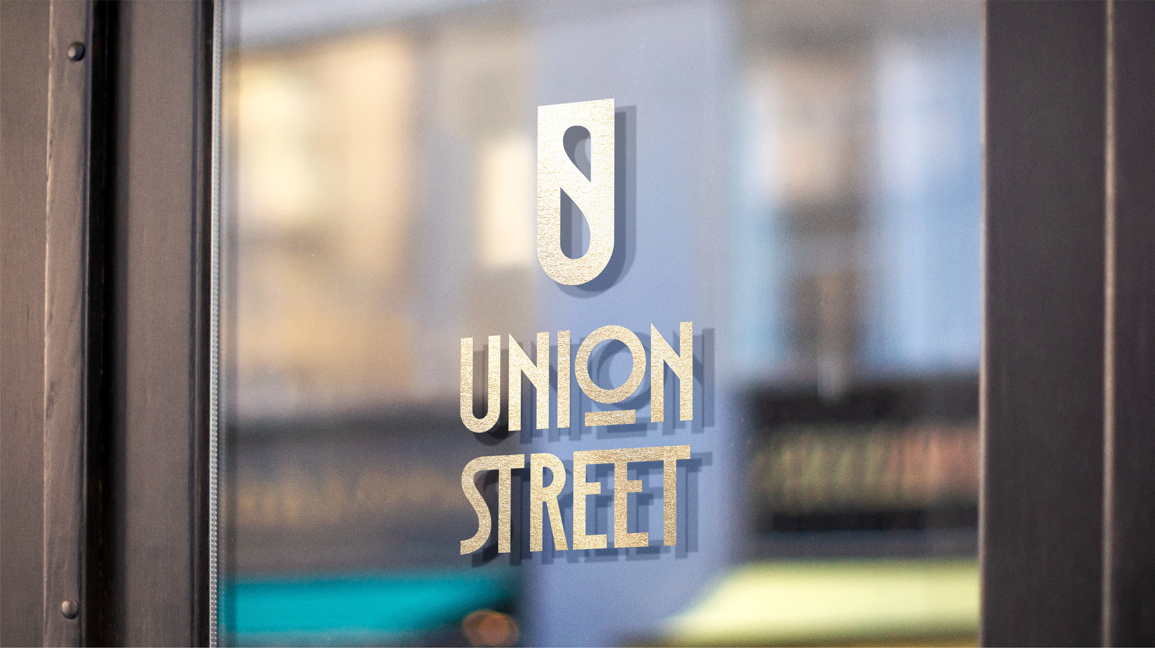
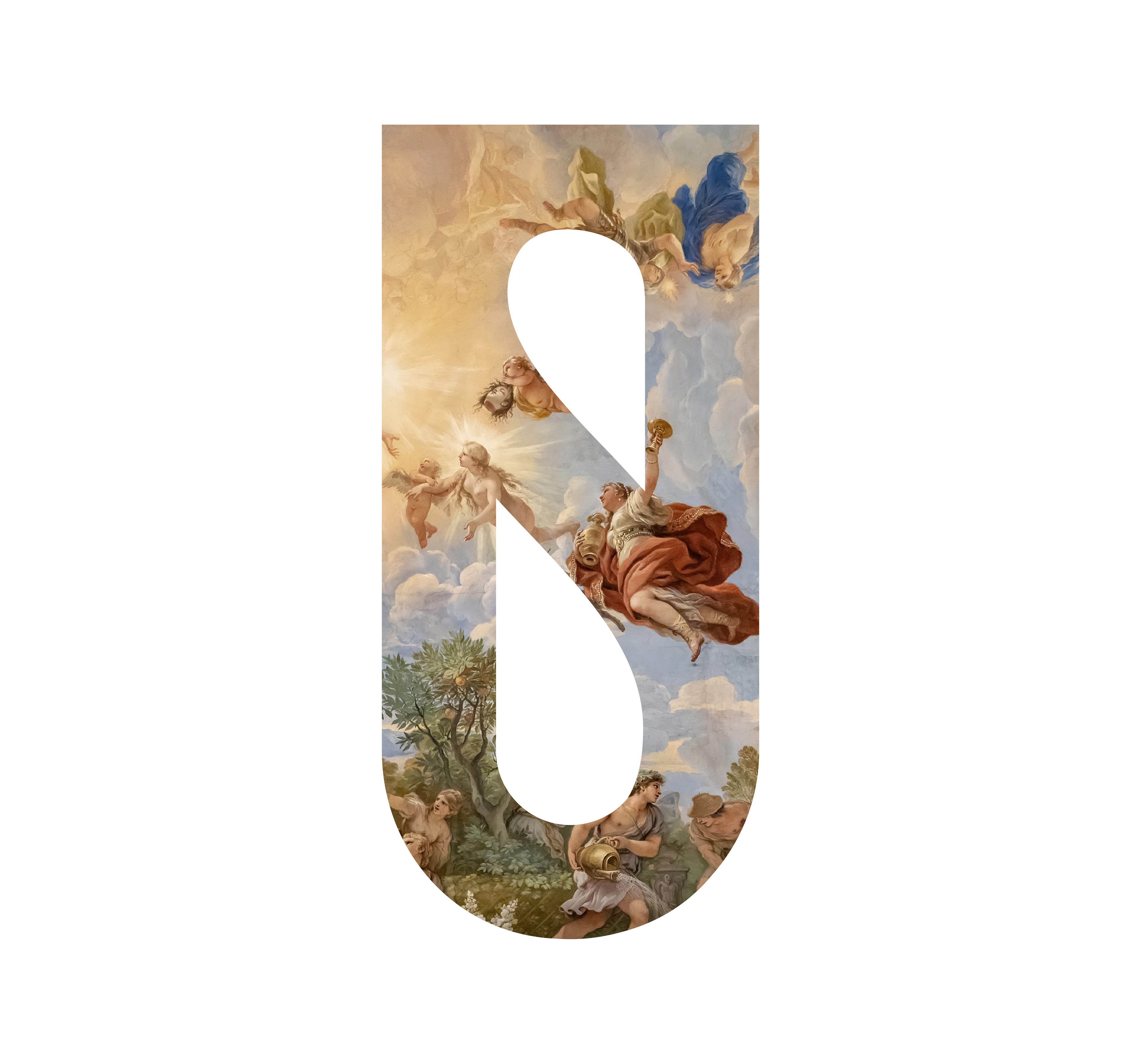
To convey this, I took the U and S from the primary typeface and combined them to create a distinct brandmark that could be utilised on it's own or through devices such as image framing or pattern.
THE UNION STREET LOGO
The lettering for the Union Street logo takes the same primary typeface, though I have customised it so that the letters join together at points, this is to further reinforce the idea of unity.
Naming throughout the venue
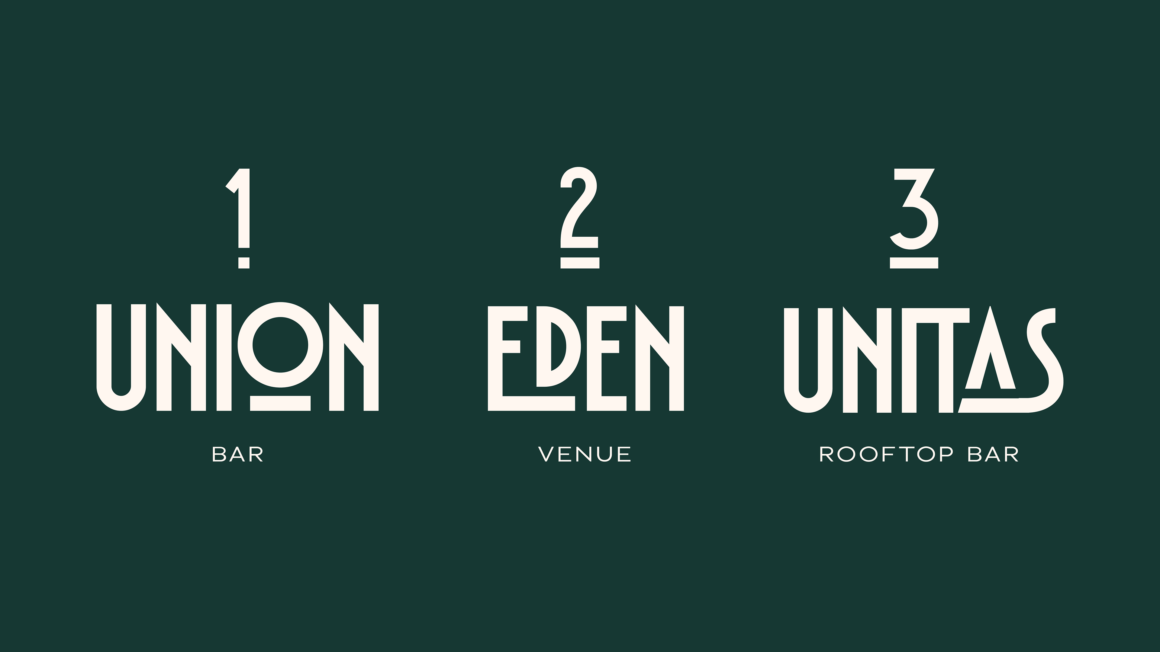
The new Union Street venue would consist of three floors: the ground floor/main bar, the upstairs lounge and the rooftop bar. Union Street had different themes in mind for each floor which informed the names I chose.
Union Bar: The main social hub for the venue. This would be where a majority of the performances would be held and would be home to their main stage. I went for 'Union', as it would be the beating heart of Union Street and I wanted people to reference the bar without confusion.
Eden Venue: The upstairs lounge was to have a secret garden theme, with ornate botanical fixtures and ambient lighting. Thus, I felt that 'Eden' would be an appropriate name, as reference to the Garden of Eden.
Unitas Rooftop Bar: The rooftop bar would primarily be used for private events, with the potential for weddings. Therefore, I thought it was best to convey the theme of togetherness through the latin term for unity - 'Unitas'.
TOUCHPOINTS
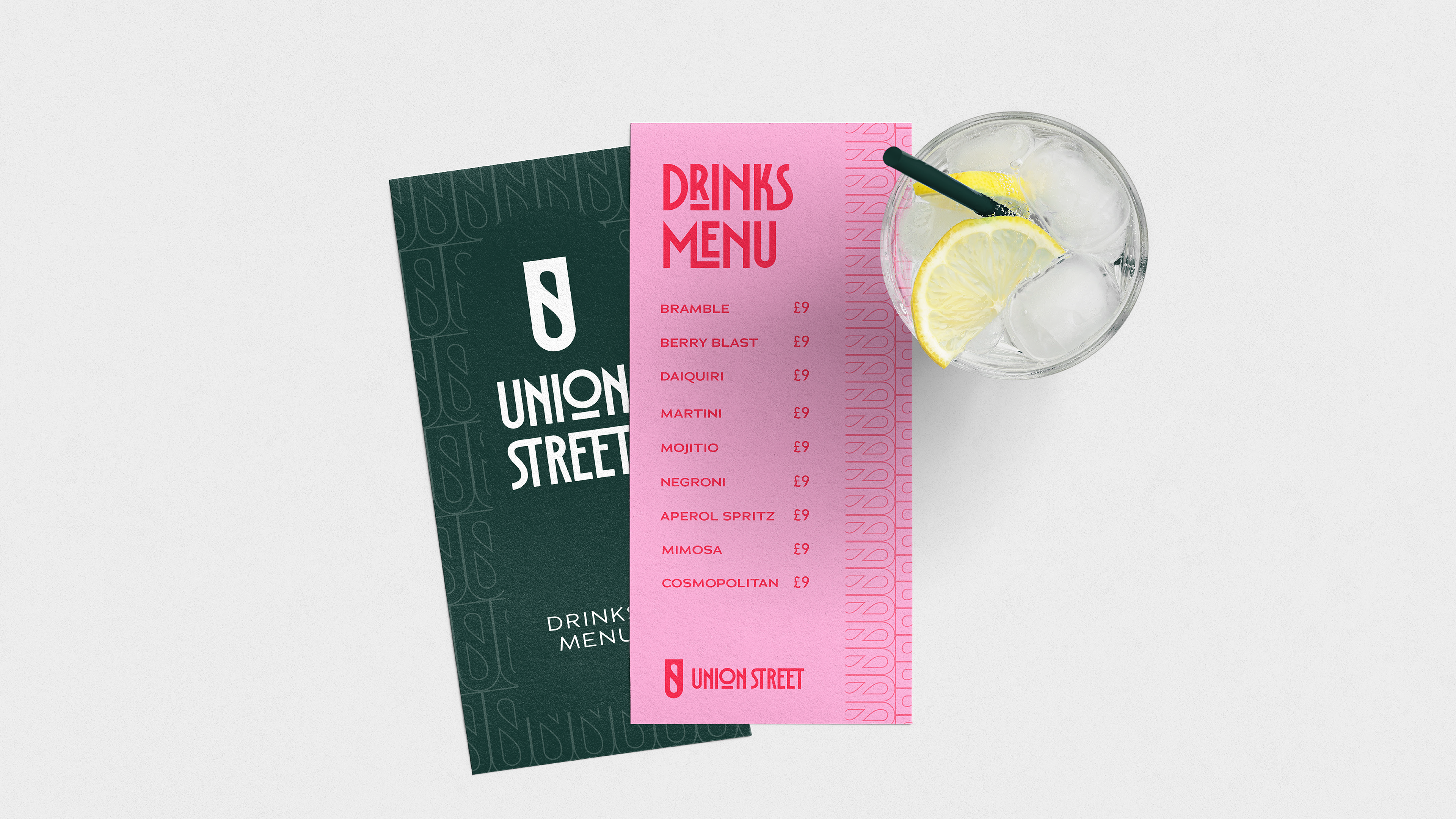
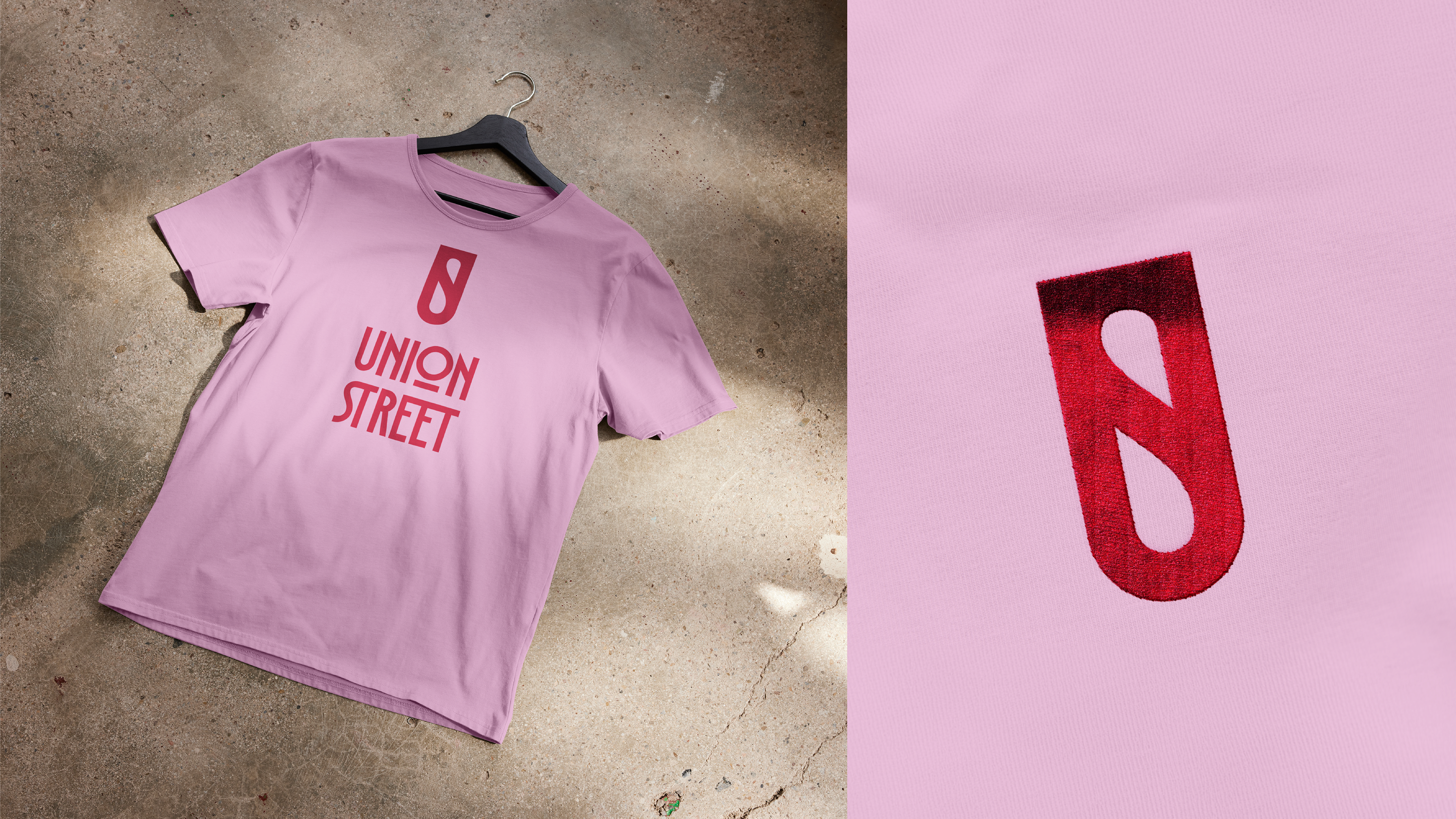
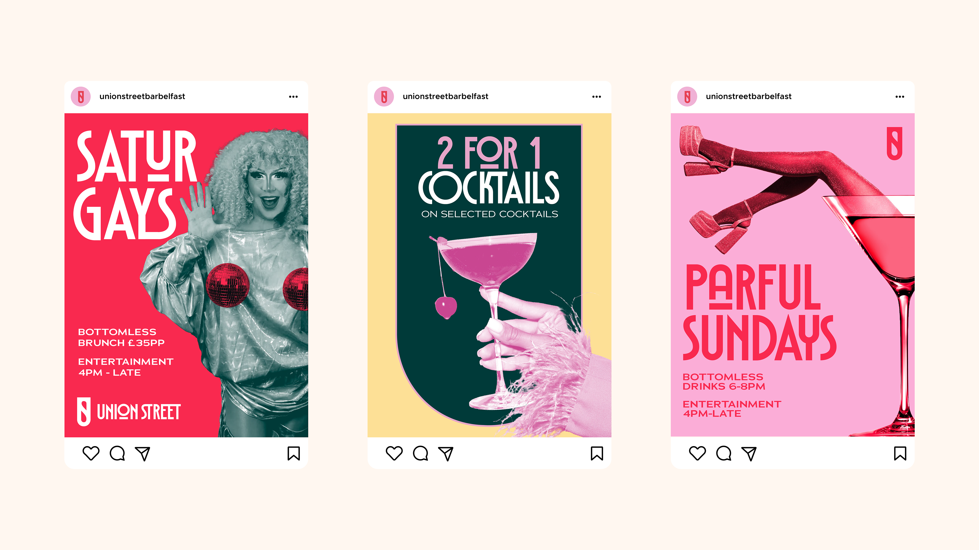
The brand would be applied through a variety of print and digital touchpoints. Signage, uniforms, menus and wallpapers were to be considered, as well as social media templates and digital ads.