REVIVING A DUNGANNON HUB.
THE BRIEF
After acquiring Hagan's Bar in Dungannon, Oakleaf Contracts wished to refresh the brand as a way of marking a new chapter and aligning Oakleaf's vision for the venue's future.
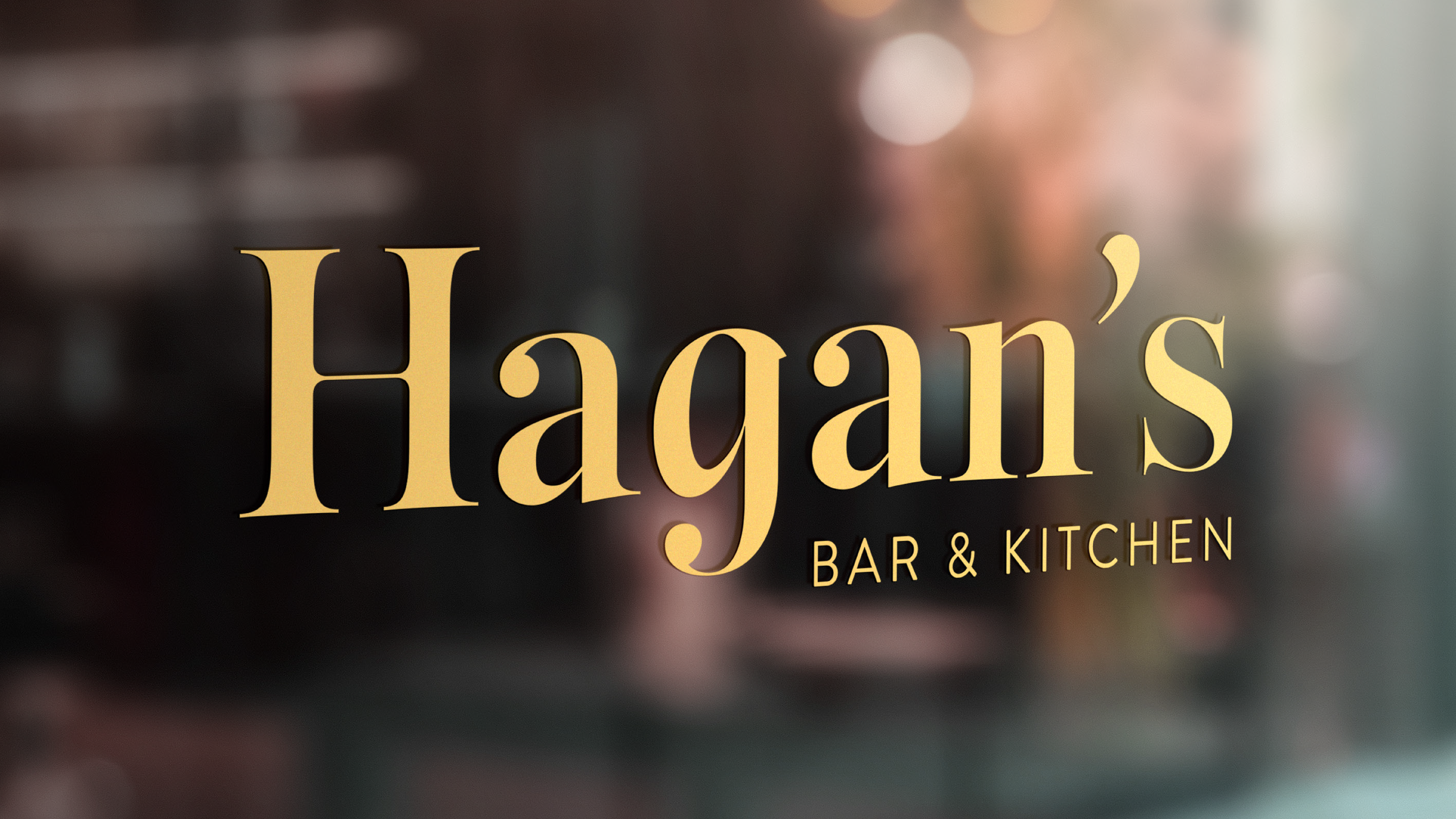
Given Hagans Bar’s established reputation in Dungannon, the refresh was to retain the core name identity that locals recognise, while simplifying and modernising the brand elements. The goal was to reflect the bar’s evolution under new ownership, especially as it expanded its offerings to include a food operation and prepared for a venue refurbishment.
THE PROCESS
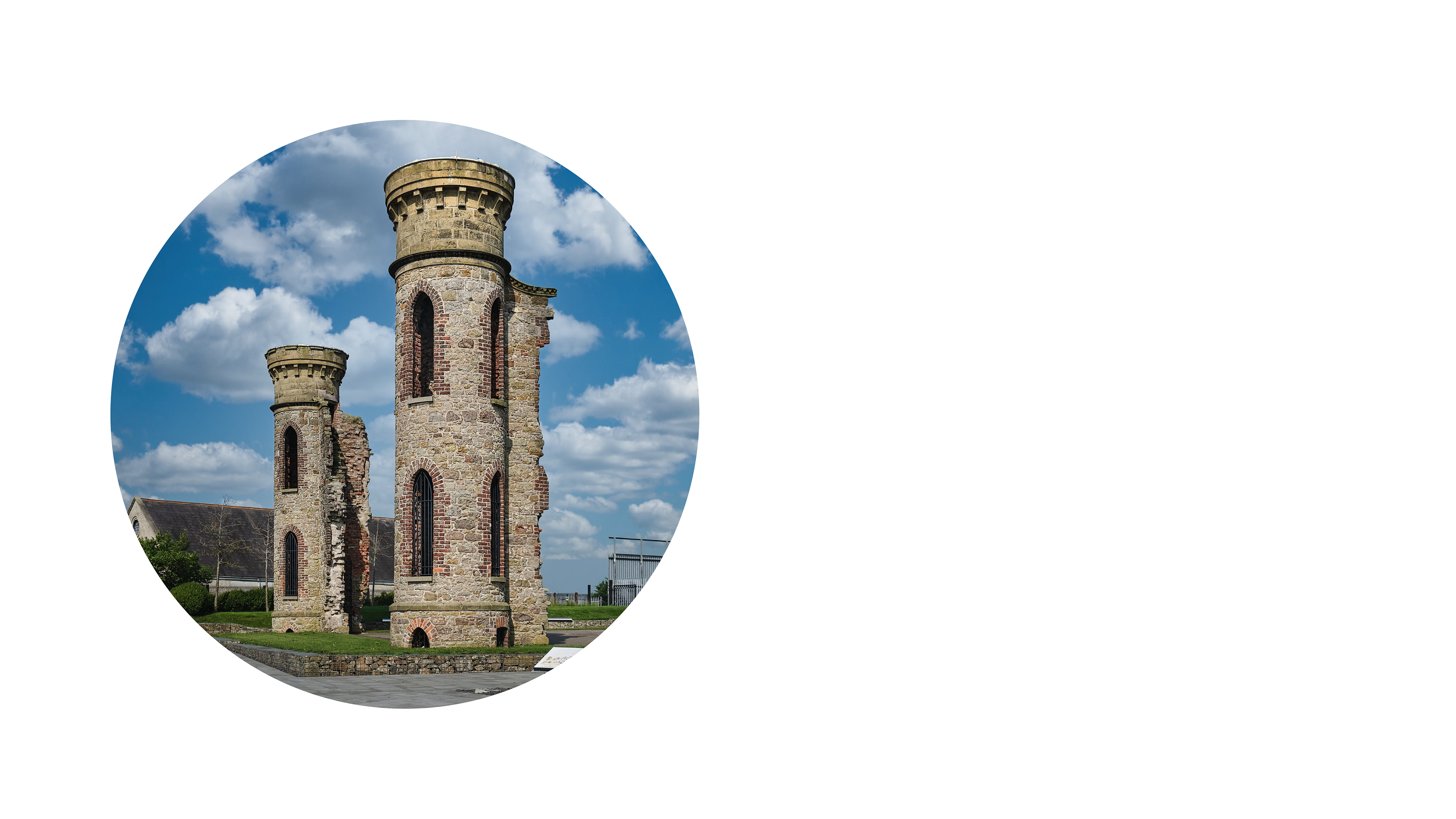
The new visuals were to focus more on the history and heritage of Dungannon in a way that catered to locals and tourists alike. I began by doing some research on Dungannon landmarks, and found myself intrigued by the Hill of O'Neill.
THE HAGAN'S BRANDMARK
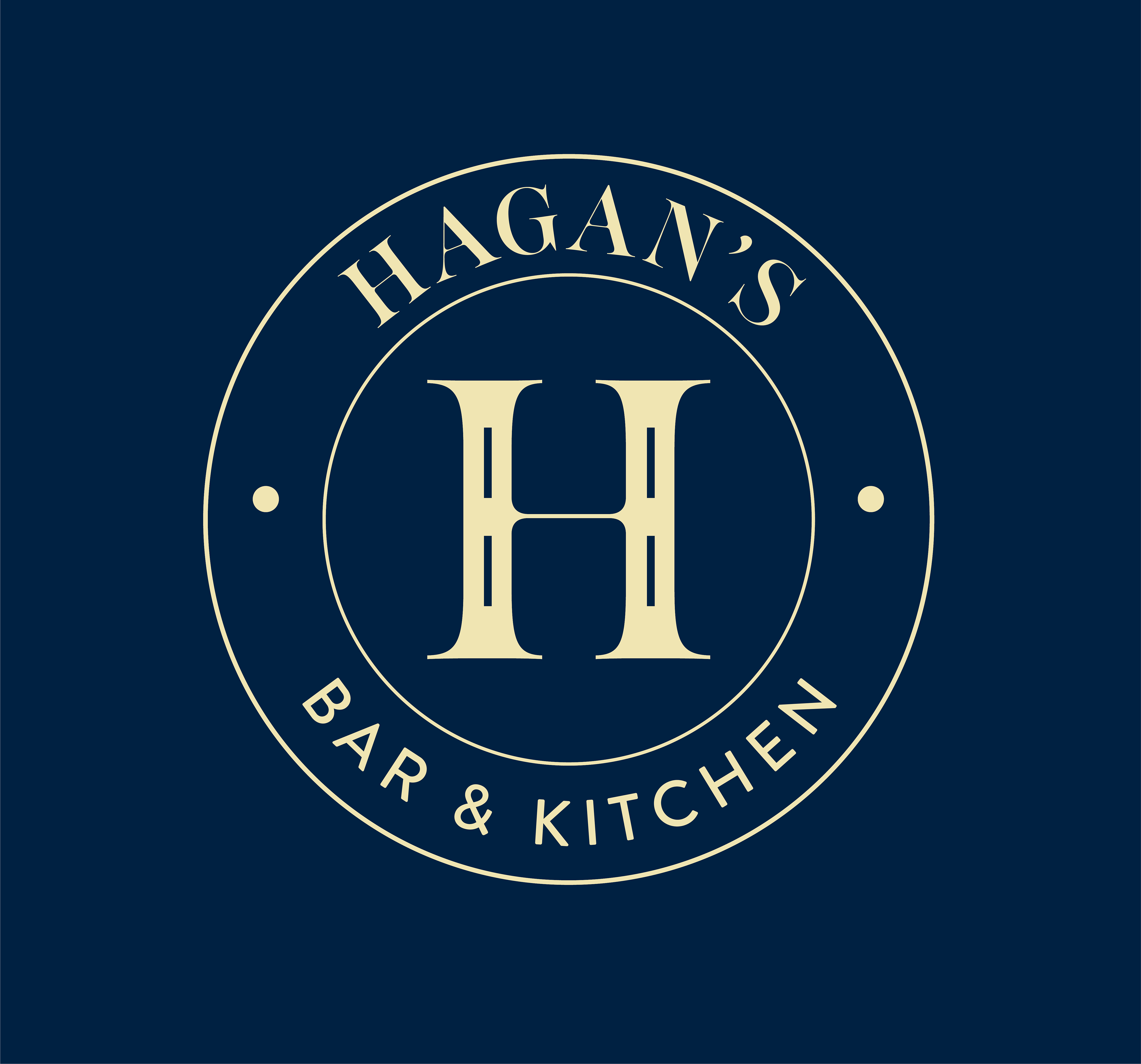
Taking the two tower shapes from this iconic landmark, I married them with the 'H' to create a logo that conveyed Dungannon's heritage.
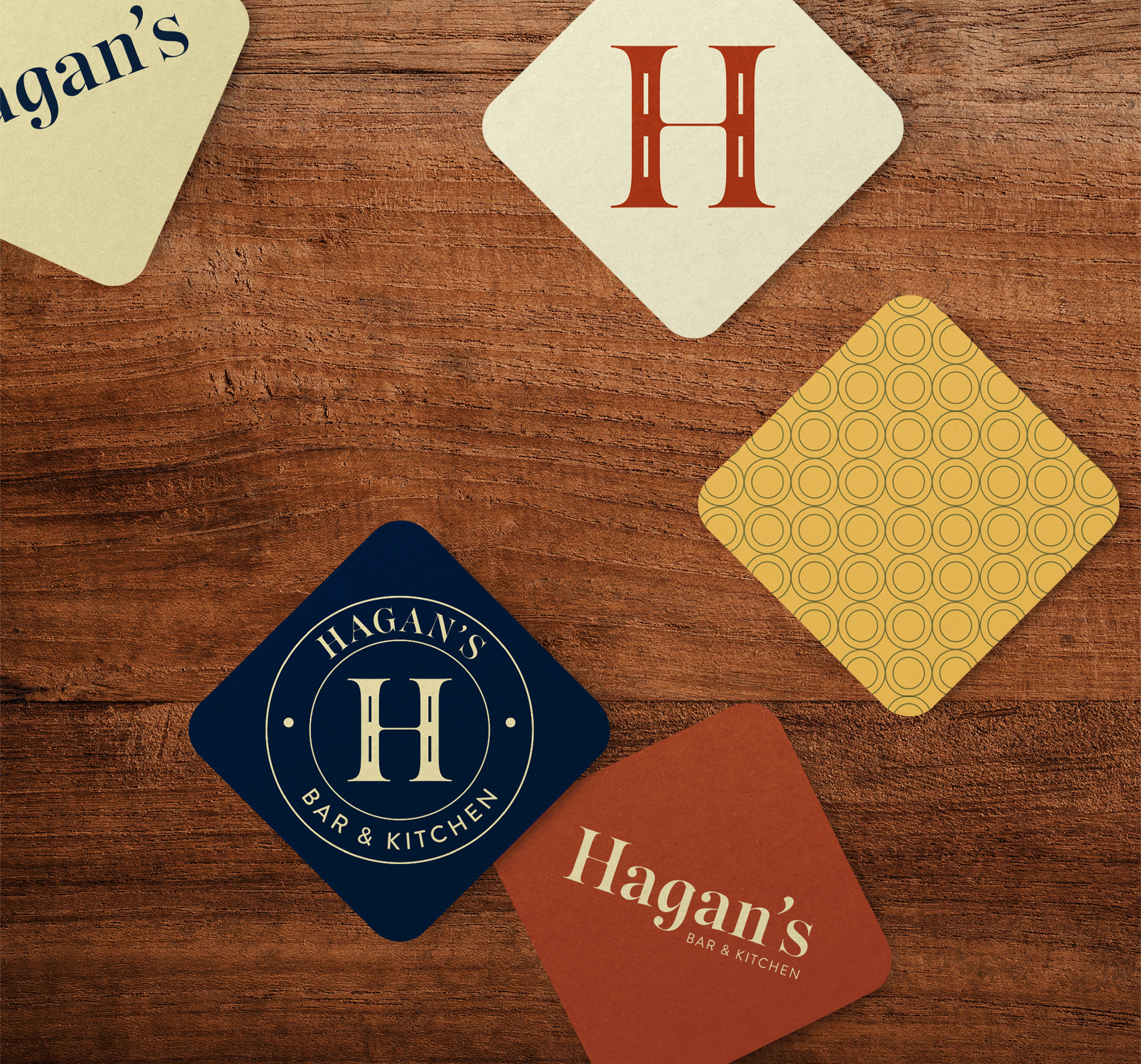
This brandmark works well on its own and can also be framed in the Hagan's emblem to reinforce the traditional nature of the brand.

THE HAGAN'S Style
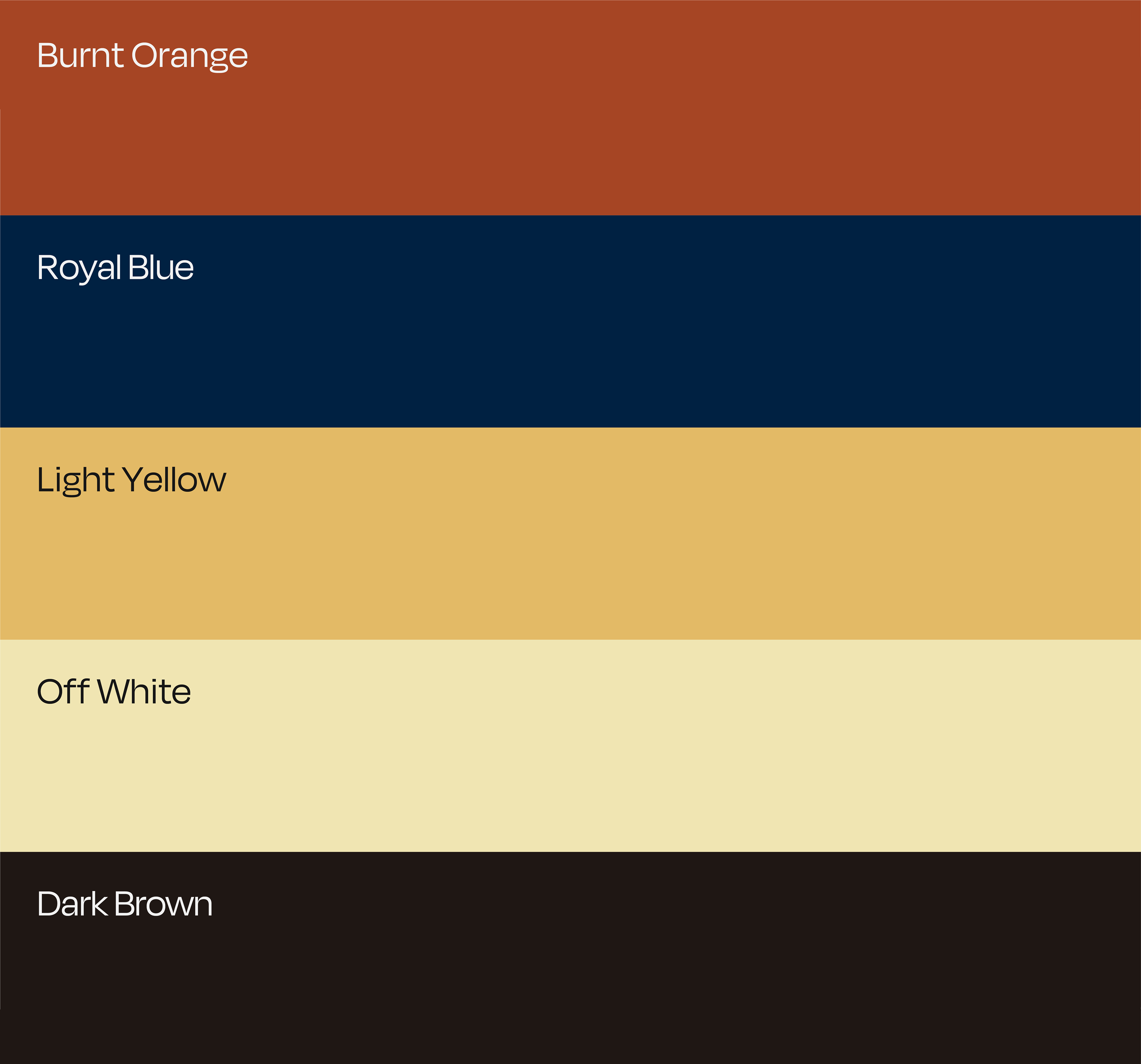
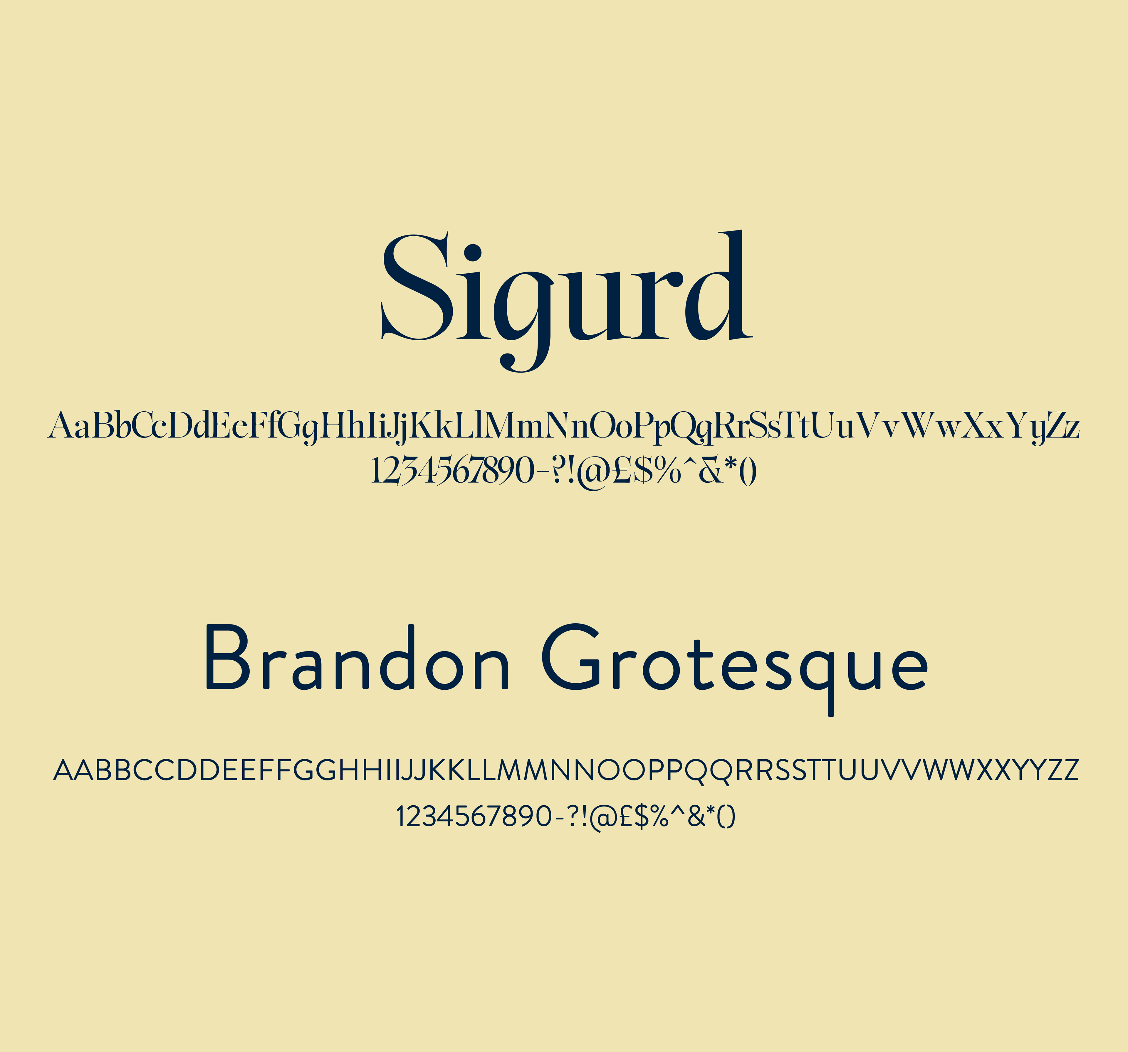
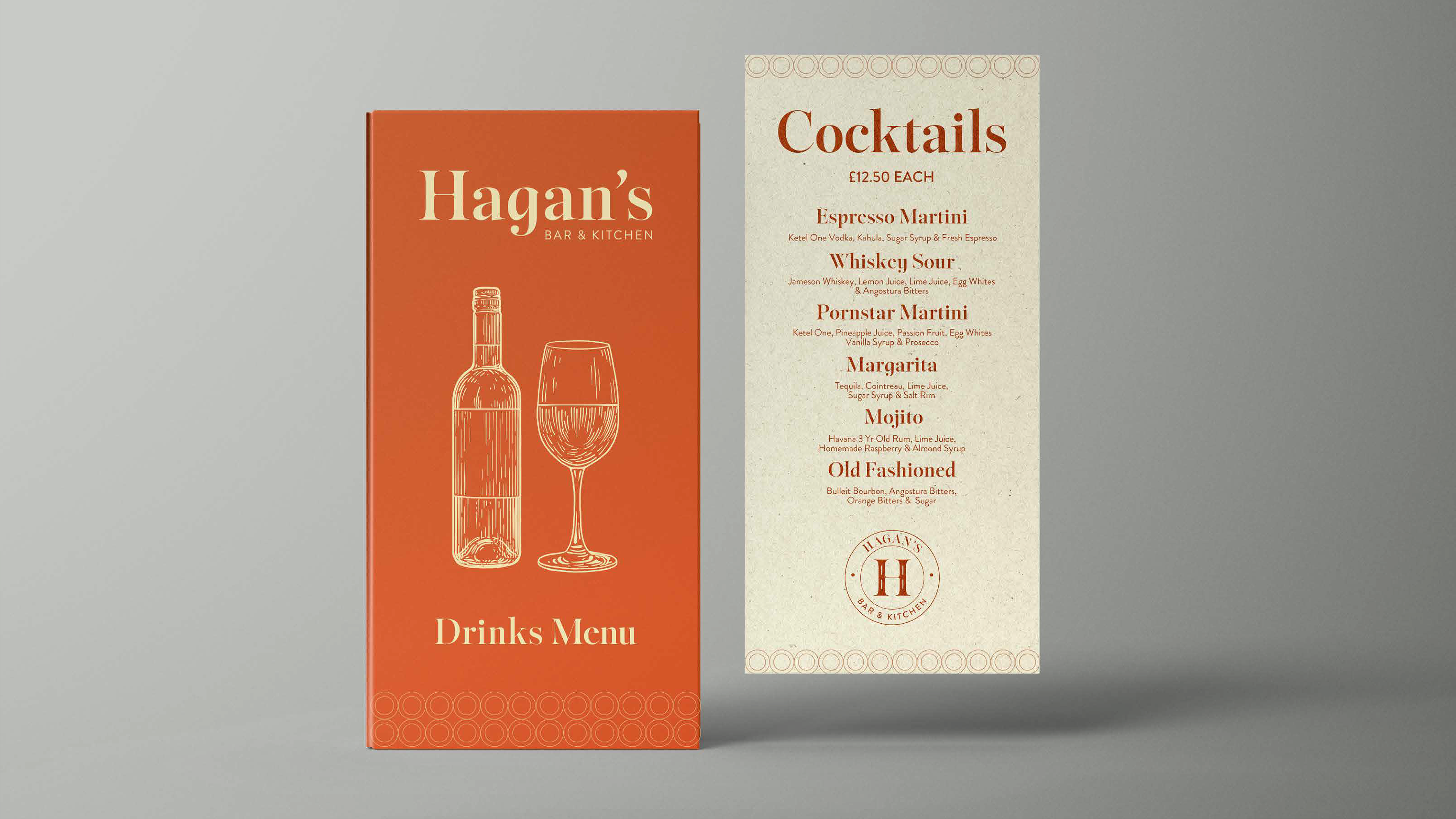
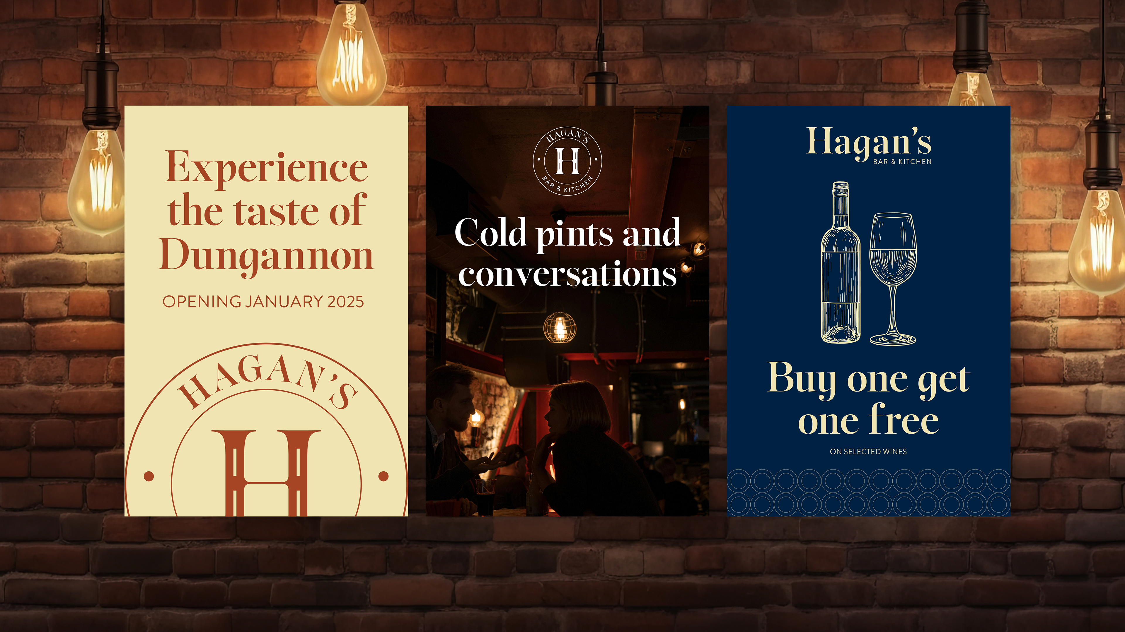
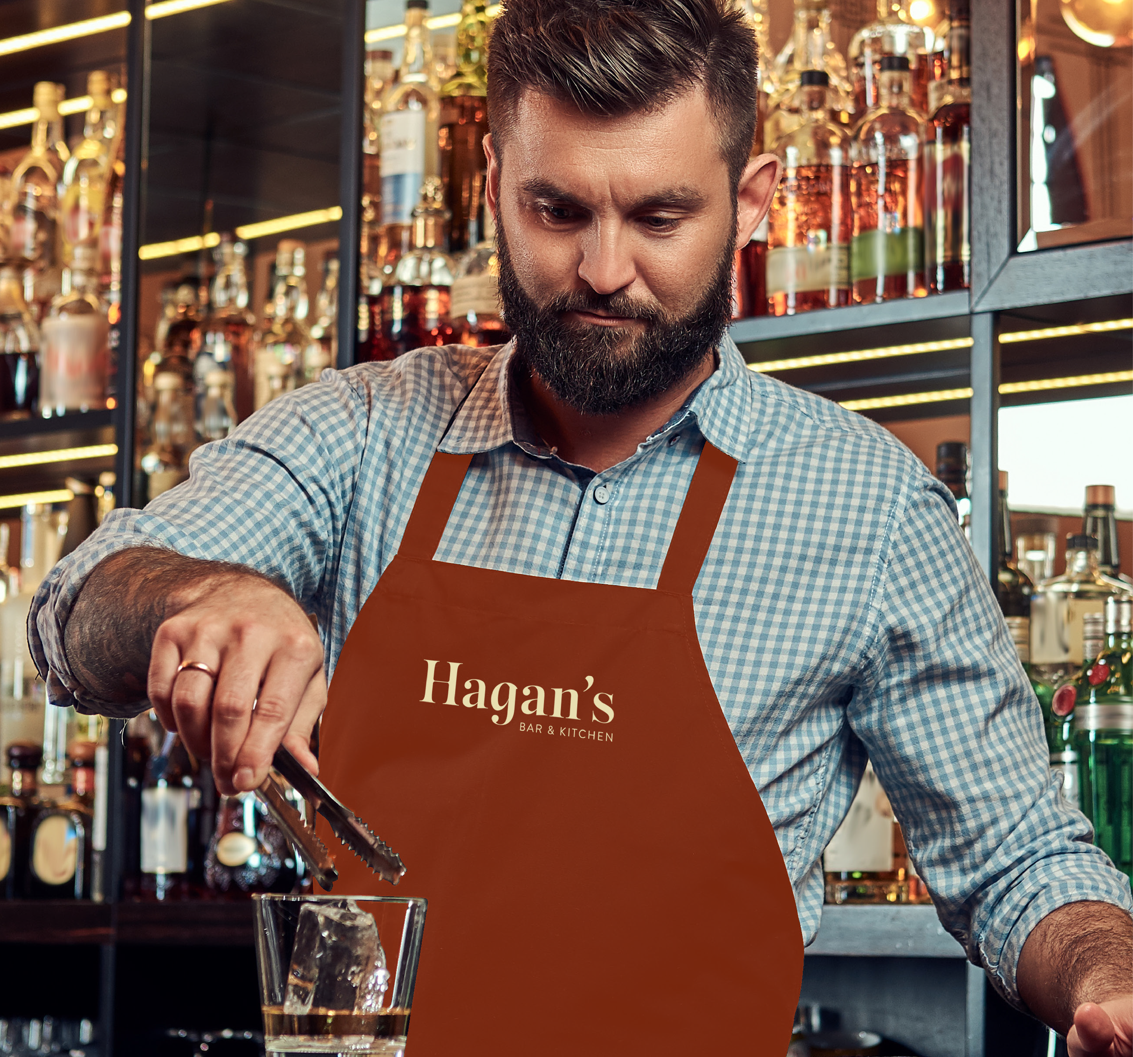
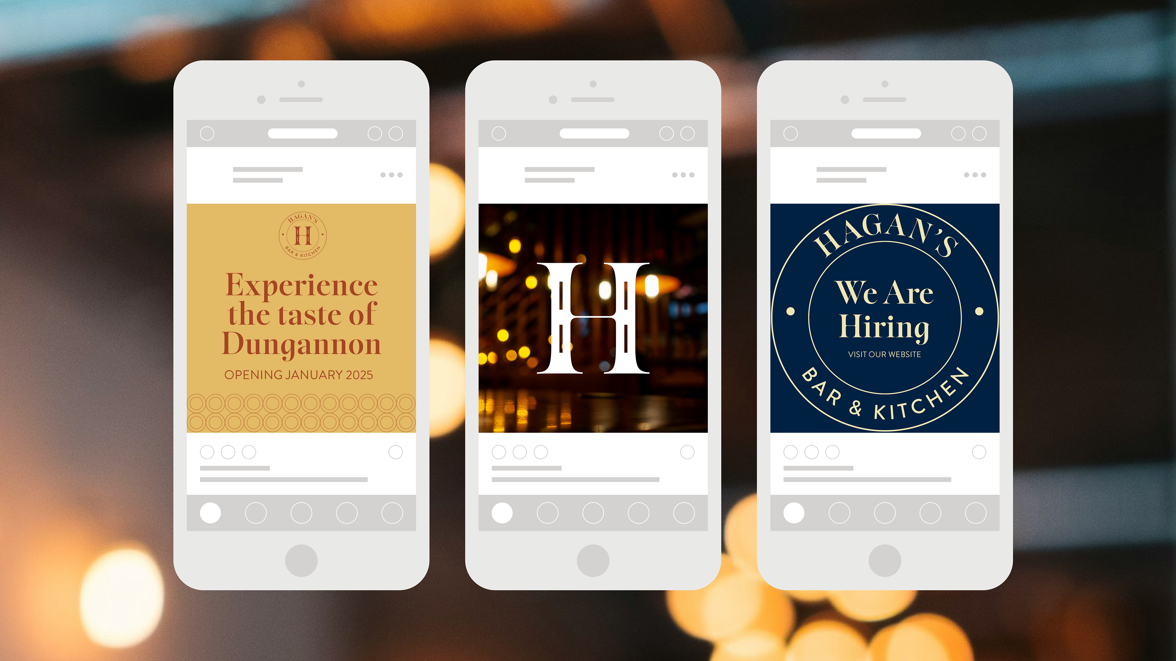
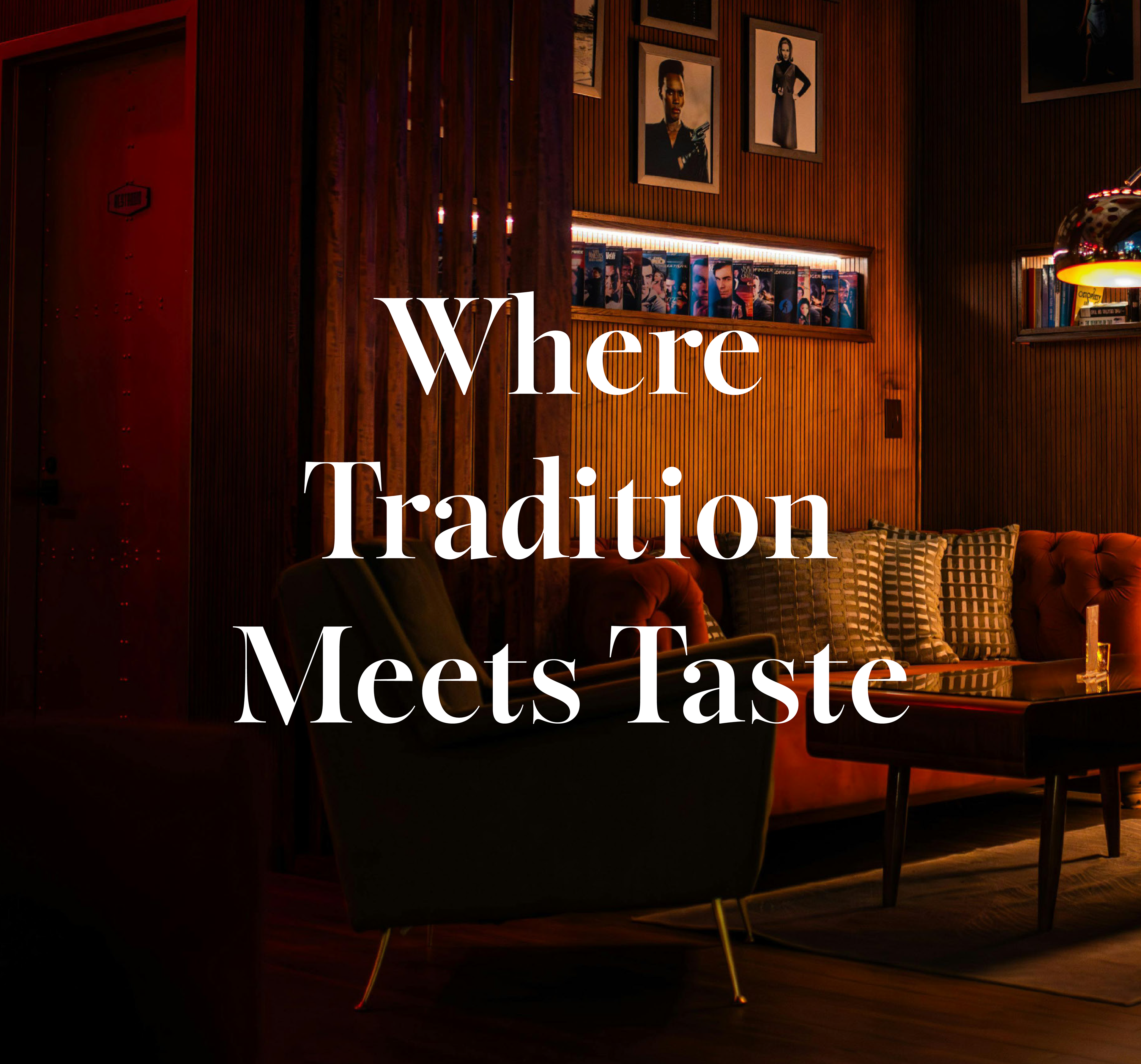
The new branding reinforces the warm and authentic character of Hagan’s. The primary typeface is Sigurd Bold, a classic sans serif with characteristic edge. This is paired with Brandon Grotesque for a contemporary touch. The photography involves ambient light and candid moments to give a more intimate vibe. The deep earthy colour palette showcases charm, tradition and quality, and brings to mind aged whiskeys, wines and ales. This is married with more muted reds and yellows to provide that clean, modern touch. Overall, these elements provide a timeless and inviting atmosphere to the venue.