LIVING UP TO THE ICON.
THE BRIEF
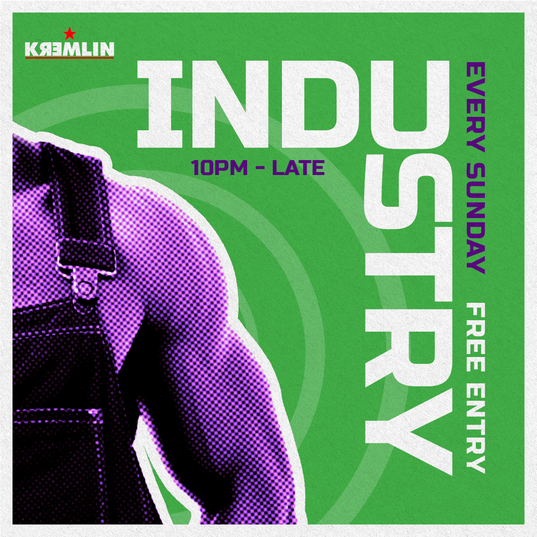
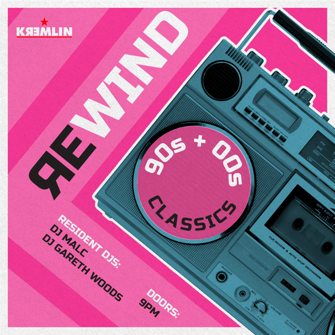
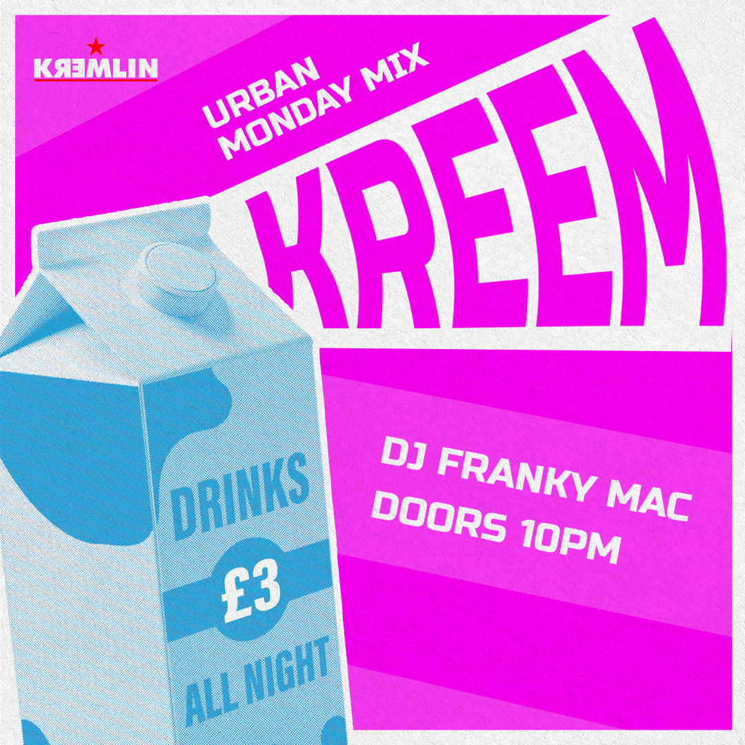
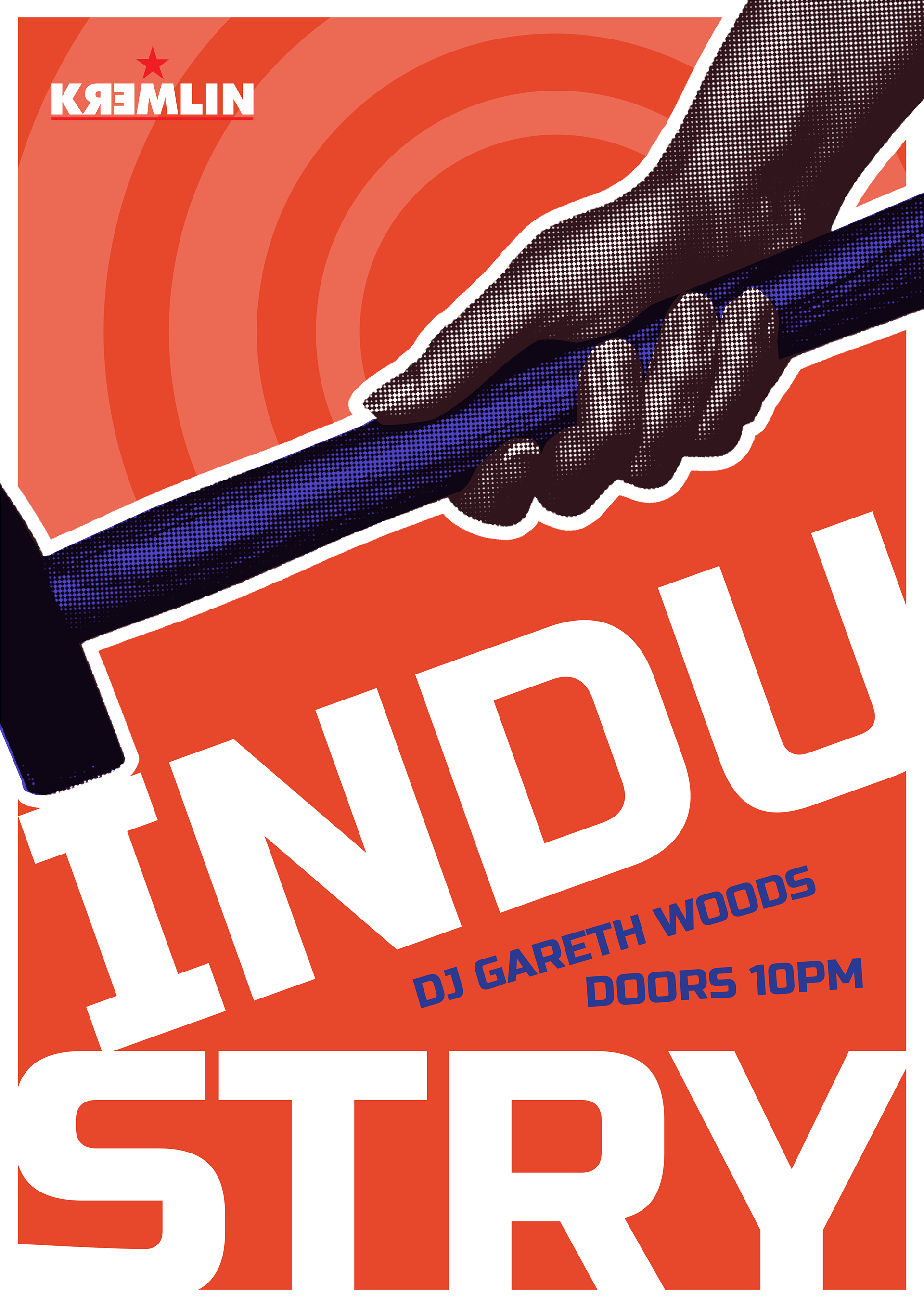
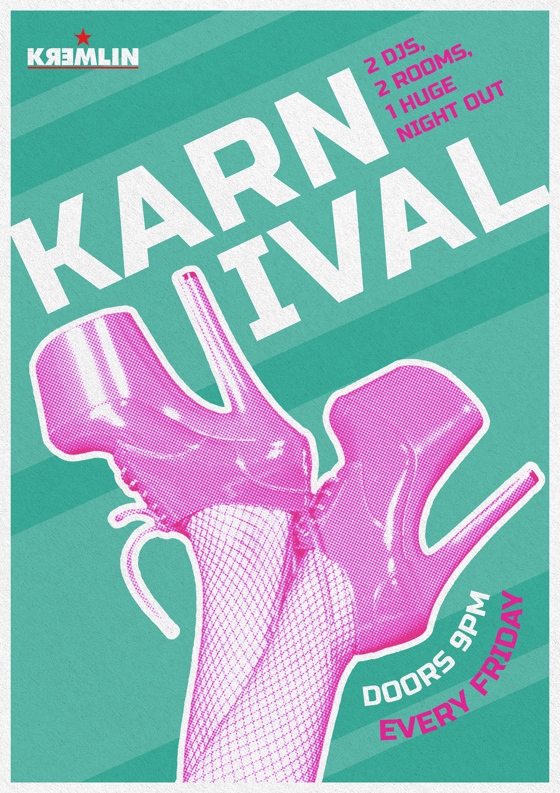
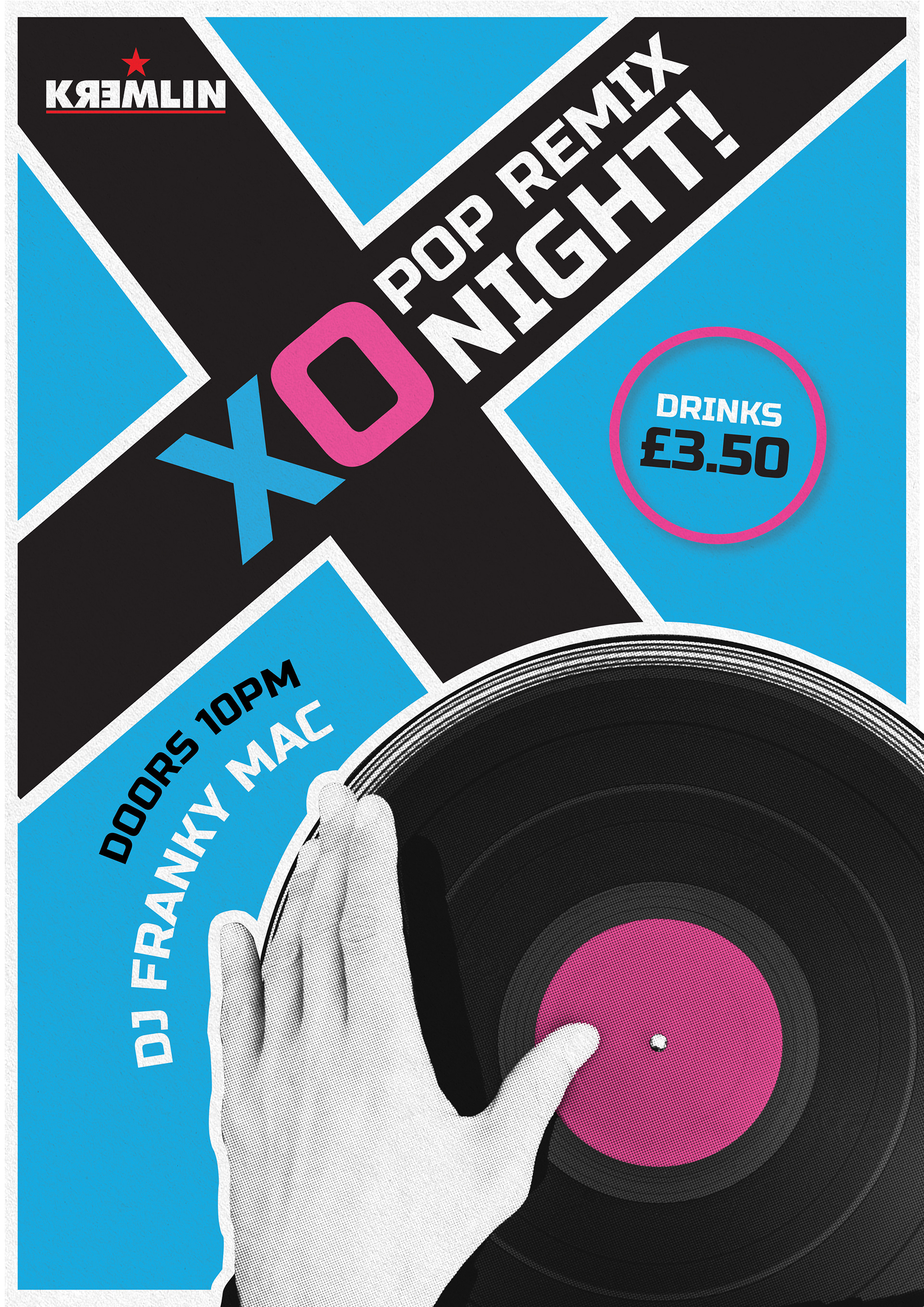
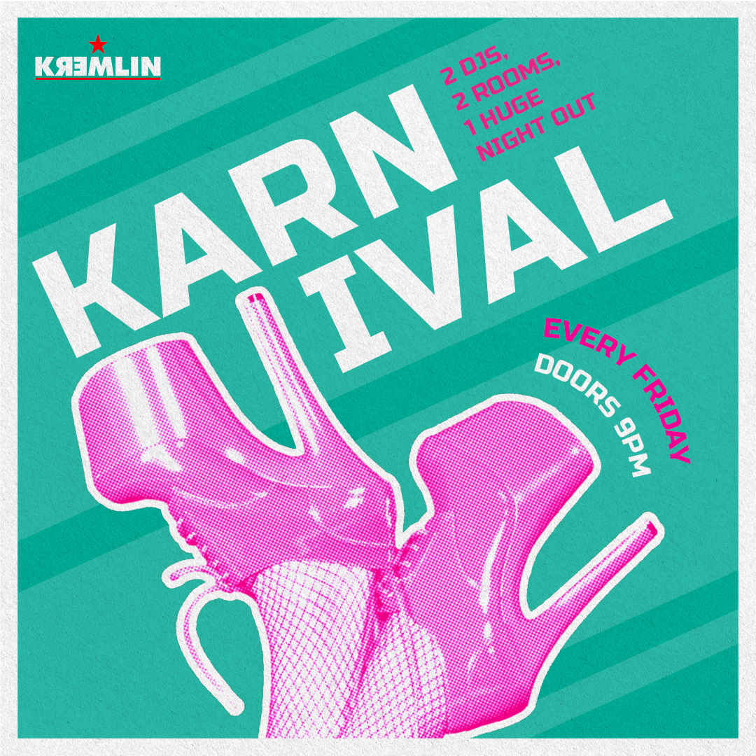
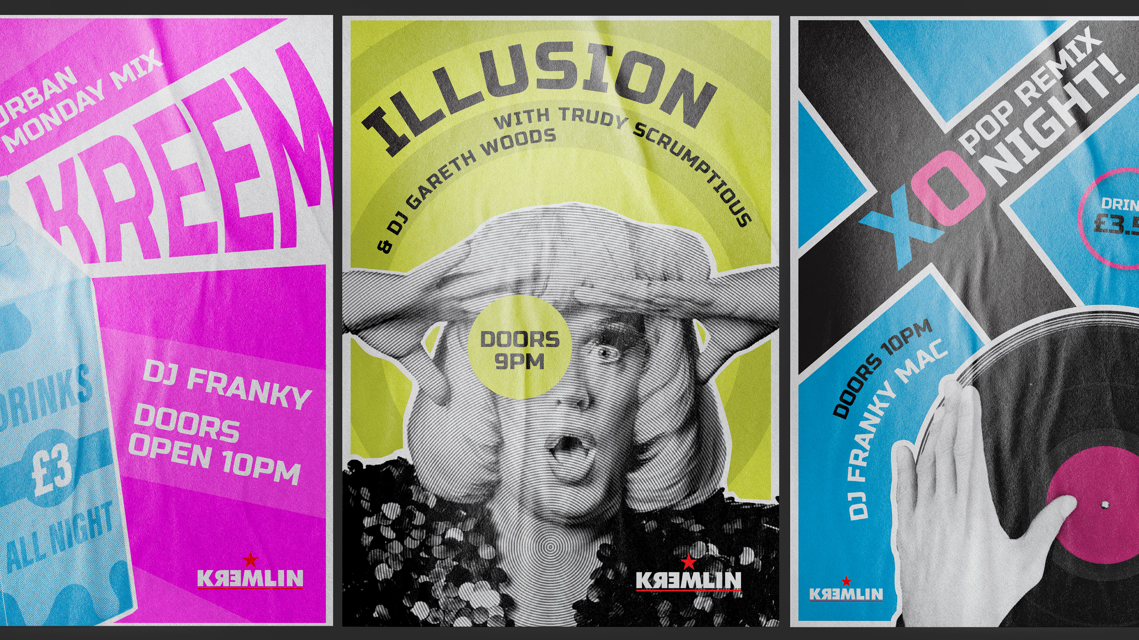
In the wake of new ownership, Kremlin wanted to redefine their brand visuals - primarily through their 9 club nights across the week. The aim was to create a suite of designs that were cohesive and distinct in style, while remaining true to the Kremlin brand. There was an emphasis on being experimental as well as tongue-and-cheek.
THE PROCESS
As it is such an iconic part of Belfast, Kremlin were eager to keep their name and core themes/visuals. Therefore, I decided to take inspiration from old constructivist designs and see how we could provide a more contemporary and flamboyant twist.
Some of the main elements that stood out to me was halftone imagery, punchy colours with high contrast, and dynamic layouts to emphasise information. Ultimately, I wanted the designs to have the bones of constructivism paired with contemporary nightclub posters.
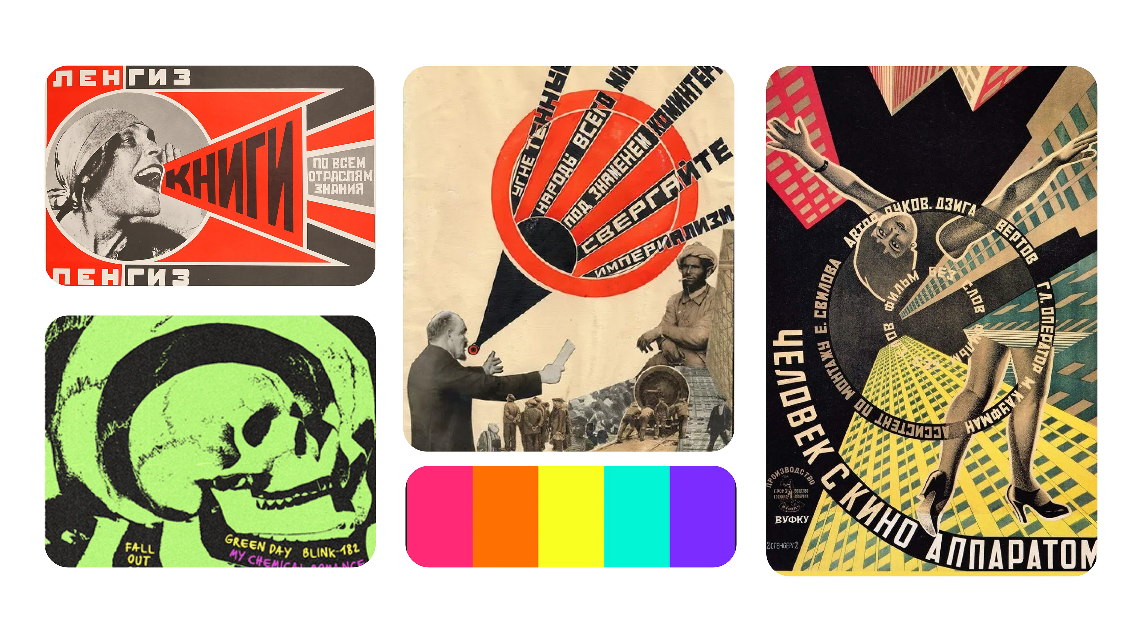
Some of the main INSPIRATION POINTS FOR THE NEW KREMLIN STYLE. I mainly wanted to focus on the constructivist characteristics such as bold type, dynamic layouts and cut-out imagery. This would be paired with bright, neon colours and flamboyant imagery/messaging to give kremlin a distinct style.
THE ROLL-OUT
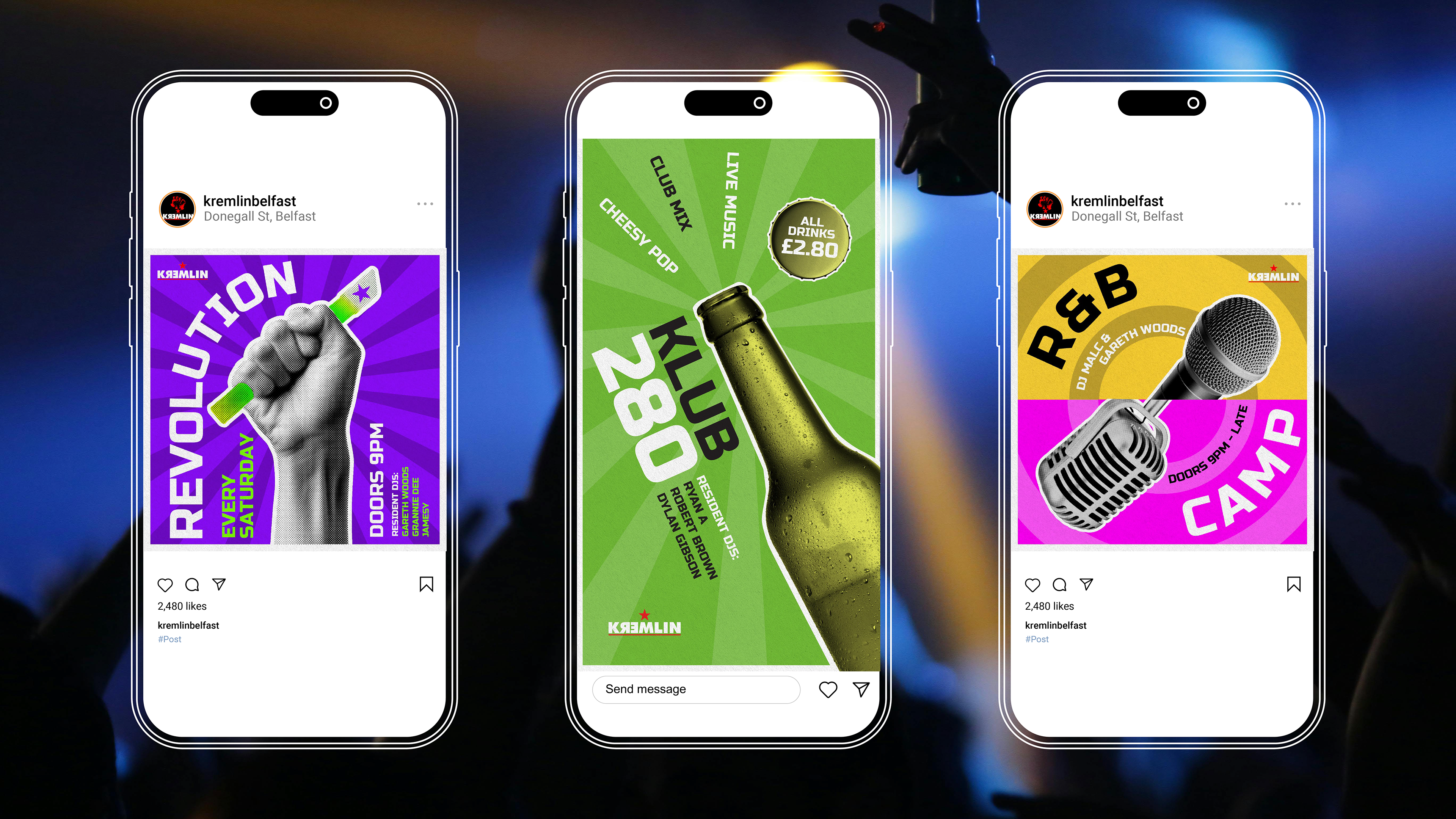
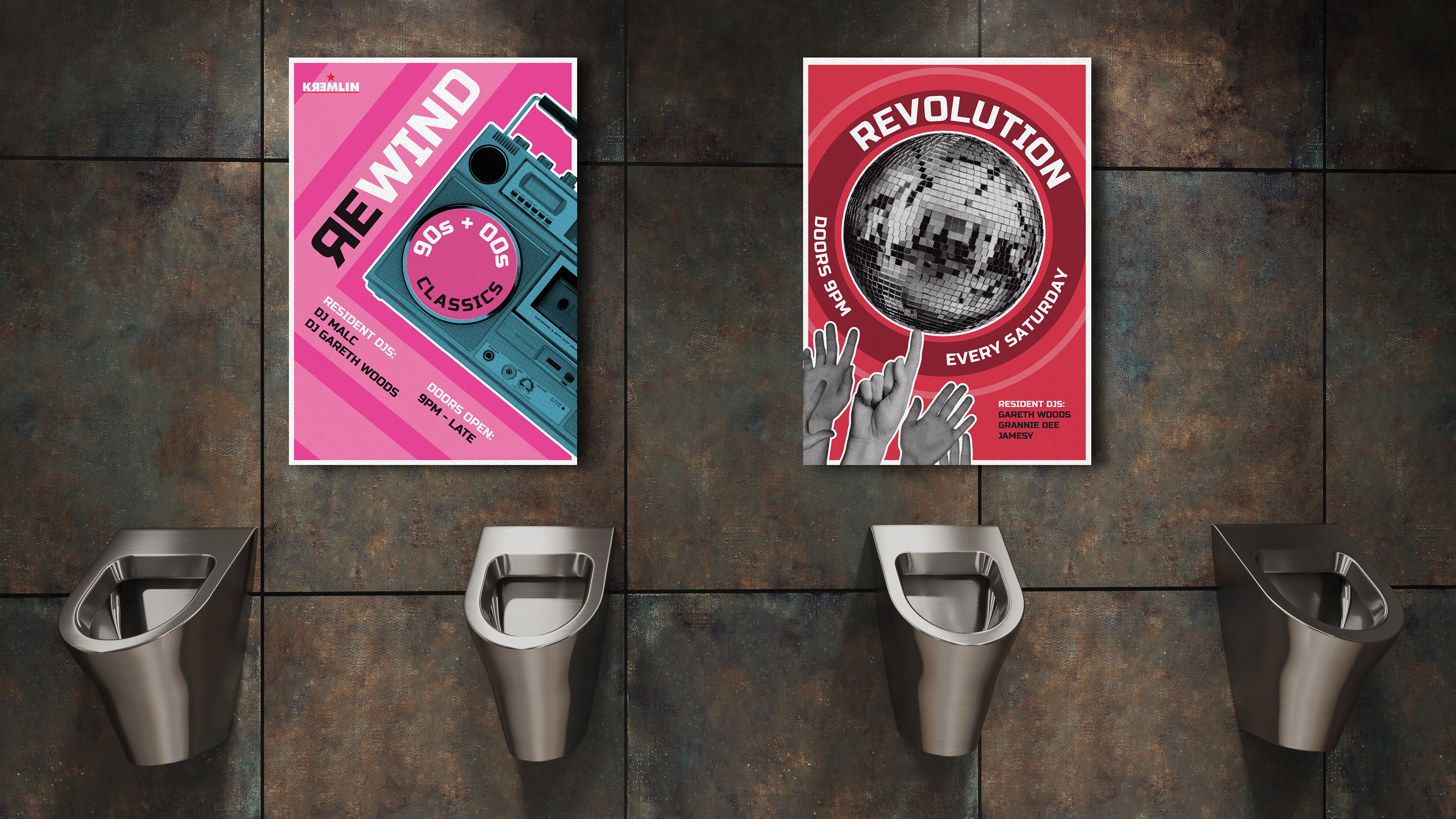
The club nights would primarily be used across social media, as well as posters that would be located throughout the venue itself. Therefore, it was important that I ensured the designs worked in both print and digital formats.
The designs required close collaboration with Kremlin, as it was important that I captured the energy/theme of each night, whether it be through tailored colour palettes or specialised imagery. I also created multiple variations of popular nights to keep things fresh and to generate interest.