
ESTABLISHING STRONG FOUNDATIONS
THE BRIEF
To prepare for the launch of their pilot location, Freshfix sought the development of a solid brand system that was cohesive across various touchpoints. The new identity also needed to be scalable for future expansion across various locations.
THE PROCESS
After speaking with Freshfix about the brief as well as goals for the business, I established three main aims in my approach:
1. Create an authentic brand that connects to the target audience, this being nearby students as well as patrons of local gyms/studios.
2. Establish a unique identity that cuts through existing competitors.
3. Develop a visual system that allows cohesion and scalability for the business.
From this I was able to start creating moodboards that aligned with my aims and would inform my process going forward.
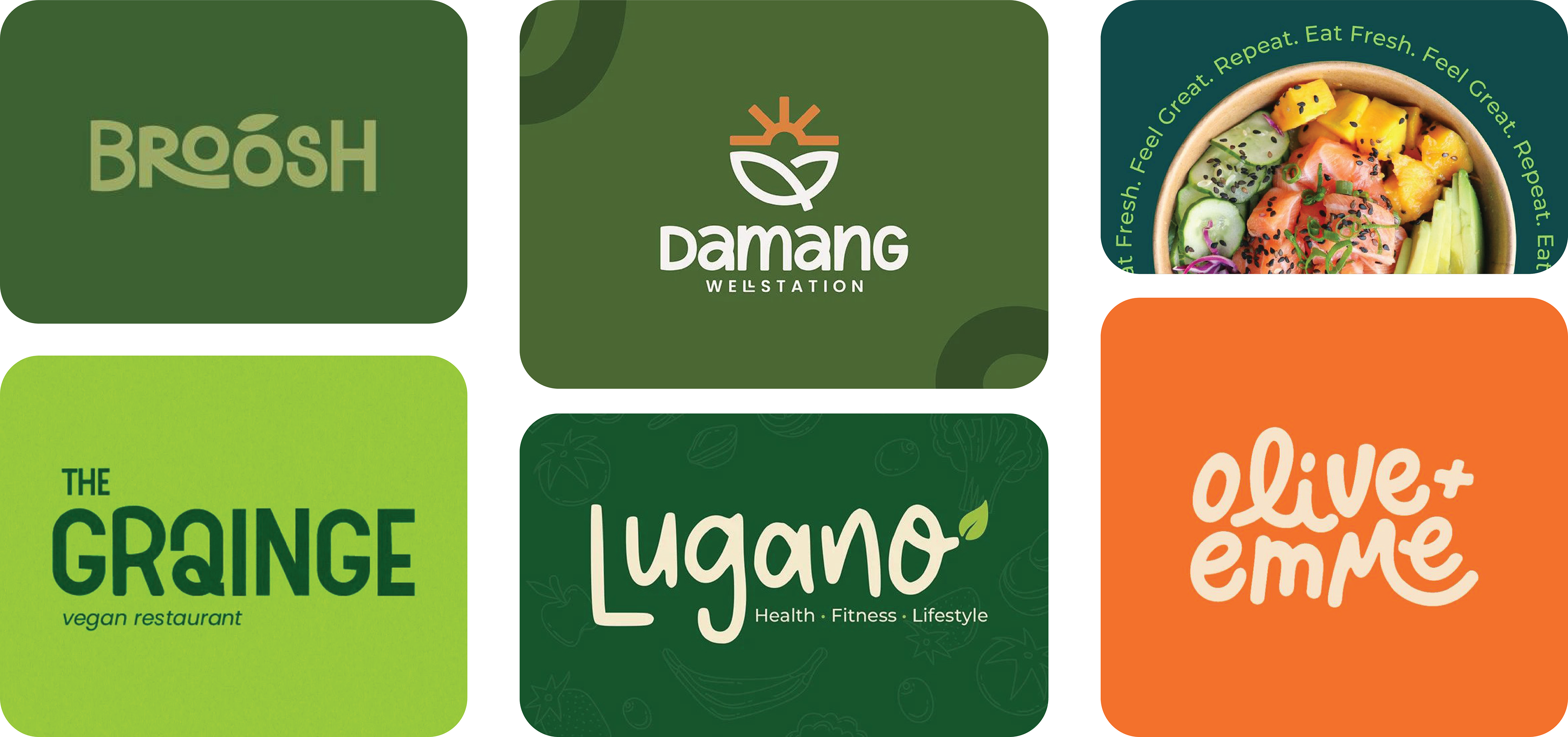
Some of the main INSPIRATION POINTS FOR THE NEW FRESHFIX STYLE. I wanted to lean on the authentic tone through handwritten typography but also make it fresh and punchy through the use of vibrant colours, illustrations/graphic shapes and clean image treatment.
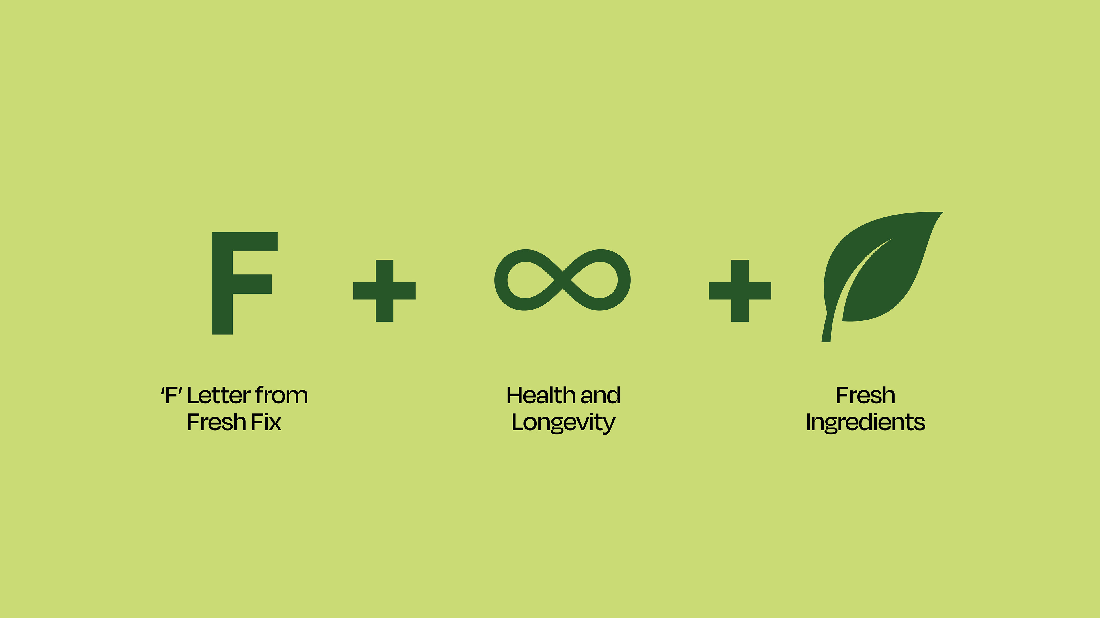
THE FRESHFIX BRANDMARK
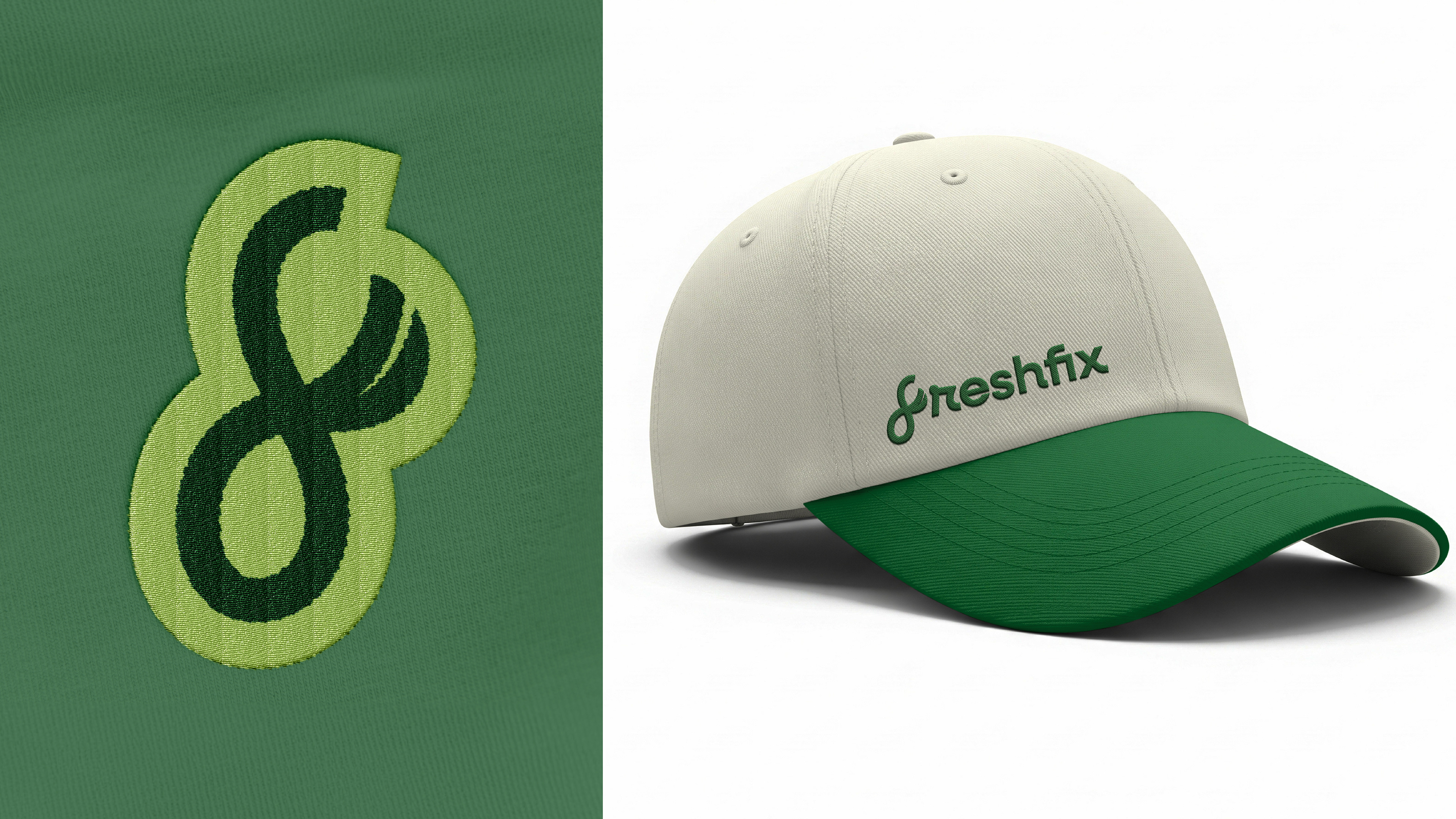
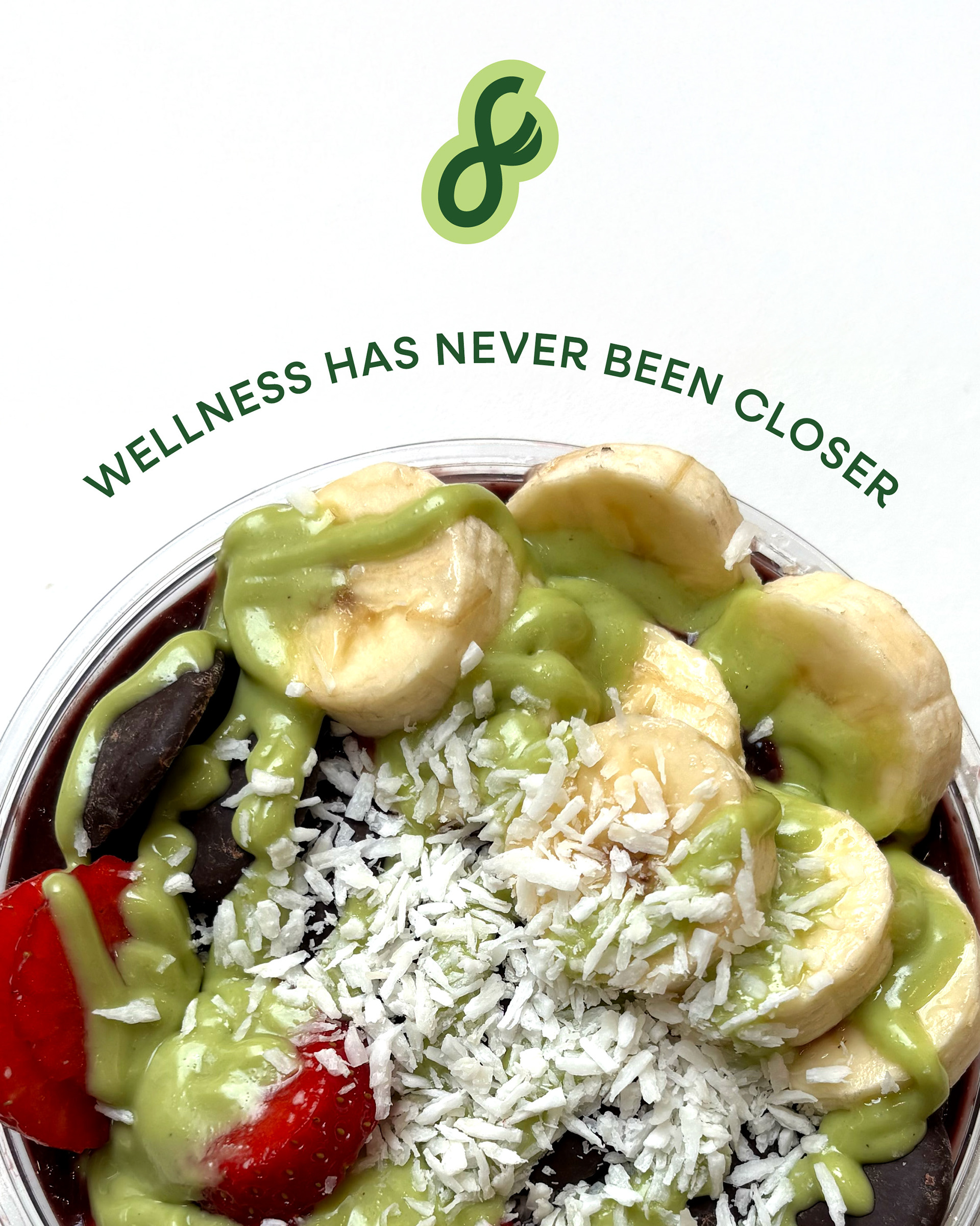
Taking inspiration from the Freshfix name, as well as elements such as wellness and fresh ingredients, I created a distinct brandmark that added personality to the visuals. This is striking on its own and can be utilised on merch, signage, stickers or through graphic shapes. It also works well when paired with the lettermark.
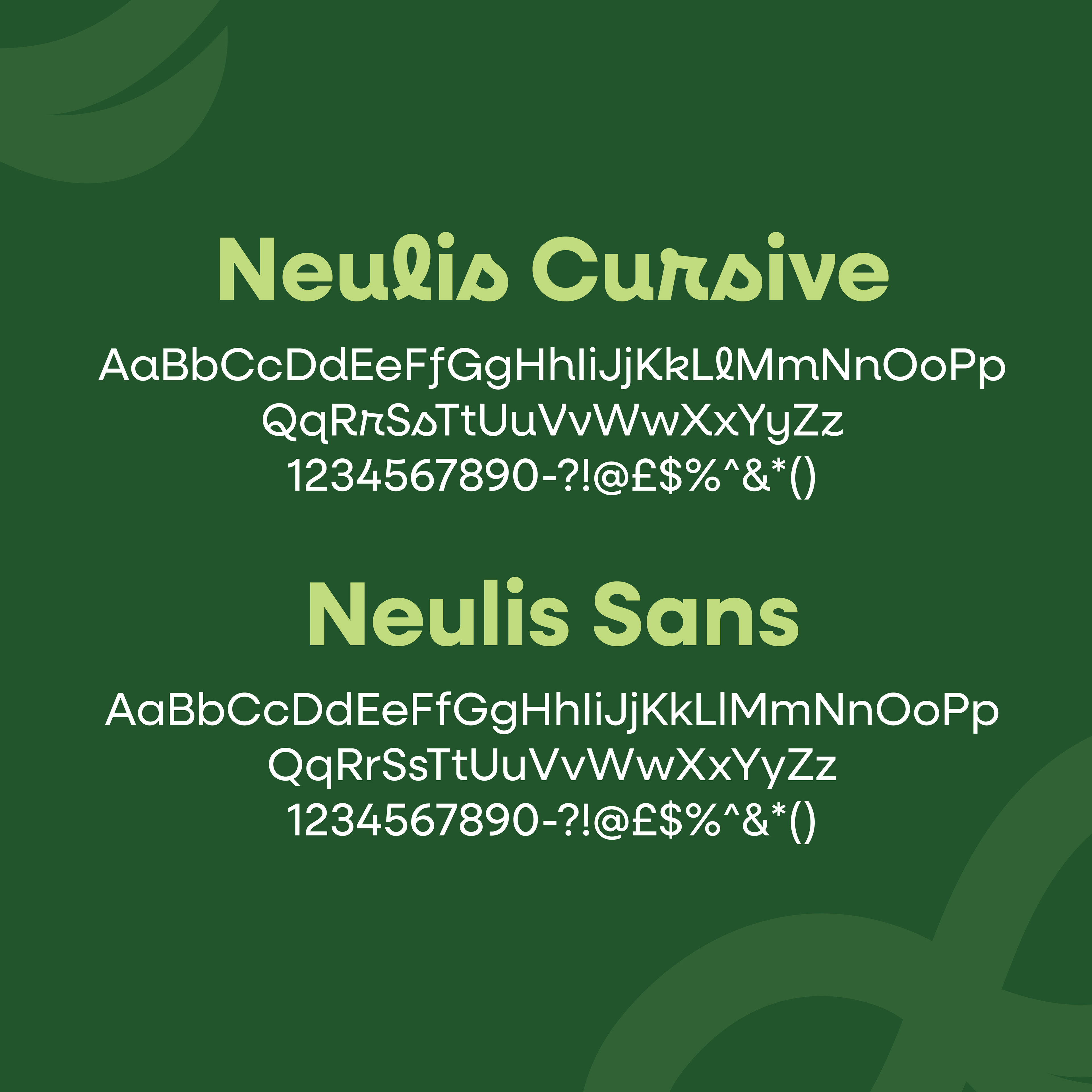
The Freshfix lettermark uses a mix of Neulis Cursive and Neulis Sans, allowing for a personable tone while also remaining clean and contemporary. Keeping different versions of the same type family also lends to the cohesive visual language.



When considering brand colours, I focused on the vibrant tones of the ingredients used by Freshfix. The primary colours are variations of green, as this is synonymous with with health and wellness, and give a trustworthy feel to the brand.
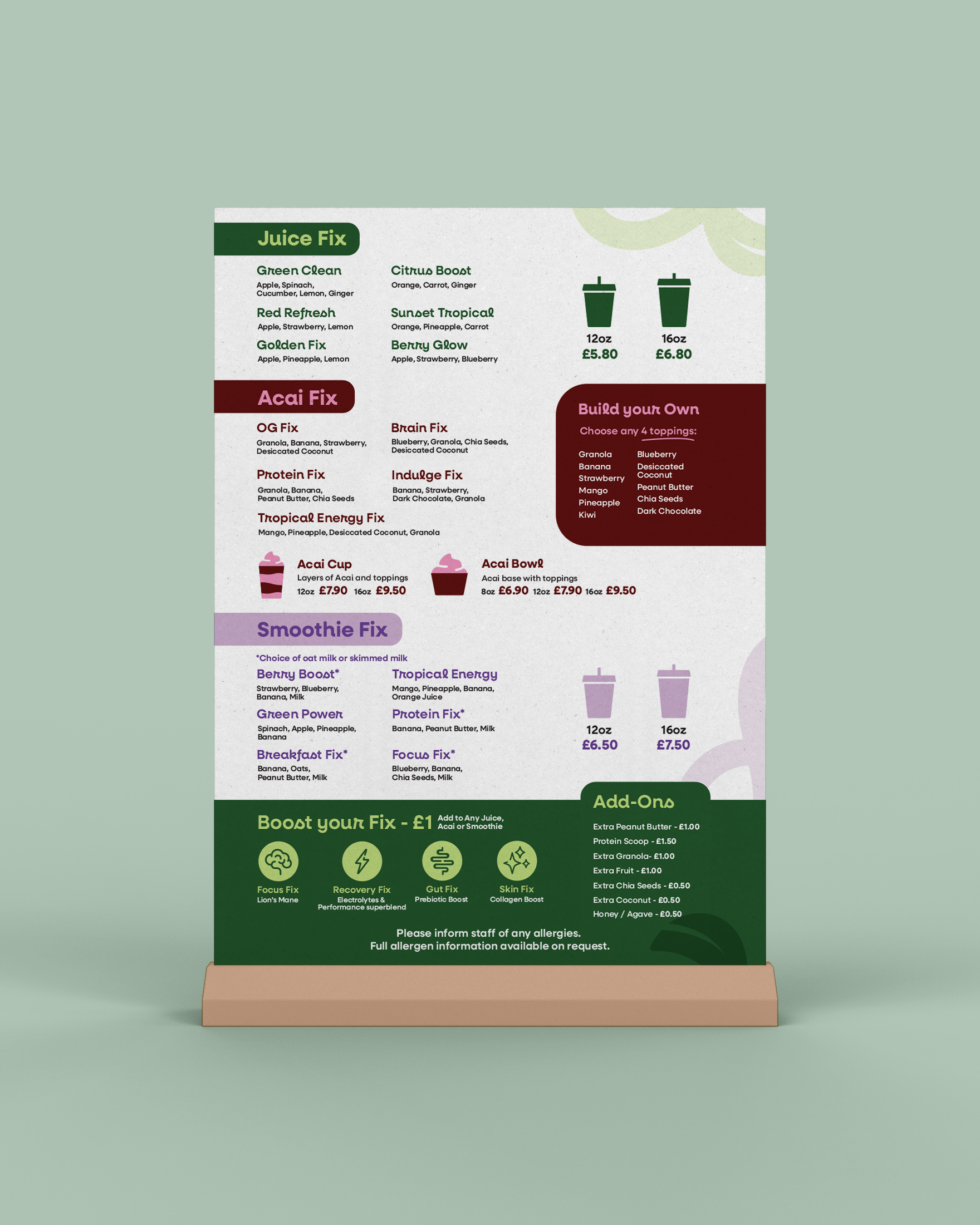
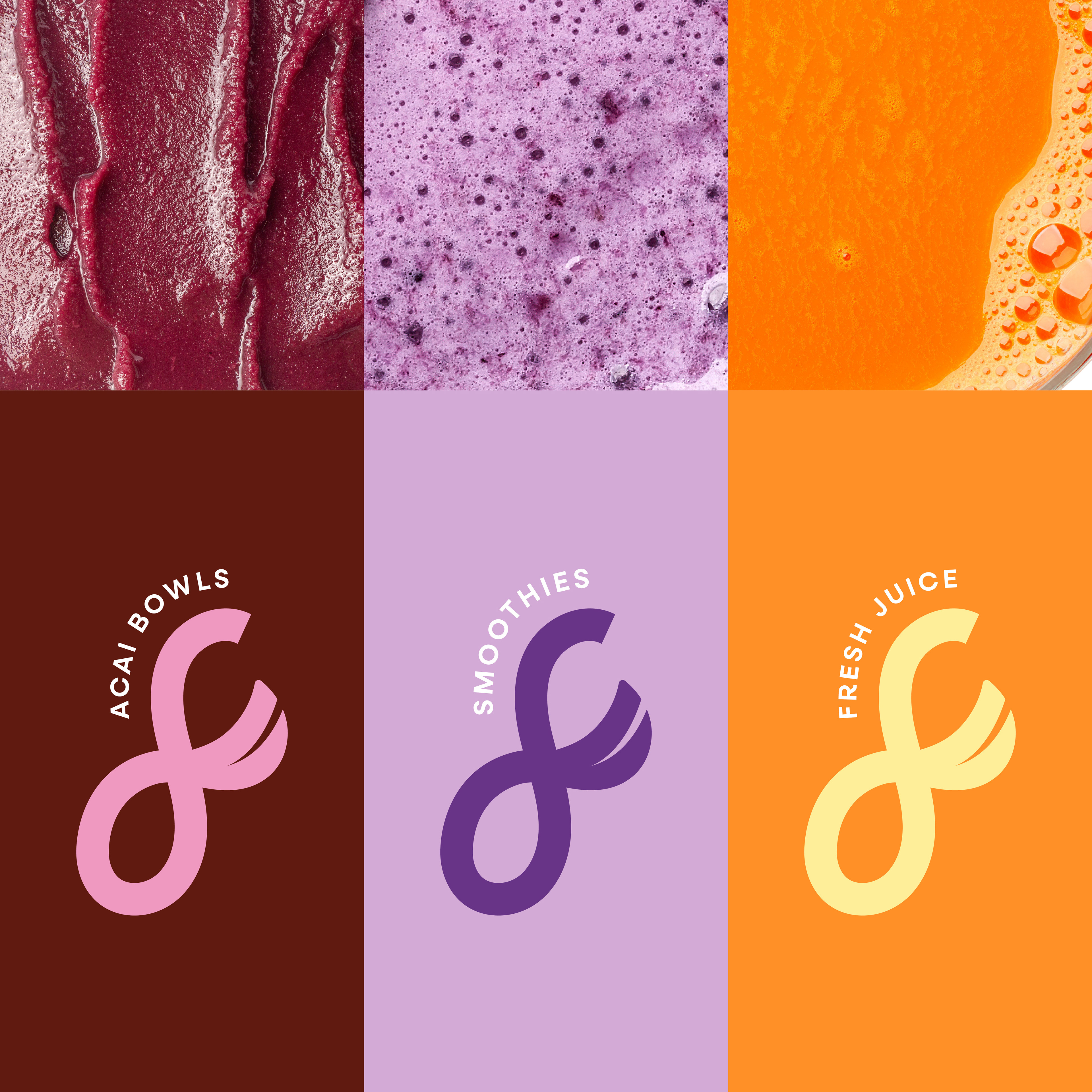
For the secondary colours, I thought it would be interesting to have limited palettes for each of the main products on offer. This would make the different menus/labels easier to recognise and, in a location with high footfall, would improve the ordering process. The range of bright colours also demonstrate variety and excitement, making the visuals intriguing to a younger audience.

Freshfix had also intended to launch bespoke syrups that targeted different functions such as brain focus, sport recovery or skin and gut health. I chose to create icons for these based on the flowing style of the brandmark.
THE ROLL-OUT
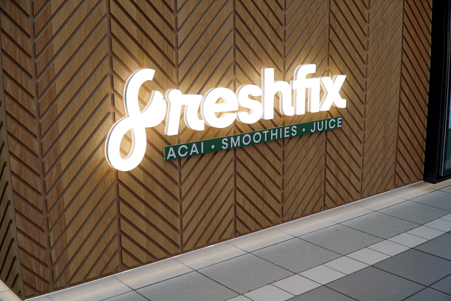
Freshfix's pilot location was to be a kiosk in CastleCourt. This meant that the brand had to be utilised in a way that was visually striking and stuck out in a busy shopping mall.
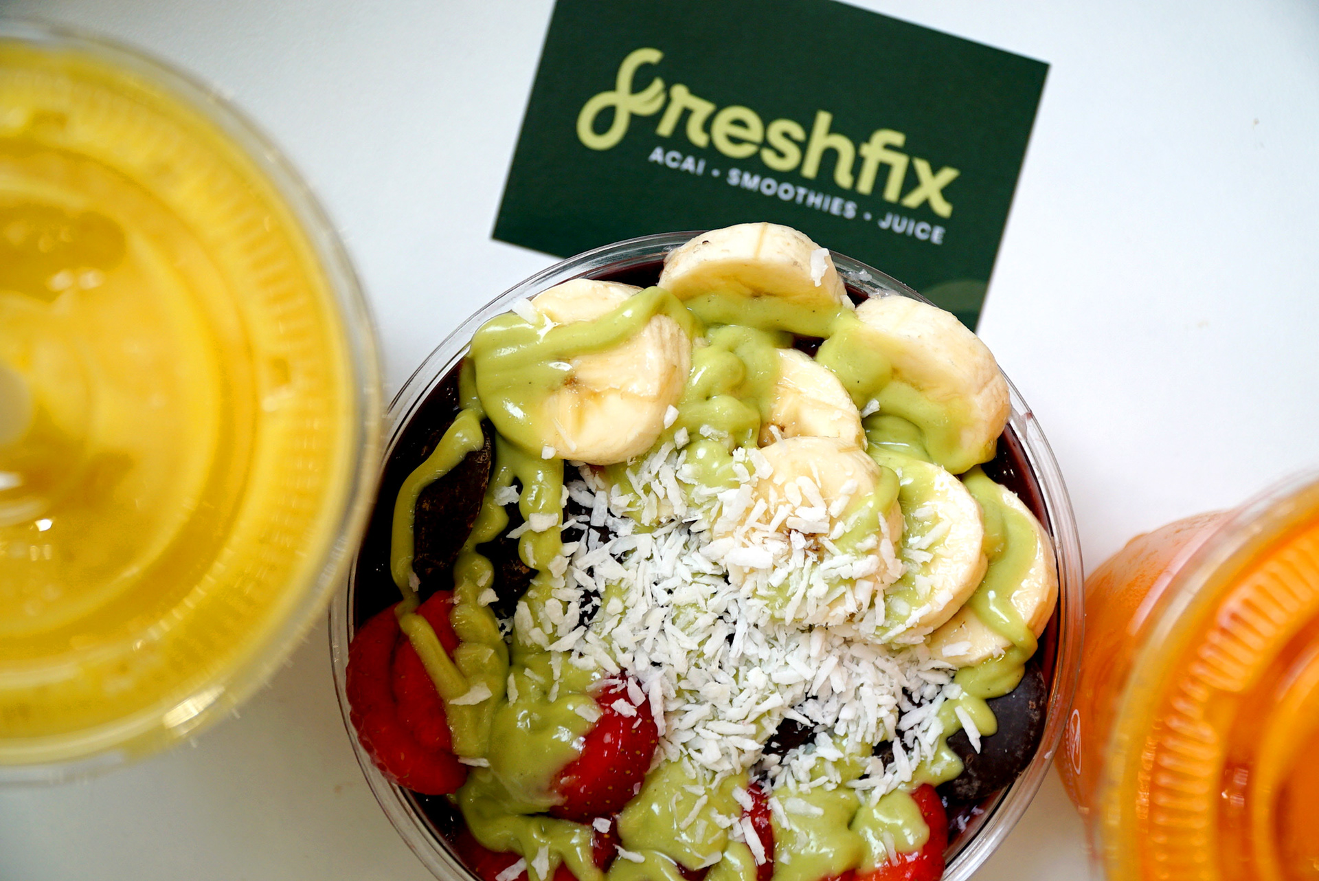
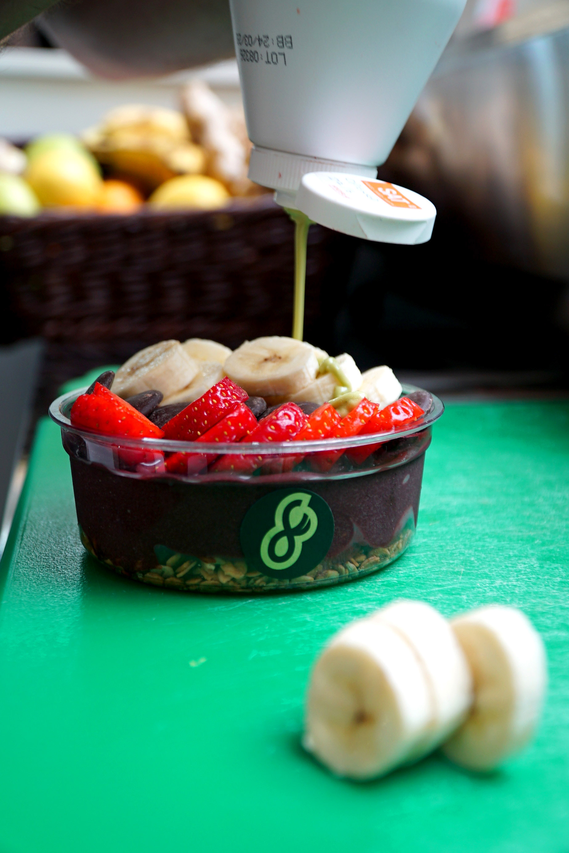
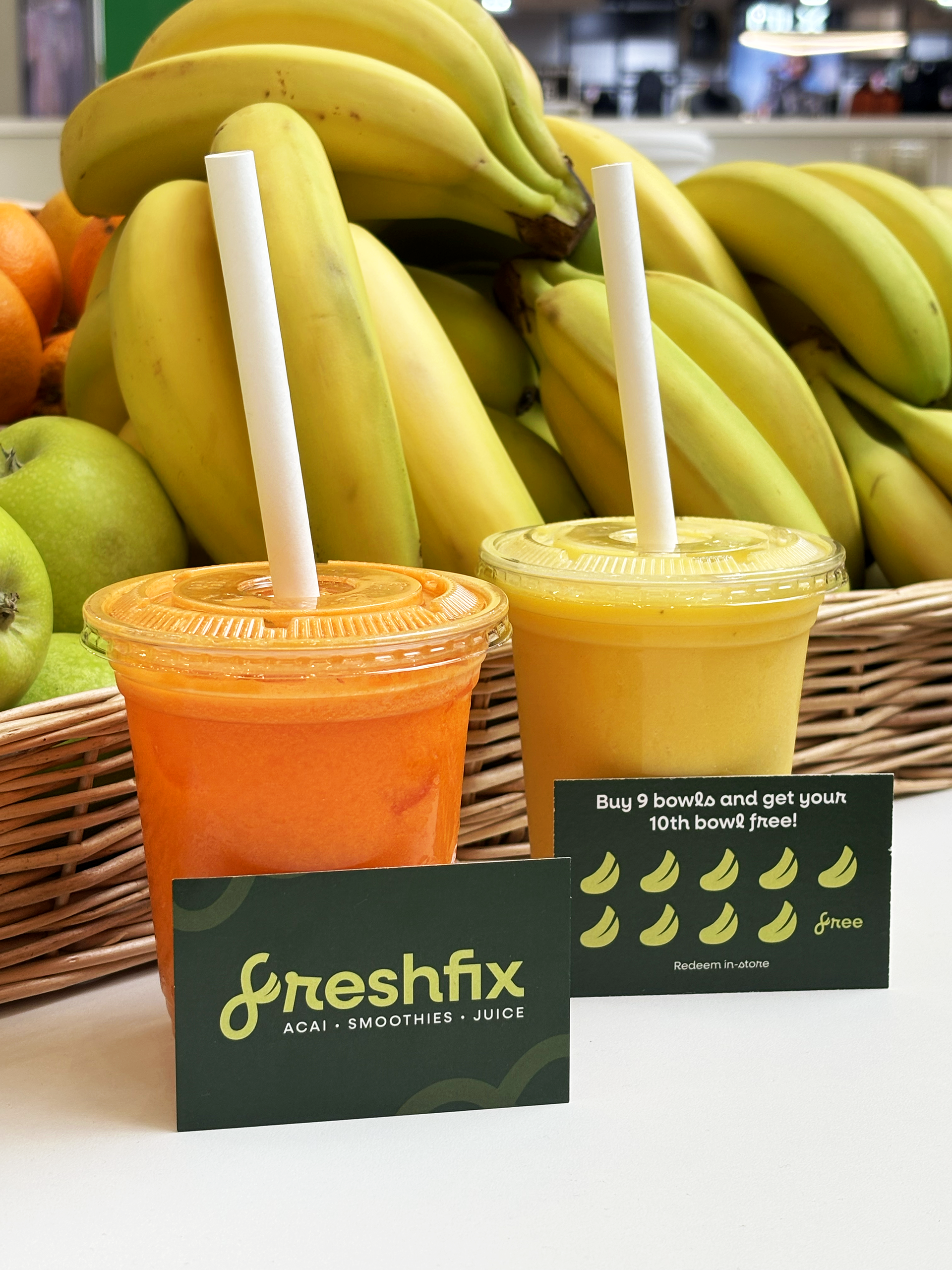
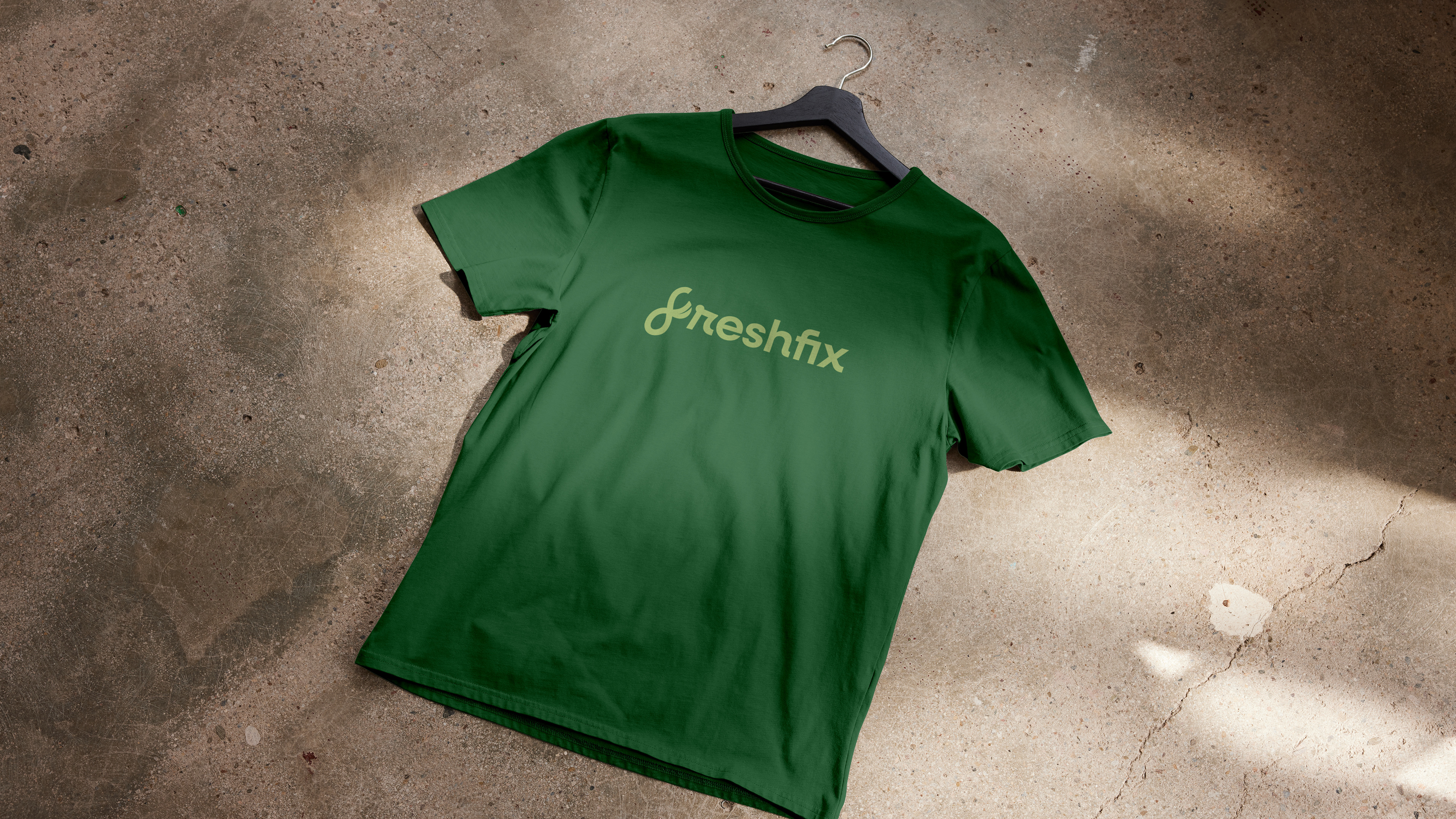
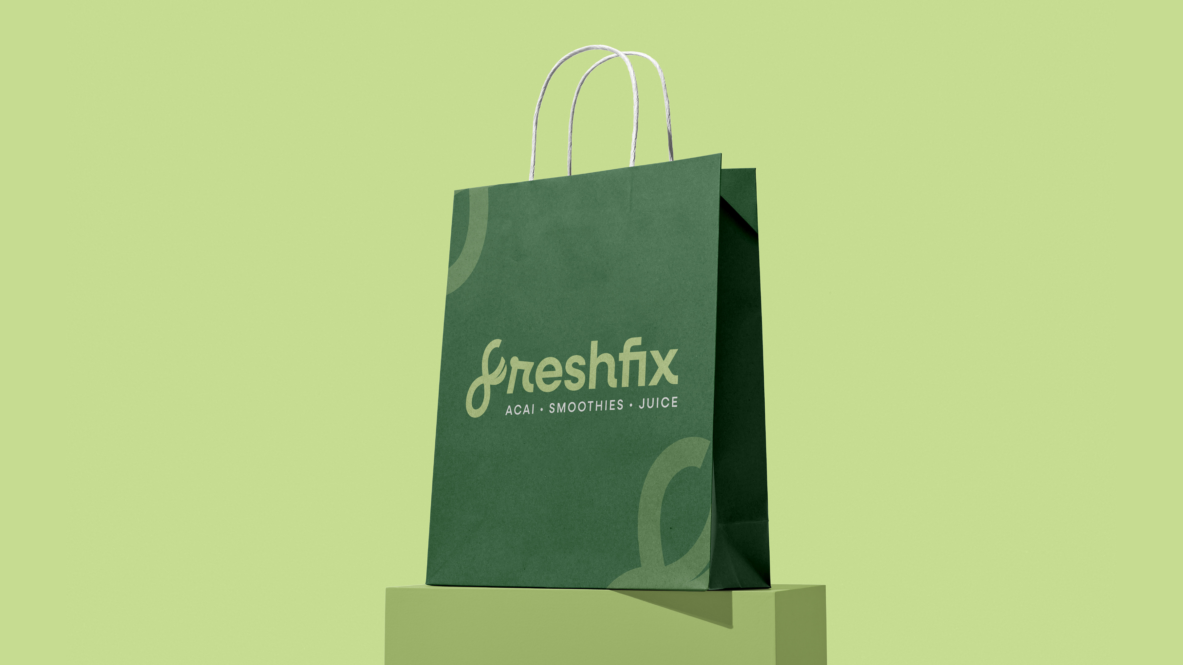
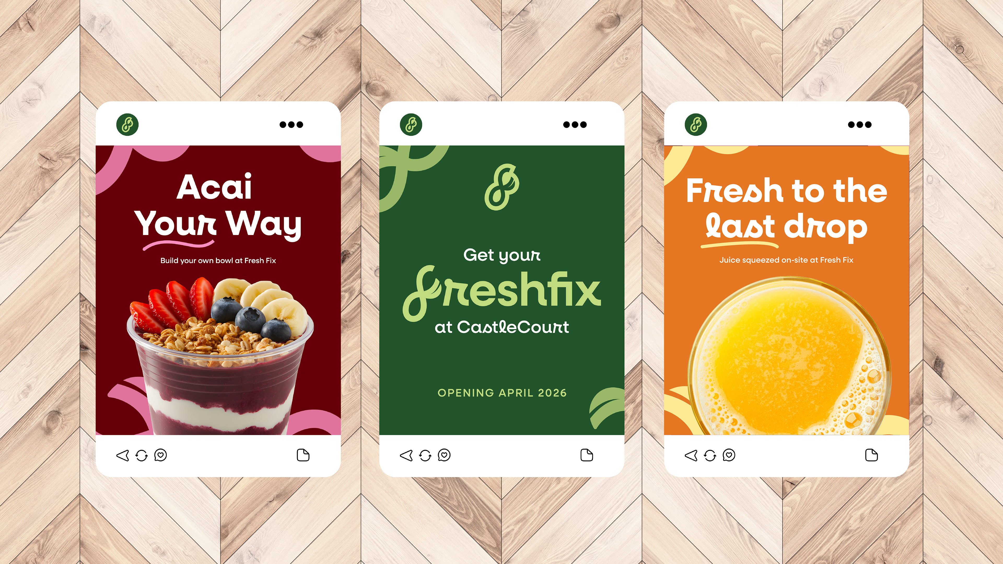
For the roll-out stage of the process, I explored how the brand worked across signage, digital screens, uniforms/merch, social media posts and print items such as loyalty cards, stickers, bags and flyers.